The Origins
In 1931, after decades of primitive experiments in saving and reproducing sound on various formats, including sealing wax, the RCA record company introduced vinyl to the market. This support, made of light and resistant plastic material, allows a more reliable and precise sound reproduction and a longer duration of the recordings themselves. Further innovations will have to wait until 1948, when Columbia will present its first LP (Long Playing), in which the microgroove is used to record sound in even higher quality.
The emergence of the various successive formats (45 rpm and EP) definitively establishes the success of the vinyl support on a global level, and the possibility of reaching up to 20 minutes of recording per side allows the creation of the musical album as it is still today we conceive: a complete and self-sufficient artistic object in which a series of songs creates a logical and anthological thread.
Vinyl thus fully configures itself as a new medium for musical artists who are able to convey an innovative message, and it is clear how the diffusion of popular music and the adoption of vinyl go hand in hand, feeding each other and giving life to an unprecedented market.
Until 1939 records were sold in generic paper packaging, without a precise cover that could in any way reveal the contents. The first envelopes were perforated in the center, they could have at least the logo of the record company, and the potential buyer could read the title and author directly on the label of the disc itself, but nothing more elaborate or specific.
Thanks to graphic designer Alex Steinweiss (1917-2011), art director of Columbia, things took a different direction. He had the idea of going beyond the anonymous cover, personalizing it with artistic images, so that they could visually accompany the music. A personalized cover for each record release, therefore, similar to what happens with editions on printed paper. The commercial success was immediate, and all the emerging record companies in those years had to deal with this new iconographic support and turn to graphic designers and illustrators, and later also to photographers.
Steinweiss himself is also responsible for the creation of the packaging in which the LPs are kept to replace the fragile original paper envelopes, and this innovation, if on the one hand has allowed a better conservation of the support itself, on the other has unknowingly paved the way for a genre of artists, sometimes from a more classical background, who based on that format have created a new type of art: cover art.
In these cases the cover itself in turn becomes a coherent and complete artistic expression, and this transforms the disc into a real art object in which the union between the recorded music and the image through which it is presented becomes something essential and unique: this new product entered the collective imagination without separating the container and the content, elements which from that moment even began to be exchanged in a reciprocal semantic osmosis.
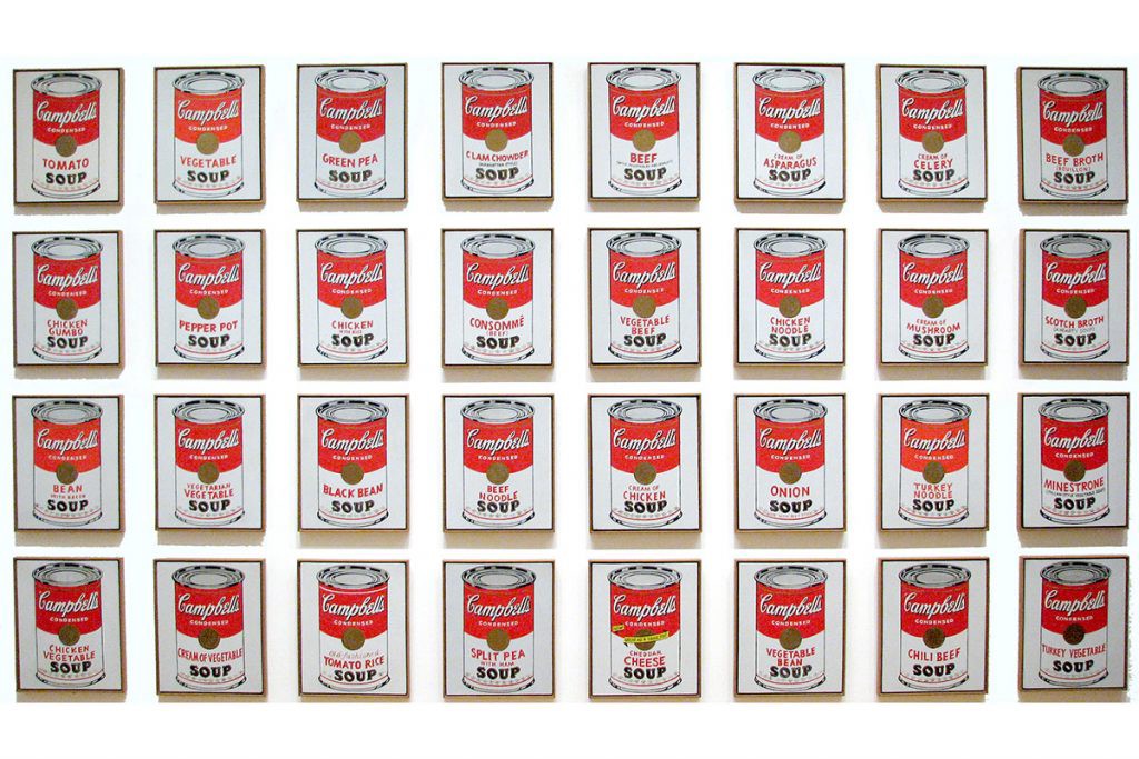
Over time, this will attract famous photographers and illustrious artists (one above all: Andy Warhol) who will want to leave their mark on this portable and pocket-sized piece of art: the cover – as a work of art – is a mirror of the times and reflects the culture of the society and the era that inspired it.
In some cases long collaborations will arise that will give life to graphic connotations that will recur practically in the entire discography of an artist or a group, as happened for example between Pink Floyd and the English photographer Storm Thorgerson (1944-2013), author of the suggestive covers of the band that have defined an imaginary rich in references and suggestions.
The graphic context is expanded by the music stored on the physical vinyl support, which will itself become an artistic expression over the years: from the simple black color it will take on the most varied colors, and sometimes it will even lose its original circular shape. Increasingly elaborate objects for collectors will be created, characterized by particularly refined inserts and cardboard processing: the container cover becomes content and in some cases takes on the function of a book or comic that accompanies the engraved music.
Some markets in particular, such as the Japanese one, have always been more sensitive to this aspect and tend to give greater value to the finished product, paying particular attention to the texts, for example, in addition to the packaging itself.
The adoption of covers in the field of music follows a path similar to that which occurred in paper publishing, but in a decidedly shorter time, and was determined by a double technological and social movement: the formation of a mass audience forced the record companies to invent ever cheaper techniques for pressing, and the rise of records into a new, previously unreleased affordable market helped shape that audience. The same dynamics – but with increasingly compressed periods – therefore pass from printed paper to the world of vinyl, and will be re-adopted later also for the covers of the new media that will have wide diffusion in the videogame field: videogames.
Since their inception, LP covers have therefore always been a fascinating universe to explore: this type of support, in fact, often turns out to be a small work of art, the result of the contribution of great artists who give life to unique covers or in any case mediated and influenced by pre-existing works. Alongside the more classic and immediate covers, other more elaborate and meaningful ones also appear, especially in the discographies of English artists belonging to the progressive genre.
Then there are examplese in which a specific logo or a real visual universe go to create an artistic corpus so rich in suggestions and interdisciplinary references as to allow the immediate identification of the musician or group, or even of the musical genre to which they belong, creating a real base of loyal enthusiasts.
Therefore, the cover is already, for the listener, a sort of visual preview that anticipates the musical content of the sound product, putting him in direct contact with the artist even before the stylus begins to reproduce the sound; and not only that, because from the graphic style of the cover it is possible to identify the musical genre (emblematic is the case of the Jazz Blue Note label in which the strong color contrast and the cut of the photographs result in a clear and precise reference, or even the layout used in all editions of the classical music label Deutsche Grammophon) and the period in which the publication took place: evidently these are real metaphors of style adopted in more recent years by the metal genre, for example, in which common elements are reused and reinterpreted to give a recognizable message.
Even this desire to orientate towards a specific end user basin follows what was already happening in paper publishing, with the aim of favoring the encounter between artist and end user, regardless of the material medium used.
This concept manages to establish a high-level aesthetic that generates a continuous appeal between the visual part and the more properly musical aspect, so that a mutual complementarity is created, and which affirms how the paper and vinyl products are linked and inseparable, even more evidently when the reference LP is a concept album.
The cover is the first contact between the musician and the final listener, and embodies not only the message of the single artist, but also of the moment, of the fashions and trends in which it was conceived, and therefore becomes a precise photograph of the historical and social context to which it belongs, an unprecedented means of communication in the artistic panorama until after the Second World War.
The reproducibility of Art
The union between visual arts and music reached such a depth as to generate a series of aesthetic consequences only starting from the 20th and 21st centuries.
What then allowed this unprecedented correlation between two artistic worlds only apparently without any reciprocal point of communication? The answer must be found in the reproducibility of the art and in theand consequences not only aesthetic: reproducible and effectively reproduced works thanks to the advent of photography and other means (with ever higher quality and therefore closer to the original, especially when compared with the engravings of previous centuries) find new diffusion at the public and are charged with completely new repercussions that go beyond the time frame of the work itself and project it, indeed, into new dimensions and contexts.
A new visual consciousness is therefore created which proliferates (thanks also to the advent of new media) and breaks down space-time barriers, since everyone potentially has a new, perfectly reproduced “original” in their hands. Indeed, the very concept of “original” changes when dealing with the seriality deriving from large-scale reproduction. Therefore, even the relationships created between music and images must be read in this context: a song, for example, which is not only inspired by a pictorial work but which tends to give a musical representation of it, is nothing more than a yet another reproduction of the original on another aesthetic and formal level.
In this interpretation, the variations themselves (and the “multiples”) must be read as a new “original”, with all the due artistic and aesthetic consequences connected to this new perspective. In this context, the covers can be interpreted as an example of industrial design, given that each copy is identical to the other and their economic and commercial exploitation dematerialises the uniqueness of the work of art until they disappear definitively with the advent of digital art: the dialectic clash between uniqueness and seriality converges in an artistic project in which the freedom of the graphic artist generates a defined and definitive product.
The covers can be placed within the context of studies of musical iconography due to their intrinsic characteristics, given that they often represent the musicians or an image that recalls them, or even a series of common elements that belong to a precise communicative universe : in this sense, traditional research and methods of analysis can be used and expanded (not neglecting the social implications) in order to deepen these new objects of study which have their full artistic justification.
One of the major affinities with classical iconographic studies is related to the fact that in pop and rock music a single image can have different connotations and it is possible to find it borrowed in many different ways according to periods or styles, without excluding references, freebies and quotations more or less aware that it is possible to identify during the analysis.
This process, which first originated with the reproducibility of art and which later developed with seriality, was then expressed in the social sphere with objectives as diverse as they were common (newspapers, LP covers, promotional photographs), each of which responds to a precise artistic and aesthetic need.
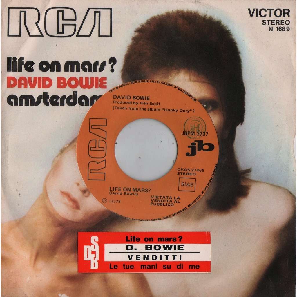
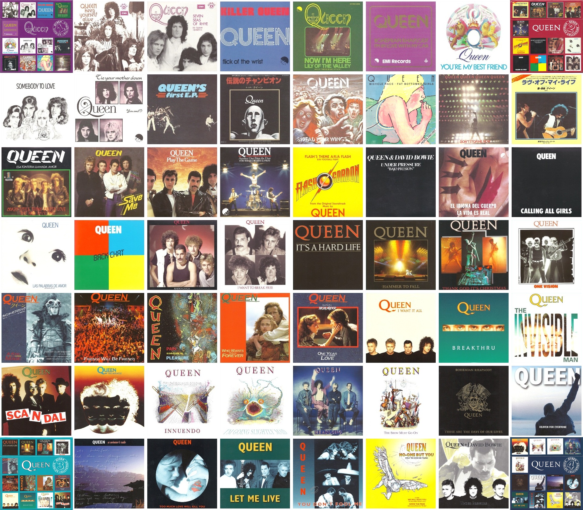
The diffusion of 45 rpms compared to LPs is decidedly greater in terms of variety: if in fact the LP is a unique and anthological work that the artists usually release on an annual basis, the 45 rpm singles are instead used to promote a specific song (engraved on side A). Therefore, several singles are usually extracted from each album.
The multiplication of supports thus leads to an increase in the necessary covers, and this concept is further accentuated by the fact that, especially in the ’60s and ’70s, each international division of the record companies adopts its own cover for each song released on a single, while instead the LP release essentially maintains a static graphic and layout in almost every country of the world, possibly adopting minimal graphic differences.
Therefore the variations of the covers for the musicians present on the international market are manifold and the independence of each division – autonomous in the choice of the covers to be used – leads to an unprecedented diffusion of the vinyl support, which makes the records highly collectable and sought after. However, the lack of a common path between the various countries has never allowed the creation of a list of all the existing releases for a specific artist, and therefore often unpublished editions are also discovered in recent times (belonging mostly to exotic countries).
The proliferation of formats (picture disc, colored vinyl, die cut, flexi, gatefold)
The variations do not specifically concern only the various formats (LP and single) and the relative covers adopted in the various markets of the world: over the years the records begin to become objects aimed at both the general public and collectors. Consequently, the experiments extend from the covers to the vinyl format itself: the discs begin to become coloured, and even to be themselves printed with a specific image (picture disc), thus merging both the cover and the – the image to be presented – both the medium on which the music is recorded – the vinyl.
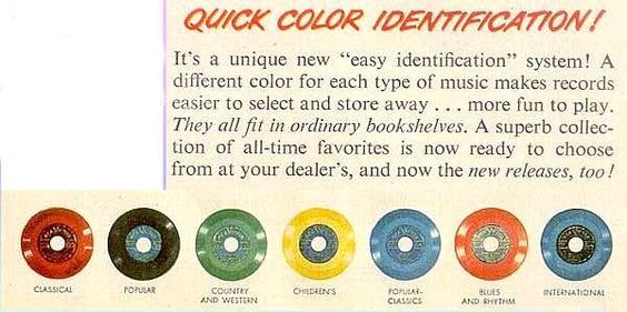
As early as 1949 RCA Victor began to color the records according to the musical genre (green for country-western, red for classical, orange for R&B…), but in those years the aim was more promotional than final for distribution to the general public. Above all, it was from the 1980s that colored vinyl was instead distributed on a wider and more homogeneous scale, thanks also to the introduction on the market of yet another new format, the 12-inch.
The 45 rpm lends itself to more experimentation than the 33 rpm counterpart, and in fact the first shaped discs also see the light, i.e. discs which are given a specific shape that goes beyond the characteristic circular profile. The internal part of the support always remains circular and this allows it to be listened to on any home system and therefore absolute compatibility.
Other times the 45 rpm records left unsold, especially in the Italian market, are withdrawn and the vinyl melted to press new ones. However, the covers are reused as mere protective envelopes but by piercing them in the center, so that they can be reused for other artists (in this case the format is called die cut): the title then remains visible and recognizable on the disc label itself and the discs with this path they are characterized by having a cover with an artist totally detached from the vinyl support.
In a similar way there are cases, above all in the Thai record markets of the 70s, in which covers are found that portray musicians who have nothing to do with the recorded songs: this is due to the scarce possibility of finding correct information in those years on the graphics to use and the fact that often these editions were not official and therefore printed clandestinely.
In the markets of Eastern Europe and going as far as Russia, one encounters different editions from the usual ones in the rest of the world: flexi discs, i.e. flexible, printed on very thin plastic supports which allow their distribution even in magazines. The audio quality in these cases is lower than that of a standard vinyl, but the discs are often colored and sometimes take the form and function of postcards, where the image on side A is engraved, while side B is dedicated to the entering the recipient’s address. Even in these examples, the covers usually have little value or are unrelated to the artist, or still use the same image for various published songs.
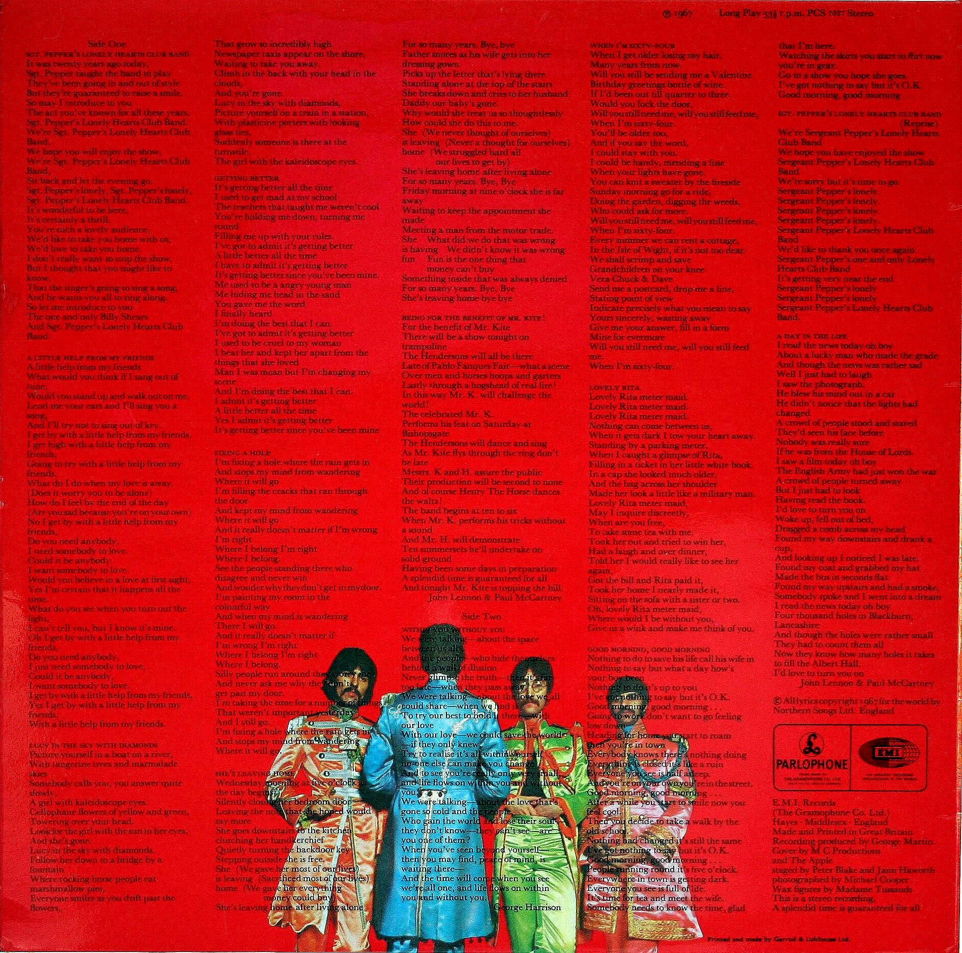
Thanks to the continuous innovations in printing, the format of the covers themselves becomes gradually more complex in the 60s: the first gatefold covers appear in which the graphic aspect no longer involves only the external facade but also the inside, which opens as a book. Thus, starting from the Beatles album “Sgt. Pepper’s Lonely Hearts Club Band” (1967) – which is already particular from an iconographic point of view due to the incredibly complex and articulated cover (a masterpiece such as to give birth to modern graphics and the cornerstone of Pop Art itself thanks to the work of Peter Blake) – artists can publish song lyrics using the space made available by the new format.
In this way the listener is involved on a further level, and the cover, in addition to representing a finished artistic object, through the lyrics or other graphic elements allows you to get even more in touch with the music contained in the vinyl support.
Dematerialization, from video clips to Spotify
This relationship between music and graphic arts is particularly evident in the heyday of vinyl, therefore from the 50s up to at least the 80s.
Then the process of dematerialisation of the support began, with the reduction of the dimensions first in the cassette format and then in the CD. At the beginning of the 80s, the advent of the video clip through MTV and then of social networks and digital distributors in the following decades (Spotify in the lead), will favor its decline up to breaking the previous balance in some way, relegating the covers mere packaging supports or products dedicated mainly to the collectors market only. Here the homologation has reached its peak as a single image is present in all identical countries, and the gesture of opening an LP and reading its lyrics is totally stripped of its peculiarity.
Even the record companies will standardize their products more, above all the releases of singles on 45 rpm, which will become almost identical in terms of graphics in all international markets, taking away the charm and inventiveness of the various publications.
The digital conversion, with all the aesthetic consequences of virtualization, has paradoxically reduced the relationship between music and image, transforming the latter into a simple attachment no longer necessary for the creation of a complete artistic identity; this process has gradually frustrated the artistic peaks previously achieved and has relegated the complex works of image and research to a few examples.
Today an artist’s success is measured by the number of his online views or by the number of streamed tracks, but this no longer has anything to do with the physical bond that only a cover could generate. The Internet and social networks have replaced television as a means of fruition, television which in turn had begun to undermine the relationship previously established between musician and listener.
The current music user is more passive in the choice of sound reproduction: more and more often we rely on algorithms disguised as playlists which suggest – on the basis of a series of pre-programmed parameters – which songs to listen to, and therefore what was first encounter between the artist and the user, favored in past years by the cover itself and by the curiosity that it aroused as exhibited in a physical shop. An important part of the interaction has been lost in favor of an almost infinite possibility of choosing songs that do not belong (in a material and emotional sense) to the listener.
From early examples to artificial intelligence
The evolution of the covers follows two distinct paths that intertwine over the years. In fact, if initially the first works of this genre are characterized by lively images, stylized drawings, innovative graphics and references to artistic works, and contextually the effort of the graphic designers and record companies is concentrated only on the LP covers, over time even the smallest 7 inches (known in some countries as 45 rpm, from the number of rotations opposed to the 33 of the older brothers), starting from standard covers with only the logo of the record company, adopt specific covers.
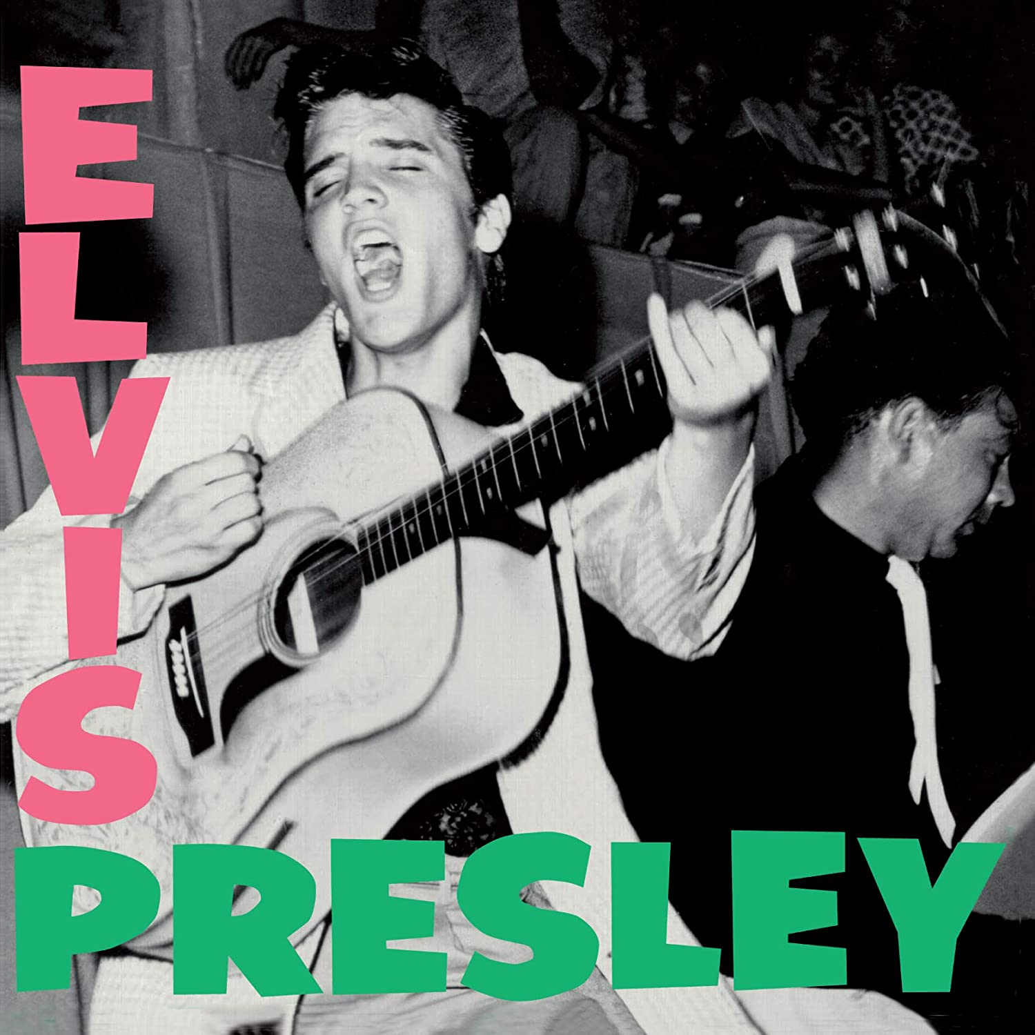
From the 60s onwards, especially with Elvis Presley’s discography, the singer often appears in the foreground on the cover and his charismatic figure is enough to drive sales without having to resort to more sophisticated or elaborate graphics. The Memphis artist therefore has a fundamental role in the history of musical communication as he gave birth to the first true mass phenomenon on a global level, creating around him not only a pioneering music industry (complete with gadgets) but imposing a style so marked in terms of singing, clothing and movements that it soon became the symbol of an entire genre.
In Italy at that time – now in full economic recovery – the birth of advertising invaded the streets, newspapers, radio and television, acting as a megaphone for the music scene which then transformed into an industry in all respects, driven by the nascent festivals singers (Sanremo, Cantagiro and Zecchino d’Oro above all) broadcast on television.
In the 70s the idea of using covers to convey a particular message made its way, alternating subliminal or more hidden languages with others that perfectly reflect the evolution that music, in the popular environment, was also facing in the same decade. So content and container move in parallel and mutually influence each other especially in some musical genres, the progressive above all, both in the English and international arena.
In the following decade the variety of shapes and colors in the covers and in the formats themselves takes the upper hand and the increasingly rapid diffusion of the vinyl support in society also coincides with the beginning of its end: the CD format is in fact upon us and promises, in intentions of its inventors, the disappearance of large format covers in favor of a disc – digitally printed – with reduced spaces for graphics and the possibilities of communication and diffusion of an image.
This trend will last for about 20 years, when the diffusion of the mp3 format will also spell the end of the CD and will open up the diffusion of music on streaming services, totally eliminating the physical support and the consequent need to have an iconic cover capable of transmitting a message and attract the final listener. The resurgence of vinyl in recent years is more linked to a nostalgia effect and relegated to collectors’ areas with sales and circulation numbers far from those of a few decades earlier.
The most recent trend in digitization as regards the genesis of covers is to delegate the creation of the image itself to an artificial intelligence service starting from a simple text: in this case the algorithm, by combining the various elements drawing from a practically infinite digitized database, it generates unique graphics that can be chosen by the artist himself without resorting to the work of an expert or a photographer, and the musical artist can indeed have the result in practically real time and at zero costs.
Mutual influences
Among the various elements that contribute to the creation of a cover we can mention other artistic works (above all, but not only pictorial), films, books and comics, other covers and also the social context within which the graphic concept develops. Furthermore, the musicians themselves, initially less involved in the choice of the covers, are more and more involved over the years to the point of influencing the choice of the final layout or in some cases designing the cover themselves.
But all this coherent iconographic environment that is created (and which extends to all the advertising and promotional material of the disc itself) will in turn influence the graphic choices of other artists, the creation of objects inspired by the original graphics and all a series of other references that move away from the original context while maintaining its most peculiar characteristics.
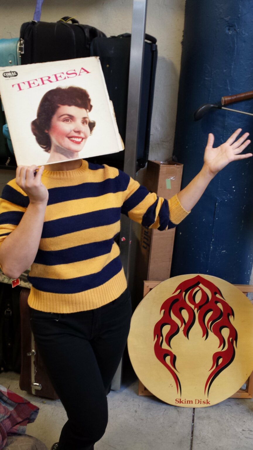
There are numerous examples of citations of music covers in other covers (therefore as homages to the original work) or even in contexts apparently distant from the initial ones: there is, for example, the reinterpretation of the iconography by the final listener, who he photographs with an album and inserts its elements into his own home environment or merging his own body with that of the photographed musician and arriving at the creation of an almost “wearable” art. Interesting projects can be found at sleeveface.com.
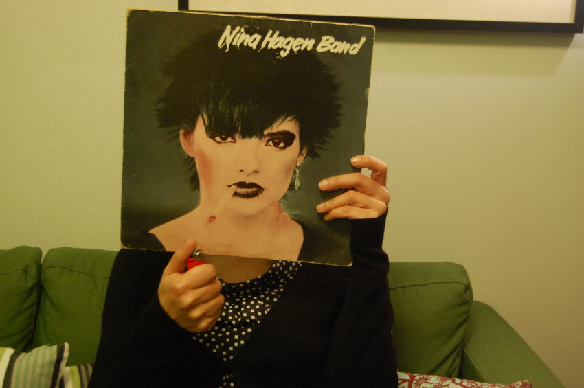
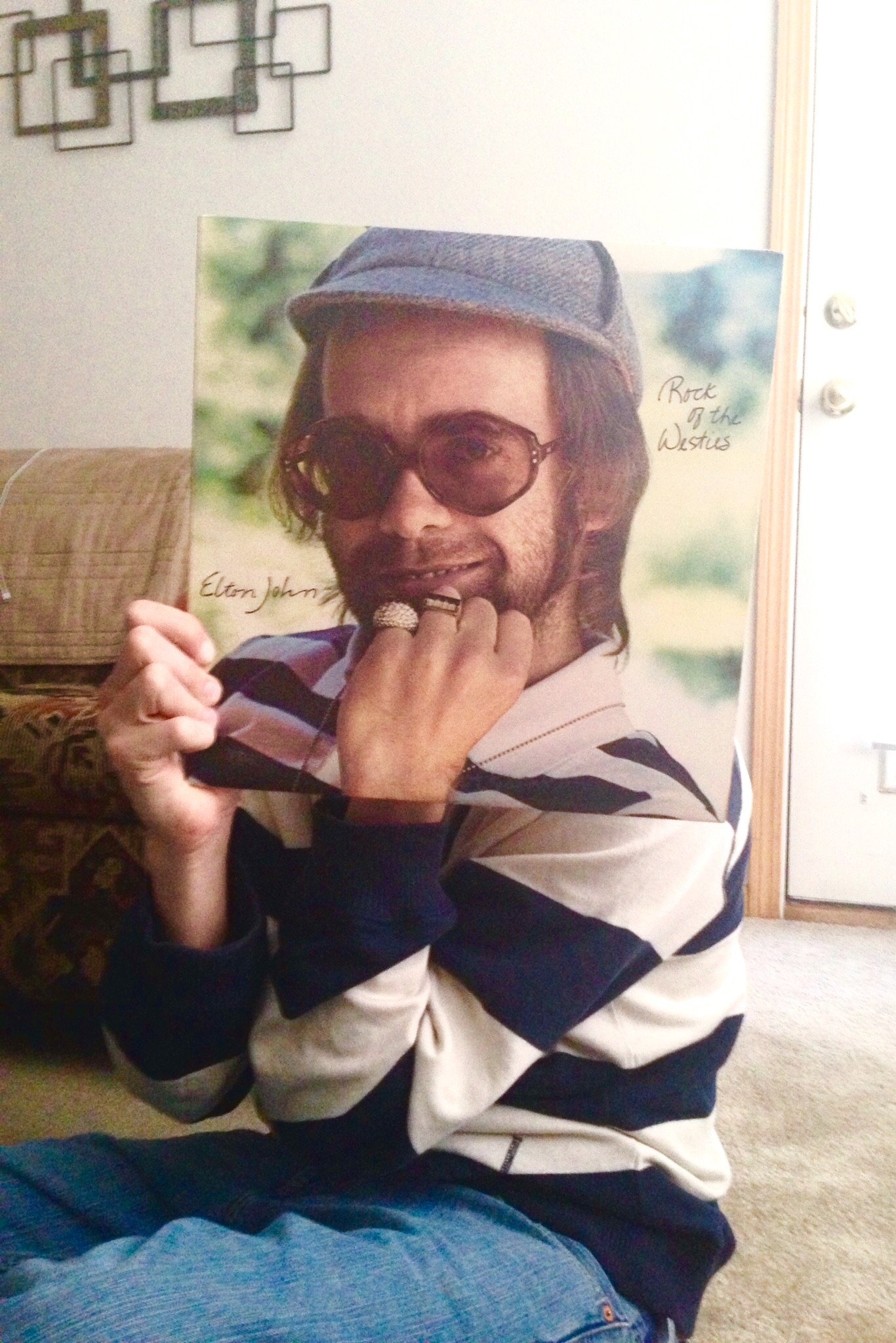

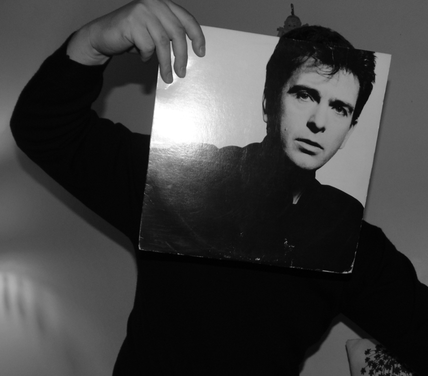
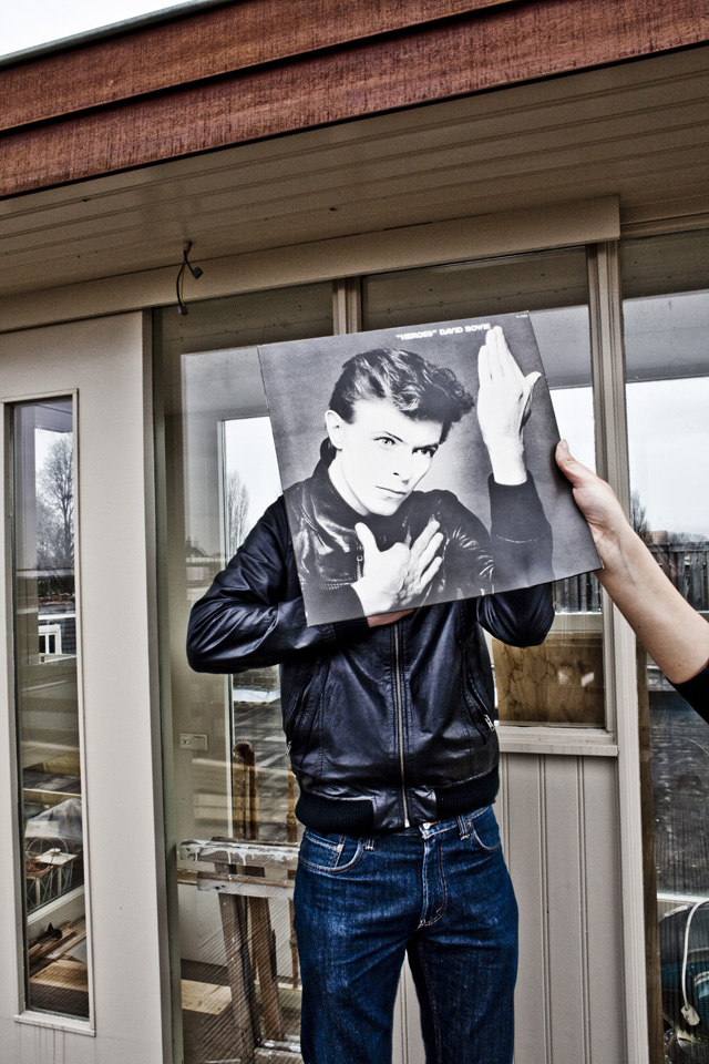
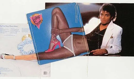
Other times different covers – born in unrelated contexts and not even belonging to the same artist – are juxtaposed to create a new unique visual space that maintains the elements of the original works and merges them into a new artistic unicum; common elements are taken between the different works and the artist combines them generating something very distant and unimaginable from the single original elements. Some of the best examples are from the artist Christian Marclay.

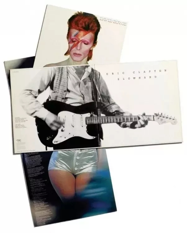
The creation of a cover generates a circle of ideas, a microworld in its own right and contains not only the ideas of a photographer or designer, but references to society or to its own symbolic universe following a precise, coherent and semantically valid aesthetic. Its use, its reinterpretation in environments even far from the original context demonstrate its intrinsic validity.
Thanks to the adoption of customized covers, the record-object (similarly to what had already happened for the book-object) begins to be conceived in itself, independently of the vinyl: this is a fundamental gap, a shift of emphasis, which from content moves to the box. And the cover from initial protection becomes cover, as if the mere musical message itself weren’t enough and needed artists, graphic designers, illustrators and photographers: it presents itself as the face of the product but is at the same time its mask.
Yet, this method of targeting the product towards a specific audience worked and allowed the creation of a totally new and unprecedented product in the artistic and commercial panorama of the 20th century, so much so that it earned the epithet of cover art thanks to the creation of author covers become iconic throughout history.
Some analysis on famous LP covers
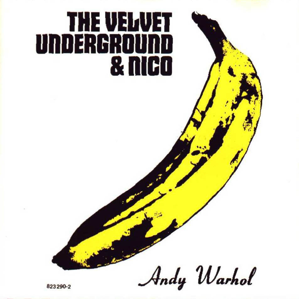
Various rock groups (and not only: even musicians belonging to other genres such as jazz or blues and so on) developed this new kind of communication, and fans were always ready to welcome this new “portable” art. Many LP covers are real artworks and sometimes well-known artist were involved in the graphical concept, as Andy Warhol with the famous banana for “THE VELVET UNDERGROUND & NICO” cover. Early copies of this album invited the owner to “Peel slowly and see”; peeling back the banana skin revealed a flesh-colored banana underneath. A special machine was needed to manufacture these covers (one of the causes of the album’s delayed release), but MGM paid for costs figuring that any ties to Warhol would boost sales of the album. Most reissued vinyl editions of the album do not feature the peel-off sticker; the original copies of the album with the peel-sticker feature are now rare collector’s items.
So, it was not only a printed cover but a brand new media that never appeared before in this context, and the market was now ready to accept vinyls’ sales in such big quantities as musical environment never knew before.
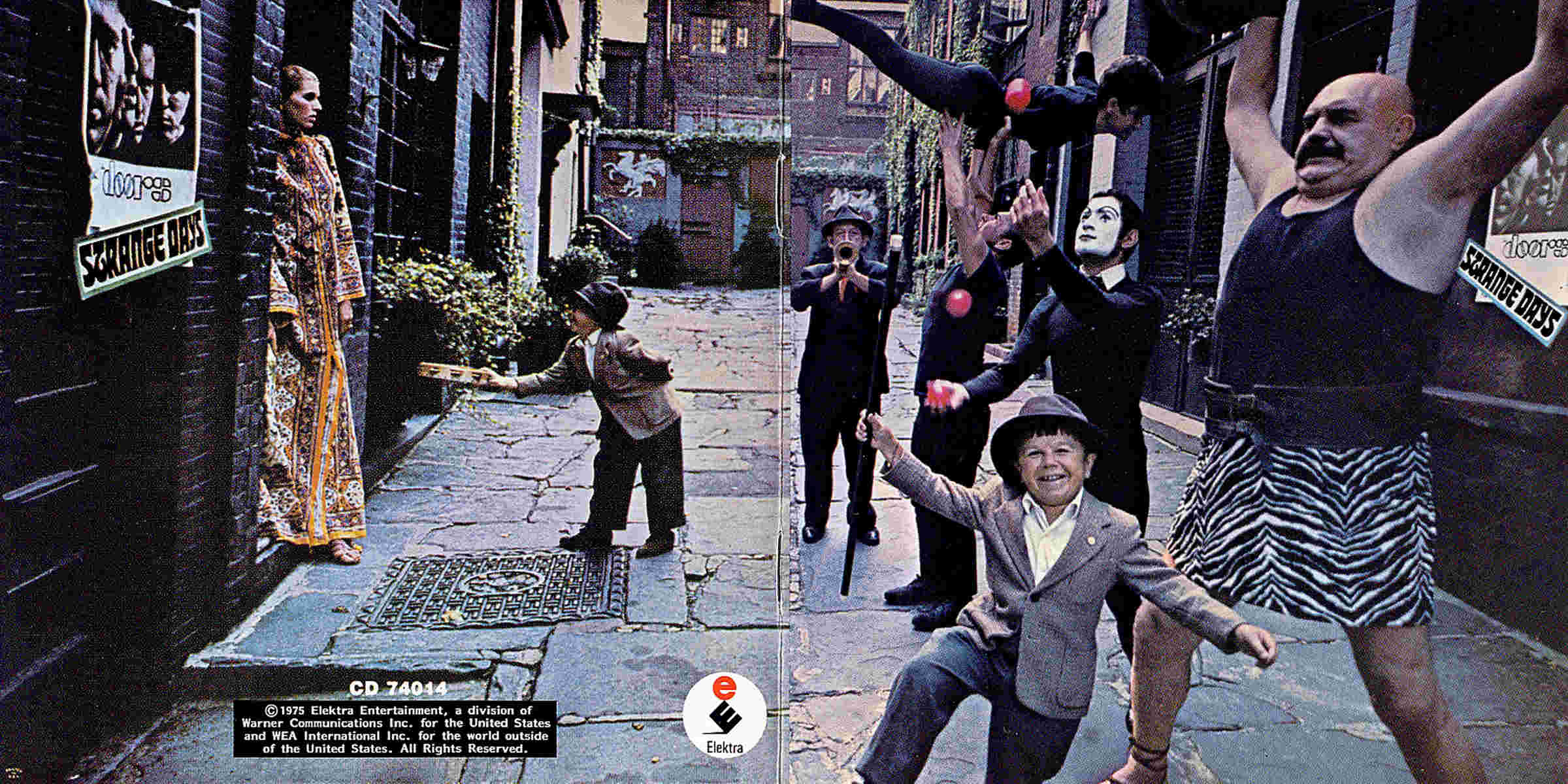
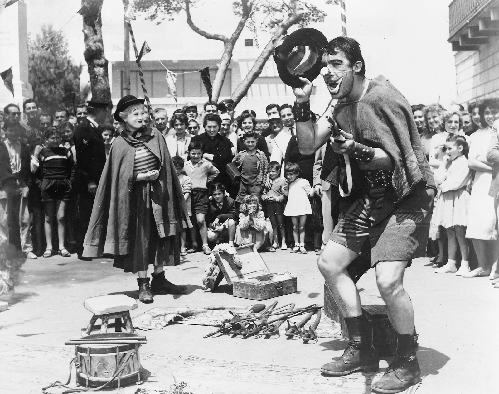
The movie La Strada directed by Federico Fellini in 1954 inspired the album cover for The Doors LP “STRANGE DAYS” (1967): the bizzarre figures in the front of vinyl edition were surreal; the photo was taken in a New York street, and according to Jim Morrison there was even an artistic touch similar to Dalì works. The members of the group (and the title itself) could be seen instead only as a small poster hanged in the wall on both sides (front and back in a simmetric way) almost hidden at first sight, in a manner very far from the usual covers of the time, especially for a Californian group.
This cover to be understood must be seen in its entirety (in the CD format many of these features are lost), and it is one of the first to track a common path with the cinema world: the strange characters from the circus world are in both cases out of reality and try to share their human nature in an open street facing the reality in a strange way, as the the title of the album itself suggests.
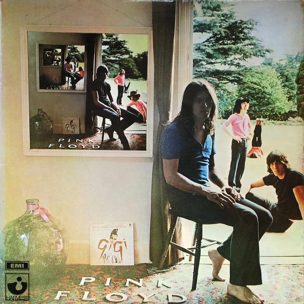
Other artist worked in similar directions: the works by the graphic designer Storm Thorgerson (who created the surreal elements in Pink Floyd’s covers through their rich discography) are full of interest. The “UMMAGUMMA” (1969) artwork shows the members of the band, with a picture hanging on the wall showing the same scene, except that the band members have switched positions. The picture on the wall also includes the picture on the wall, creating a recursion effect, with each recursion showing band members exchanging positions. After four variations of the scene, the final picture within picture is the cover of the previous Pink Floyd album, “A SAURCEFUL OF SECRETS”. The latter, however, is absent from the CD release; instead, the recursion effect is seemingly ad infinitum and it is known as the Droste effect.
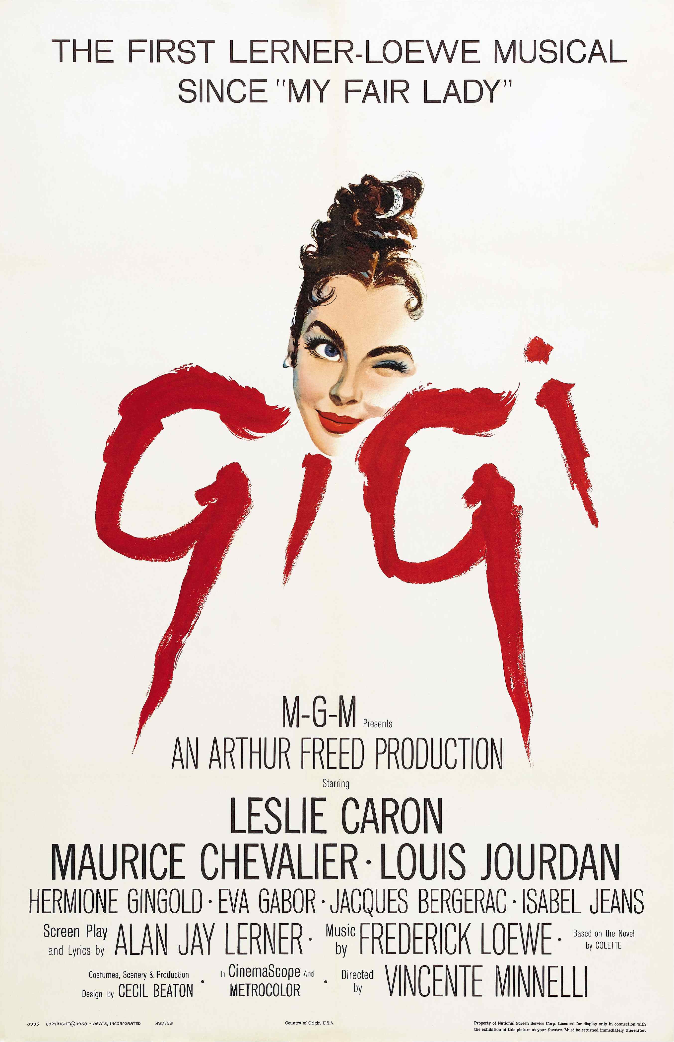
A small picture of the LP with the original soundtrack from the movie “Gigi” is near the main chair, and so a link between two different media (album cover and movie) can be tracked even in this example.
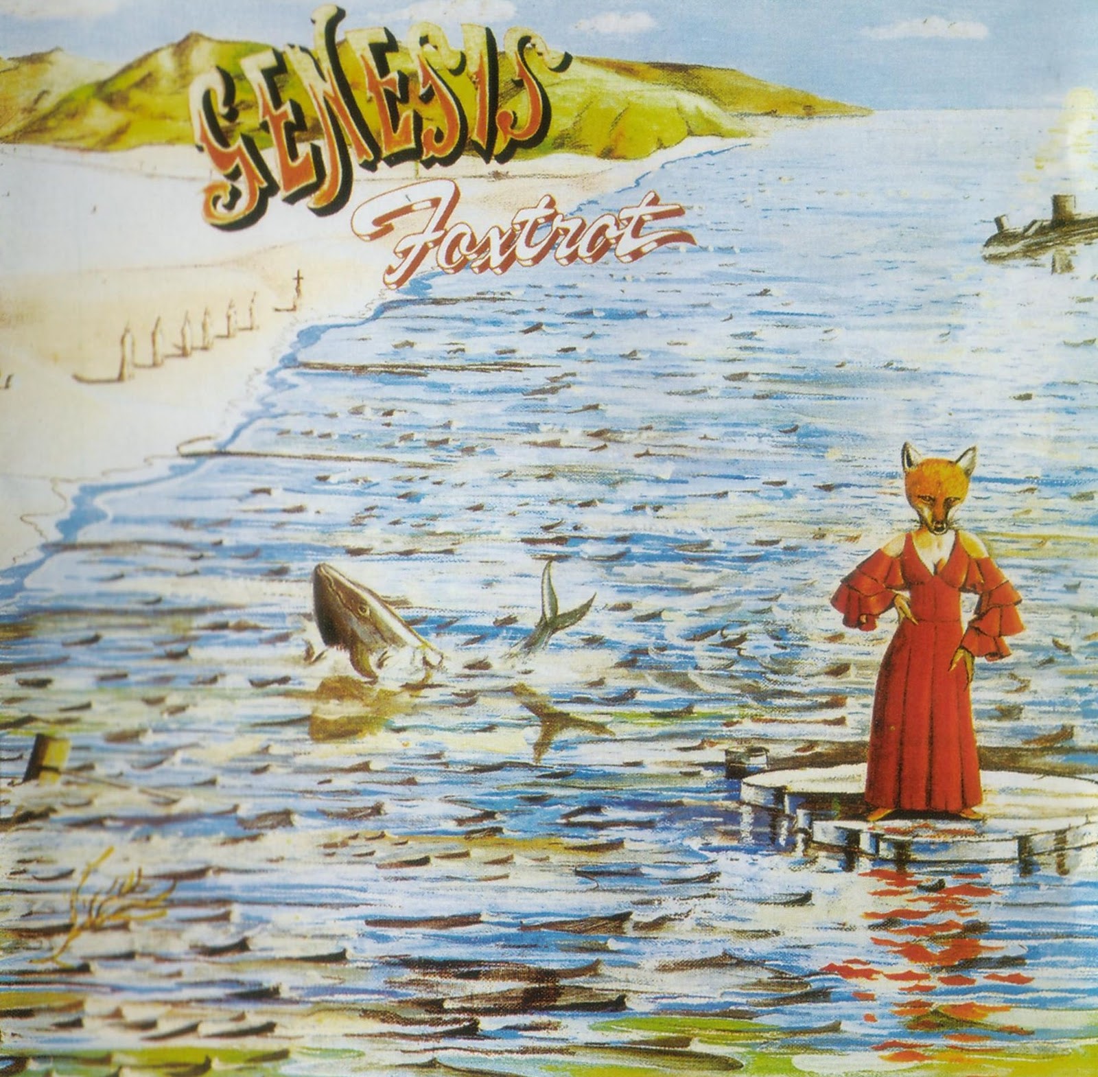
Similar surreal covers (often with the presence of animals) can be found in Genesis album covers drawn by the British painter and graphic artist Paul Whitehead. The “FOXTROT” album is full of hidden treasures and meanings:
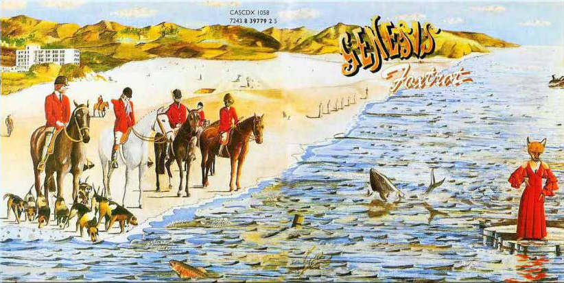
And it could be understood with all the quotes, from the Bible (the four horsemen recall the ones from the Apocalypse), to the English society (with the fox hunting), and to enviromental themes (the fishes and the dolphins escape from pollution) only when fully open:
The artist Georhe Underwood had a part in the completion of the creation of some of the most complex and well known LP covers of the 70’s, helped by the format of the vinyl LP album that let the artists to create real artwork thanks to its big (but still portabile and accessible) size. These are some of them, for T.REX and Gentle Giant:

In 1969 the LP “IN THE COURT OF CRIMSON KING” was published. Barry Godber, painted the album cover and died in February 1970 of a heart attack, shortly after the album’s release. It was his only painting, and is now owned by Robert Fripp. Fripp had this to say about Godber:
Peter brought this painting in and the band loved it. I recently recovered the original from EG’s offices because they kept it exposed to bright light, at the risk of ruining it, so I ended up removing it. The face on the outside is the Schizoid Man, and on the inside it’s the Crimson King. If you cover the smiling face, the eyes reveal an incredible sadness. What can one add? It reflects the music.
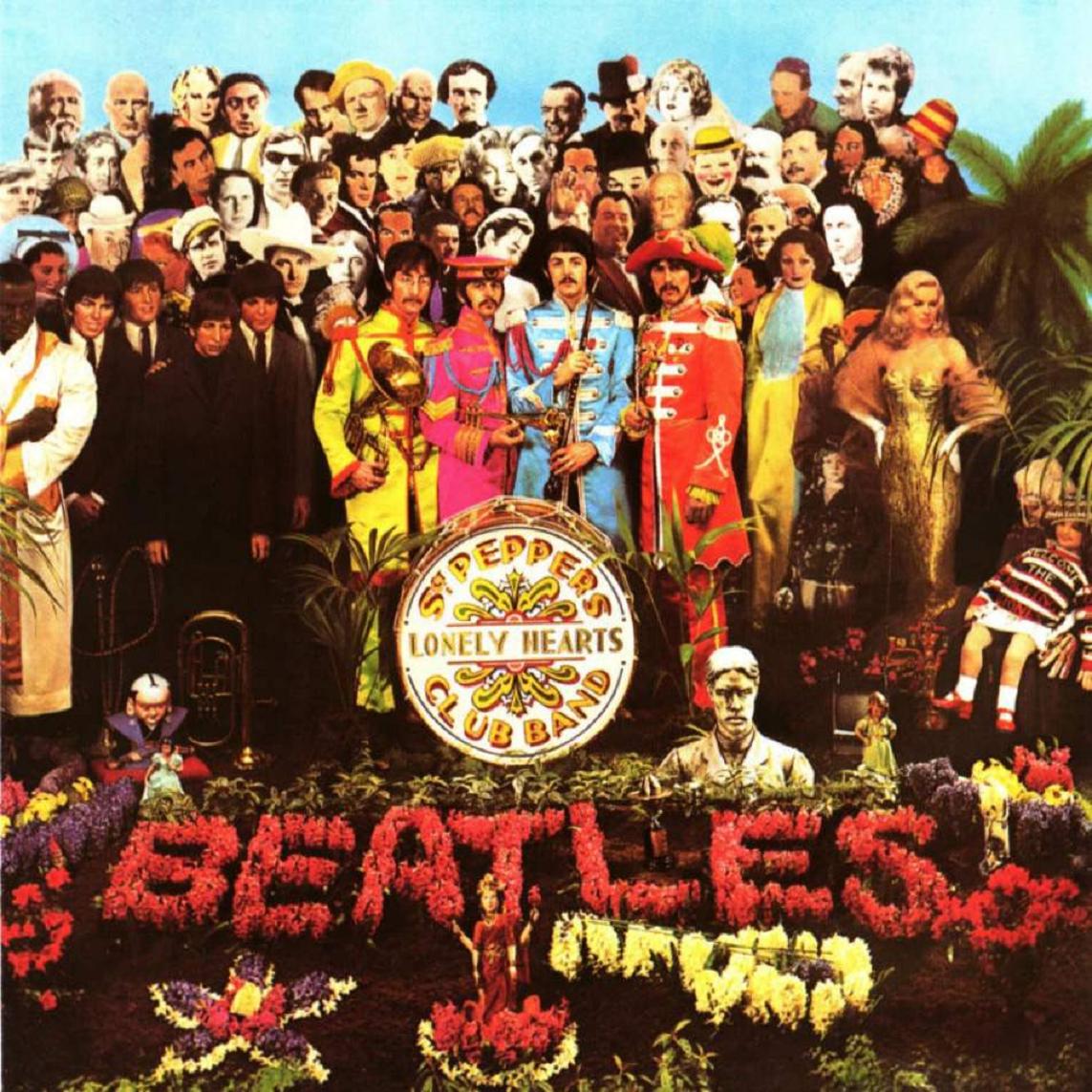
Many Beatles albums have particular cover, and one of the most famous is the one for “SGT. PEPPER’S LONELY HEARTS CLUB BAND” from 1967. The Grammy Award-winning album packaging was art-directed by Robert Fraser, designed by Peter Blake and Jann Haworth, his wife and artistic partner, and photographed by Michael Cooper. It featured a colourful collage of life-sized cardboard models of famous people on the front of the album cover and the lyrics printed in full on the back cover, the first time this had been done on a rock LP. In the guise of the Sgt. Pepper band, the Beatles were dressed in custom-made military-style outfits made of satin dyed in day-glo colours. The suits were designed by Manuel Cuevas. Among the insignia on their uniforms are: MBE medals on McCartney’s and Harrison’s jackets, the Royal Coat of Arms of the United Kingdom on Lennon’s right sleeve and an Ontario Provincial Police flash on McCartney’s sleeve.
The collage depicted around 60 famous people, including writers, musicians, film stars, and (at Harrison’s request) a number of Indian gurus. The final grouping included Marlene Dietrich, Carl Gustav Jung, W.C. Fields, Diana Dors, Bob Dylan, Issy Bonn, Marilyn Monroe, Aldous Huxley, Karlheinz Stockhausen, Sigmund Freud, Aleister Crowley, T. E. Lawrence, Lewis Carroll, Edgar Allan Poe, Karl Marx, Sir Robert Peel, Oscar Wilde, H. G. Wells, Marlon Brando, Stan Laurel and Oliver Hardy, and Lenny Bruce. Also included was the image of the original Beatles’ bassist, the late Stuart Sutcliffe. Pete Best said in a later NPR interview that Lennon borrowed family medals from his (Best’s) mother Mona for the shoot, on condition that he did not lose them. Adolf Hitler and Jesus Christ were requested by Lennon, but ultimately they were left out.
Again a variety of different media form different fields (movie stars, musicians, writers, politician ad so on) are here put together to achieve a unique effect, in some way baroque since an horror vacui is one of the most predominat feature of the cover itself.
Another contact with movie themes and artists can be found in Emerson, Lake & Plamer LP “BRAIN SALAD SURGERY” (1973): the album cover features a distinctive monochromatic biomechanical artwork by Swiss surreal painter H. R. Giger (who will later create and draw xenomorfs creatures in Ridley Scott “Alien” in 1979), integrating an industrial mechanism with a human skull and the new ELP logo created by Giger himself. The lower part of the skull’s face is covered by a circular “screen”, which shows the mouth and lower face in its flesh-covered state. In the original LP release, the front cover was split in half down the centre, except for the circular screen section (which was attached to the right half).
Opening the halves revealed a painting of the complete face: a human female (modelled after Giger’s then-wife Li Tobler), with “alien” hair and multiple scars, including the infinity symbol and a scar from a frontal lobotomy, recalling in that way the LP title. The two images of the woman are very similar, but the outer image (in the circle) contains what appears to be the top of a phallus below her chin, arising from the “ELP” column below. Both paintings were created in pure shades of grey airbrush, to appear metallic and mechanical. On later vinyl printings (and most CD releases), the front cover is a single piece, and the alternate (“face”) view is used on the back cover, and again the original artistic effect is lost in new media as it often happens when LP covers are reduced to CD format.
The mid-’70s were full of attempts to shock the public.
Emerson says of the band’s choice of artist.
You’d do it on the stage, in artwork, and do it in your music; try to push the limits. We chose this artwork because it pushed album cover art to its extreme.
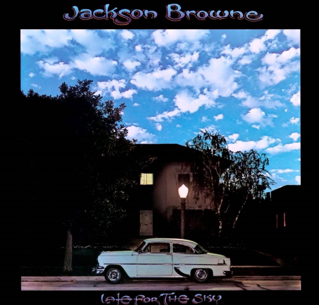
The oil on canvas paintings by René Magritte painted between 1949 and 1954 called “The empire of Light” were the main influence for the artowrk of the cover of the 1974 LP “Late for the sky” by Jackson Browne. The original paradoxical image of a nighttime street, lit only by a single street light, beneath a daytime sky was recreated in the front cover indeed with the addiction of a car.
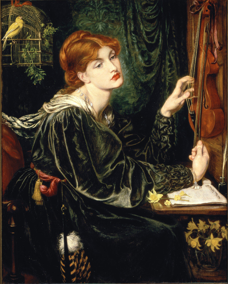
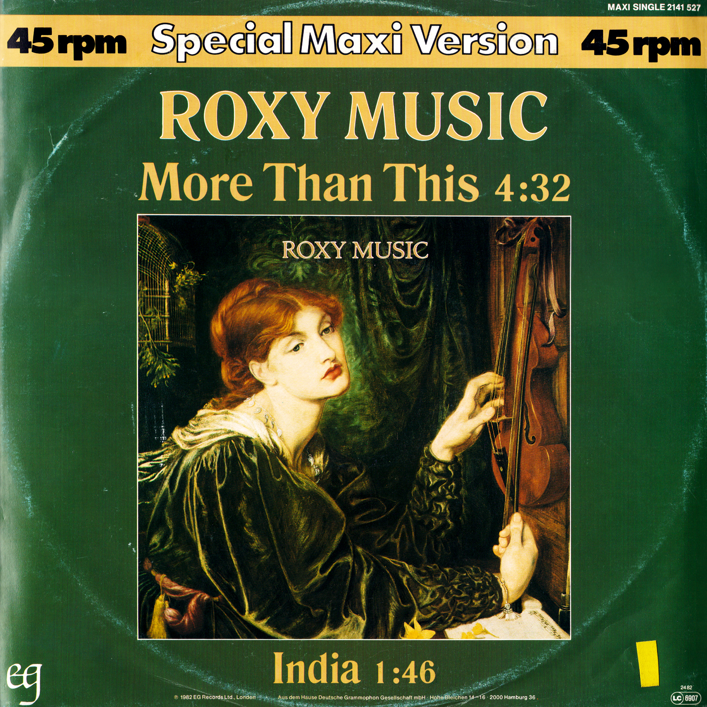
An oil painting by Dante Gabriel Rossetti (1828-1882) intitled “Veronica Veronese” was used to promote the single “More Than This” by Roxy Music in 1982. The original artwork is a work of musical iconography thanks to its subject and the presence of a violin (the theme is the artistic soul in the act of creation) and it appears on the cover album untouched, preserving its style and classicity. Other works from this pre-Raphaelite artist appear on the covers of classical music albums.
In the Van Halen album intitled “1984” the iconic cover was created by graphic artist Margo Nahas. It was not specifically commissioned; Nahas had been asked to create a cover that featured four chrome women dancing, but declined. Her husband brought her portfolio to the band anyway, and from that material they chose the painting of a cherub stealing cigarettes that was ultimately used. The model was Carter Helm, who was the child of one of Nahas’ best friends, who she photographed holding a candy cigarette. It is evident that a Raphael paint was used to compose the image.
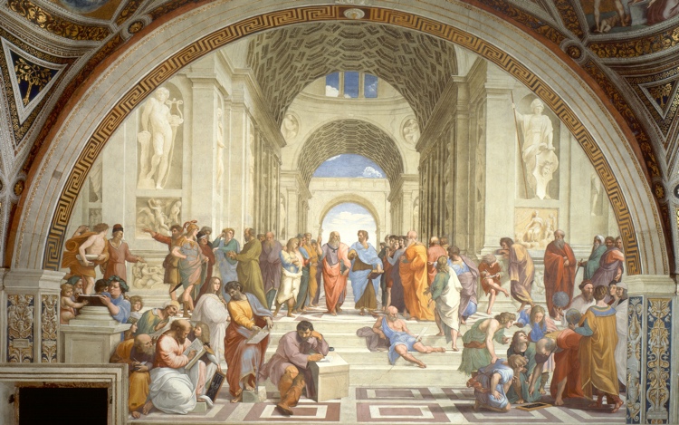
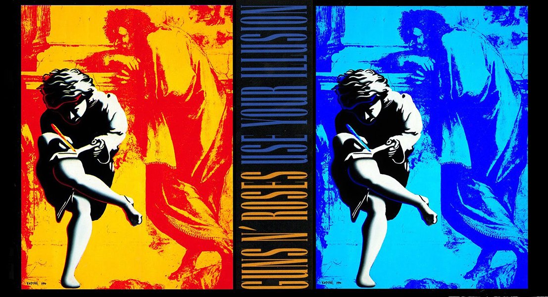
A detail from Raphael’s “The School of Athens” (1509-1511) is the insipiration from the covers of the 2 LPs (both published in 1991) “USE YOUR ILLUSION I” and “USE YOUR ILLUSION II” by Guns N’ Roses. The artwork is by the Estonian-American artist Mark Kostabi.
The highlighted figure, unlike many of those in the painting, has not been identified with any specific philosopher. The only difference in the artwork between the albums is the color scheme used for each album. “USE YOUR ILLUSION I” uses yellow and red, whilst “USE YOUR ILLUSION II” uses blue and violet.
Kurt Cobain for the Nirvana’s album “IN UTERO” (1994) was helped by the art director Robert Fisher, who created the enigmatic cover from an original idea of the singer. Most of the ideas for the artwork for the album and related singles came in fact from Cobain, and this cover is an image of a transparent anatomical manikin, with angel wings superimposed. Cobain created the collage on the back cover, which he described as “Sex and woman and In Utero and vaginas and birth and death”, that consists of model fetuses and body parts lying in a bed of orchids and lilies, such as a modern Ophelia. The standing position recalls even an ancient Greek statue.
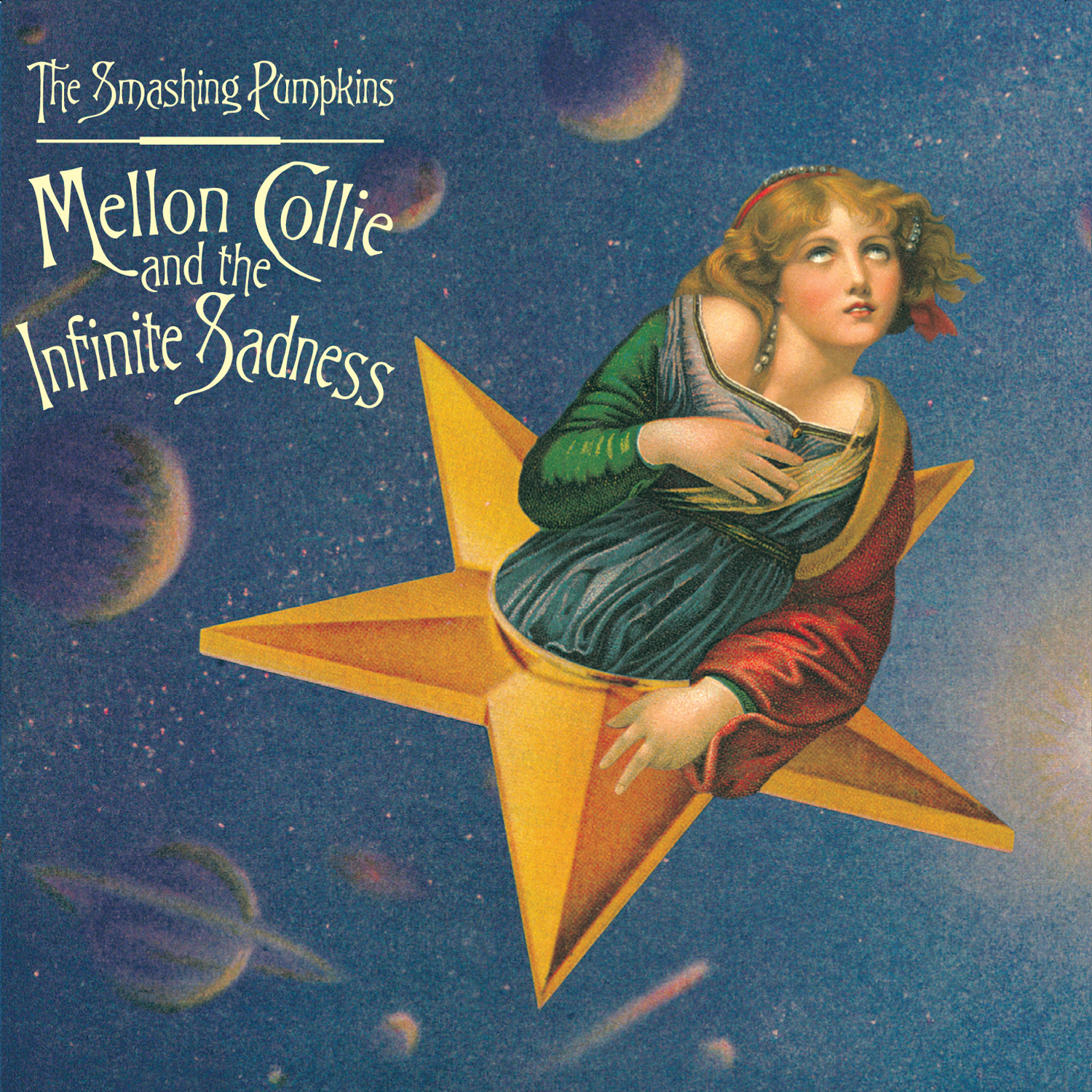
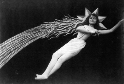
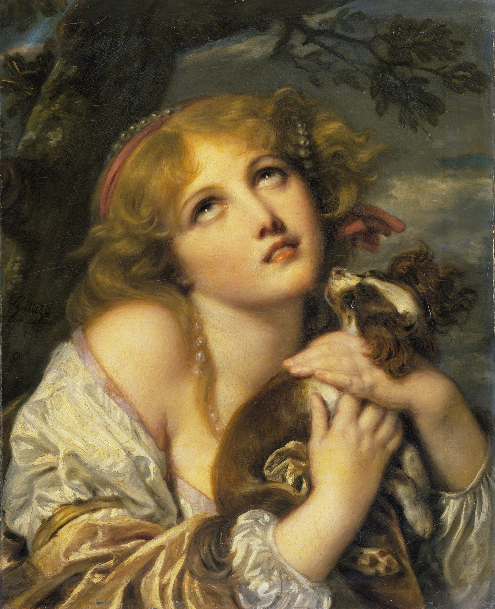
One year later (but the main spread of this kind of covers can be found in the 70’s, the golden age of vinyl and therefore of the big format), The Smashing Pumpkins published a cover rich of deep meanings and details, inspired by several elements for the double album “MELLON COLLIE AND THE INFINITE SADNESS”. The background is taken from the classical movies (such as the Méliés ones), the femal body is inspired from Raffaello’s “Santa Caterina di Alessandria” and the face from Jean-Baptiste Greuze’s “Fidelity” artwork.
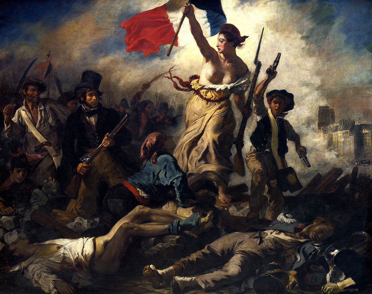
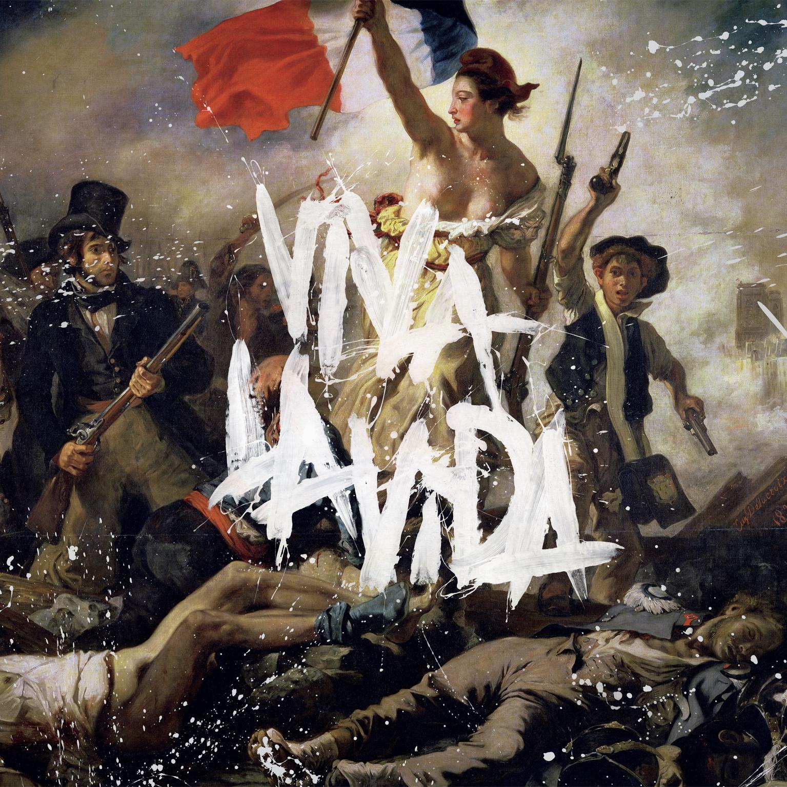
The work “La liberté guidant le peuple” by Eugène Delacroix inspired the cover for the album cover “VIVA LA VIDA OR DEATH AND ALL HIS FRIENDS” by Coldplay in 2008. In this example the original drawing is almost untouched and was slightly altered for the cover by using a white paint brush to draw “VIVA LA VIDA”. But the new format losts the original proportion and so the pyramidal composition is stretched and becomes more chaotic.
So different media are involved in musical industry, especially in Queen context, and many influences can be traced as well starting from stars of the movies such as Marlene Dietrich. Her position with cross arms will be later imitated by Mercury:
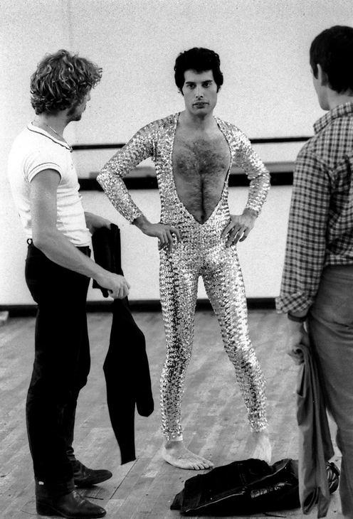
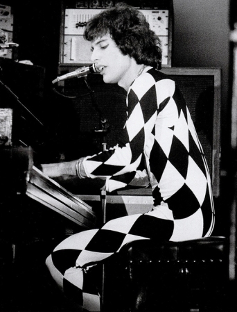
Even classical ballet had a deep impact on Freddie Mercury’s stage movements and garments, especially in the 70’s.
Album covers are the media used in the 70’s to spread and share an image of the musical performer, as in the past centuries it has been with paintings or engravings. Of course there is as well a commercial side in that years, but this won’t change the approach since the studies are focalized on the links between image and music.
In this point of view (that it is far from a “classical” approach, but new fileds must be investigated as well, since the methodology could migrate and could be applied with some small adjustments in different fileds of study) “musical iconography” has to deal with all the different approaches that merge together music and image, and this is why in these articles have been analyzed both videoclips and the costumes used during live shows, since in these examples it has been possible to draw back a line of mutual interest and influences from different worlds.
The approach is to give an overlook to the variety of that album covers (for singles and LPs as well) and to show their richness from an iconographic point of view with all the influences. At the same time it will be possible to show a development of the album covers themselves, since in a few years they will decline as well because of the spread of the new media: the small format CD that shares with covers only some aspects, and the videoclips with the MTV generation that increased the relationship with movie directors on the other side.
© Nicola Bizzo
Related Articles














You must be logged in to post a comment.