

Introduction
Queen’s discography in Portugal comprises at least 27 distinct seven-inch records, alongside at least two Angolan pressings. The range is particularly varied between 1973 and 1980, when sleeves exclusive to these markets appeared. Angolan editions were pressed until 1975, the year Angola gained independence from Portugal. Although not every Queen single was released in Portugal, the known editions can be examined through their sleeve designs and catalogue numbers. The Portuguese and Angolan track listings correspond to those of the UK pressings.
During the early years of Queen’s discography, national record companies frequently issued distinct sleeves for the same single. Consequently, one song could appear in several visual forms, each with its own design. Like the UK releases, all the Portuguese Queen singles discussed here appeared on the EMI label.
Changes to the Queen logo provide another means of tracing the band’s visual history. The versions printed on the sleeves help situate each release within the discography, as do the musicians’ evolving appearance and style.
Several of these pressings are now scarce and highly sought after by collectors. Early Portuguese and Angolan singles are especially notable because their sleeves were often unique and their print runs comparatively small.
This study therefore considers the seven-inch releases in chronological order. Each Portuguese or Angolan sleeve is compared with its UK counterpart to identify both shared elements and local variations, and to assess the particular importance of these editions for Queen’s visual history.
The analysis of the 7” picture sleeves
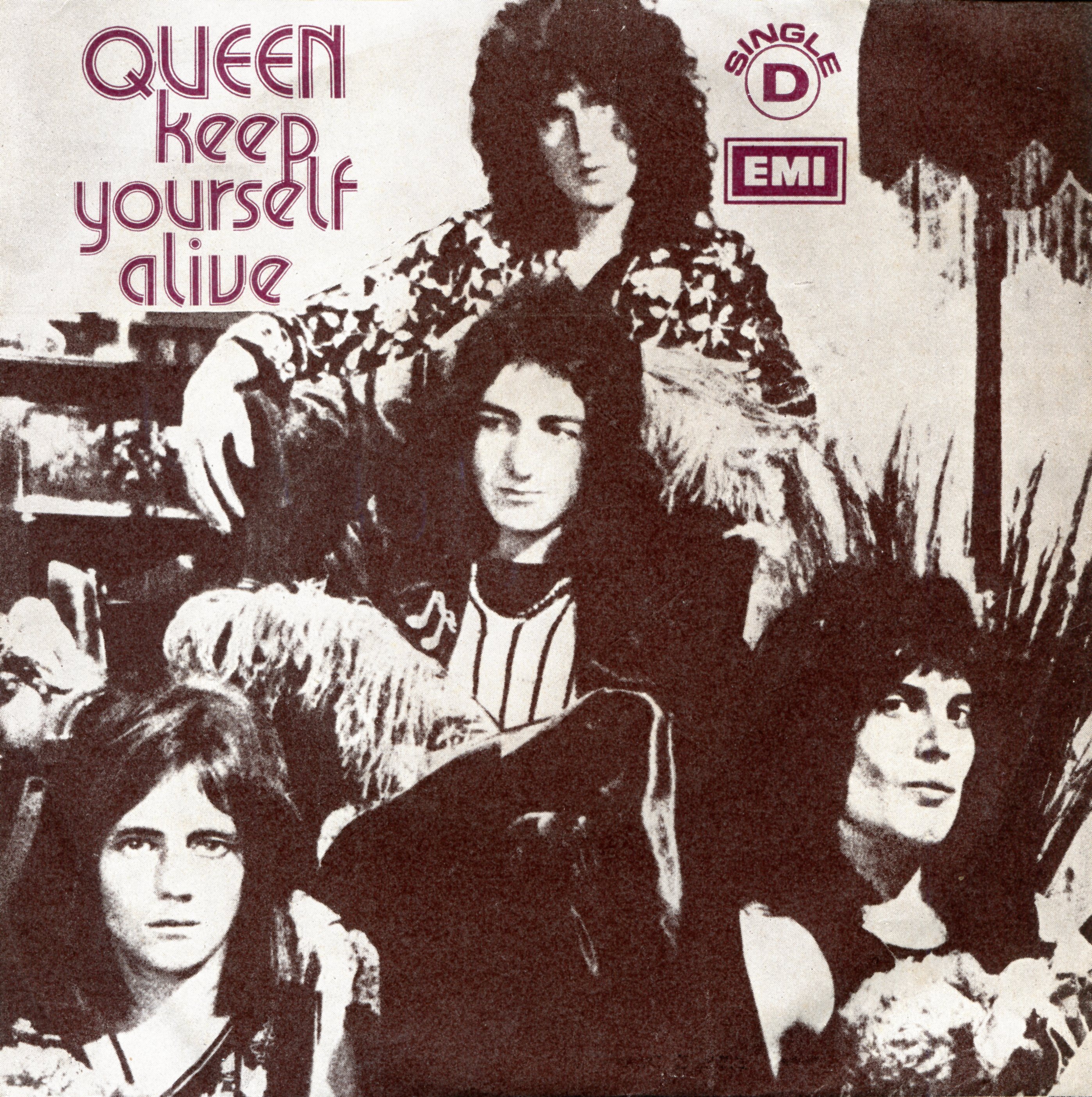
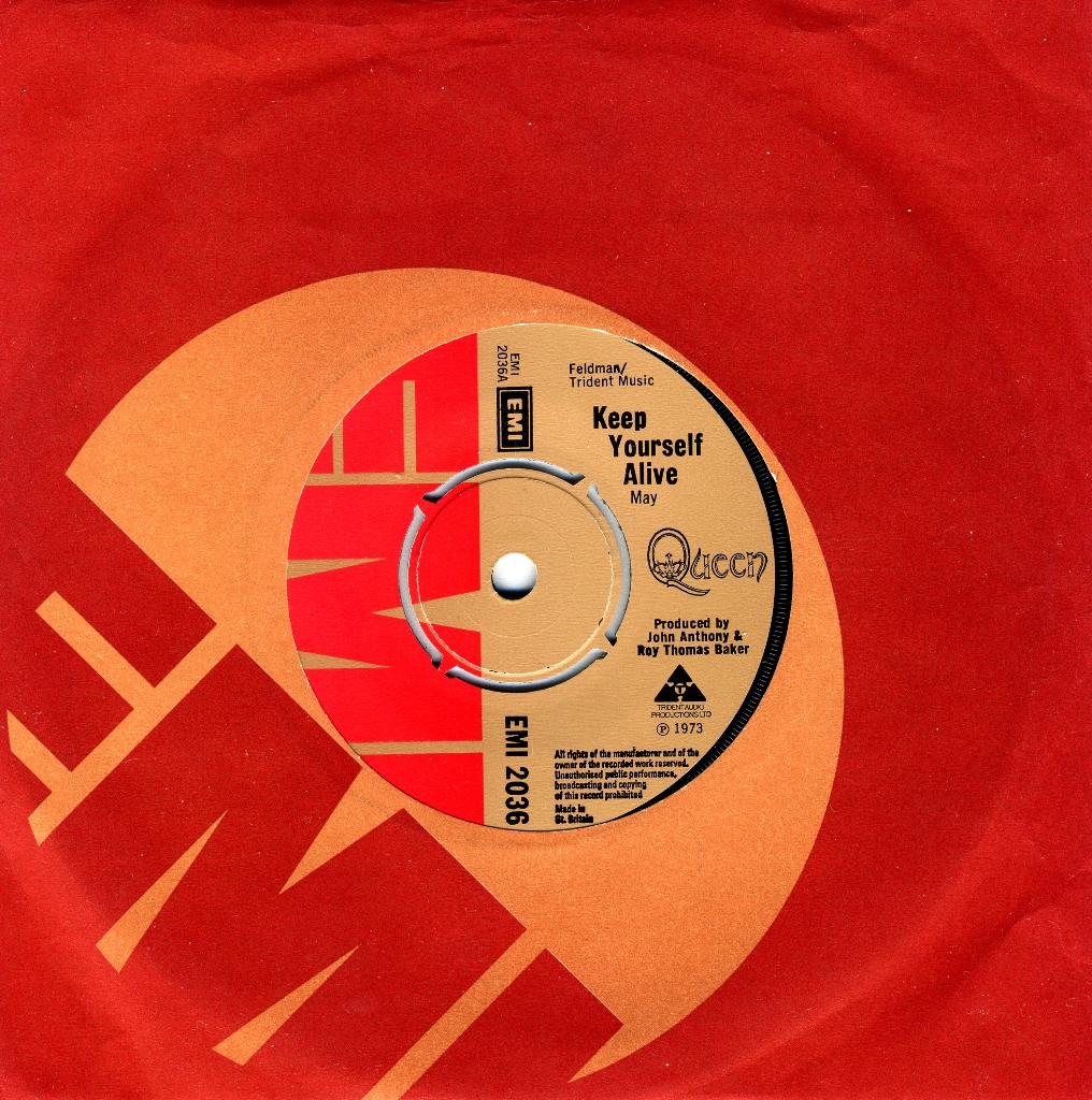
Queen’s debut single, Keep Yourself Alive, has one of the rarest Portuguese picture sleeves (Figure 1). Unlike the UK issue, which appeared in a standard red EMI sleeve (Figure 2), the Portuguese edition used a photograph taken in Freddie Mercury’s London flat. The local office thus gave a new act a distinctive visual presentation from its first release.
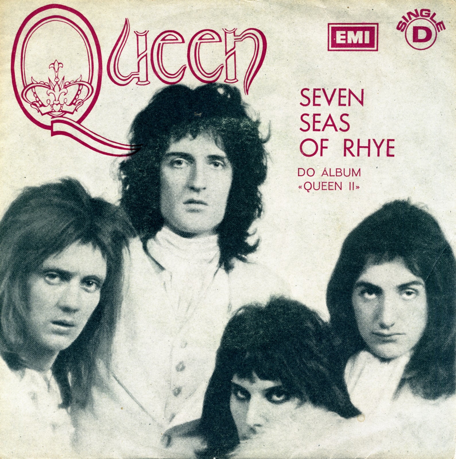
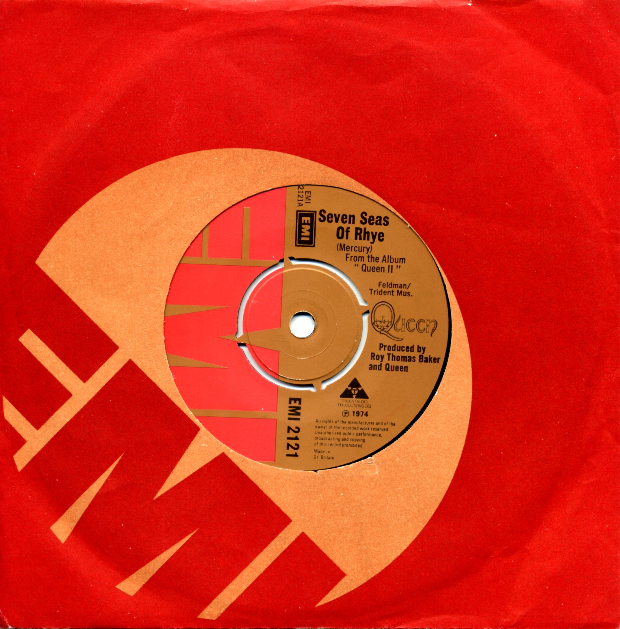
Portugal again issued a picture sleeve for Seven Seas Of Rhye (Figure 3), whereas the UK pressing used a standard EMI sleeve (Figure 4). Its photograph came from the inner sleeve of the album “QUEEN II”, on which the song originally appeared. The prominently printed early Queen logo already conveyed the band’s ornate visual identity.
The Angolan pressing used the same front cover as the Portuguese edition. Details on the reverse, concerning the factory that pressed the single, distinguish the two.
Killer Queen, from “SHEER HEART ATTACK”, appeared in several countries. The UK edition again used a standard red EMI sleeve (Figure 6). Portugal reused the photograph from Keep Yourself Alive, but altered it through a cut-and-paste composition (Figure 5). A claim on the front that the song had topped the charts in London suggests that this sleeve was printed after the UK release.
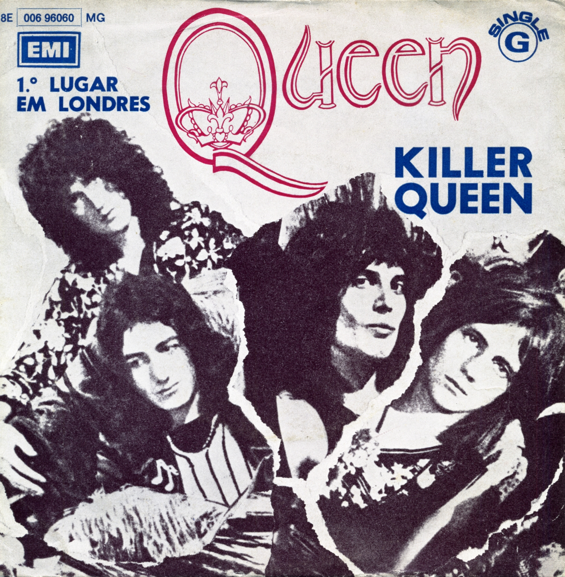
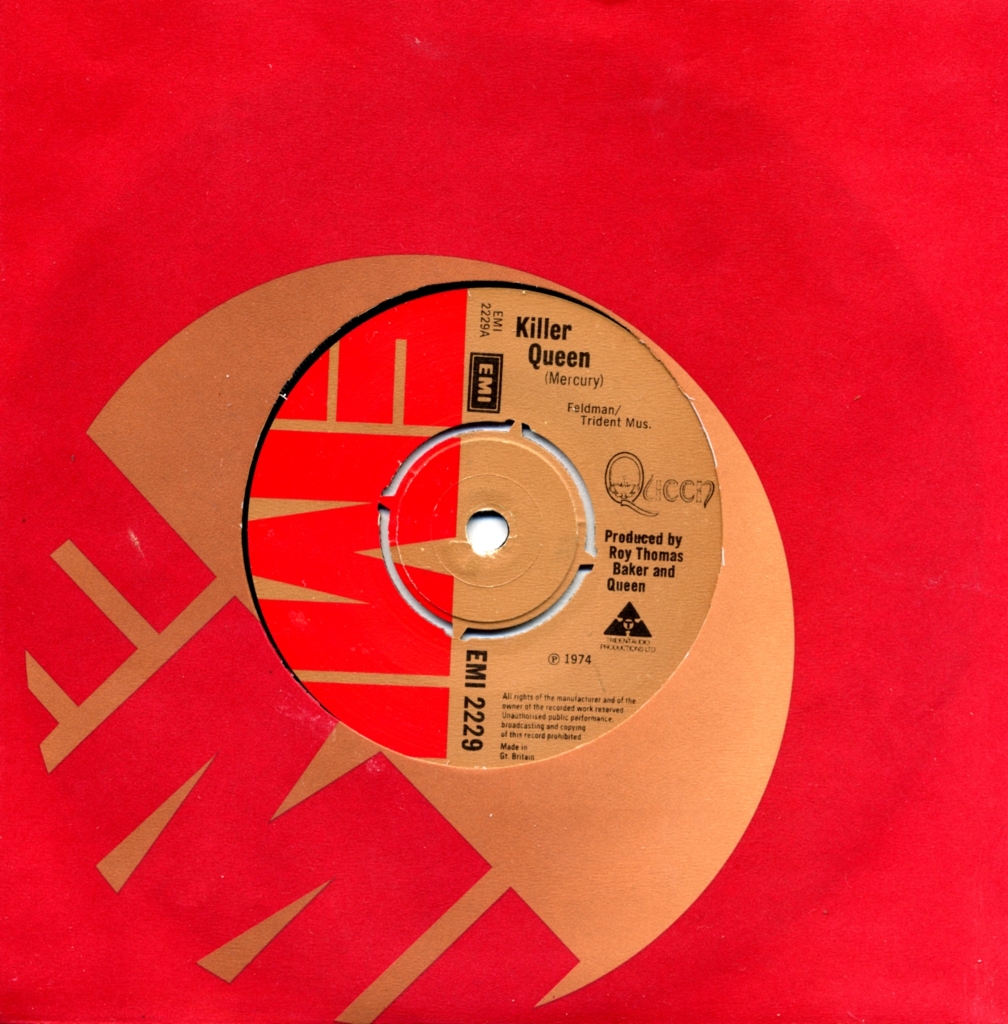
The Angolan sleeve closely followed the Portuguese design, with minor differences on the reverse. As with the other Angolan examples discussed here, the two editions shared a catalogue number.
The Portuguese sleeve for Now I’m Here (Figure 7) features an apparently unpublished monochrome concert photograph, making it particularly distinctive. By comparison, the UK edition appeared without a picture sleeve (Figure 8).
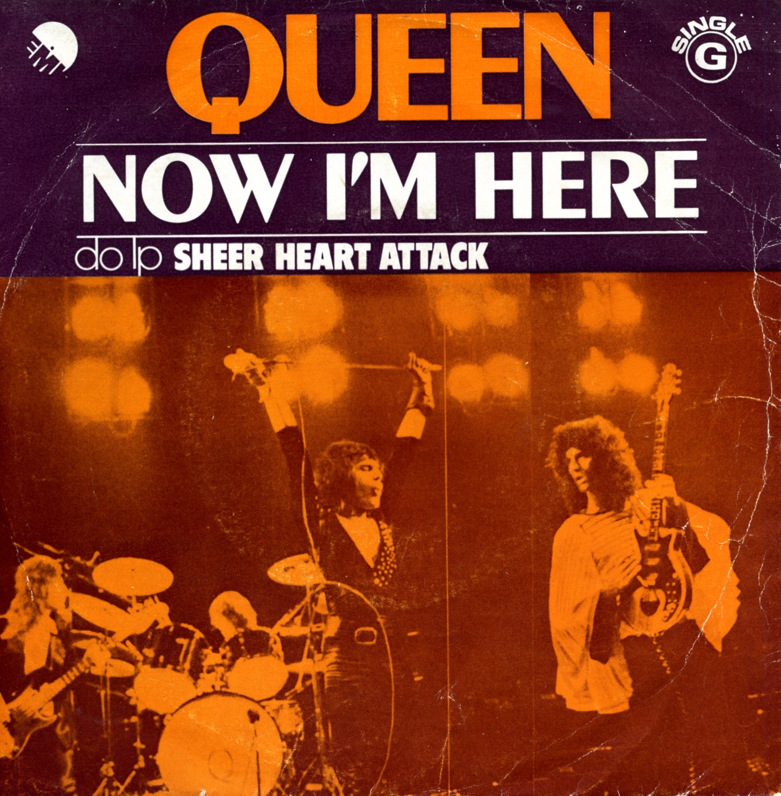
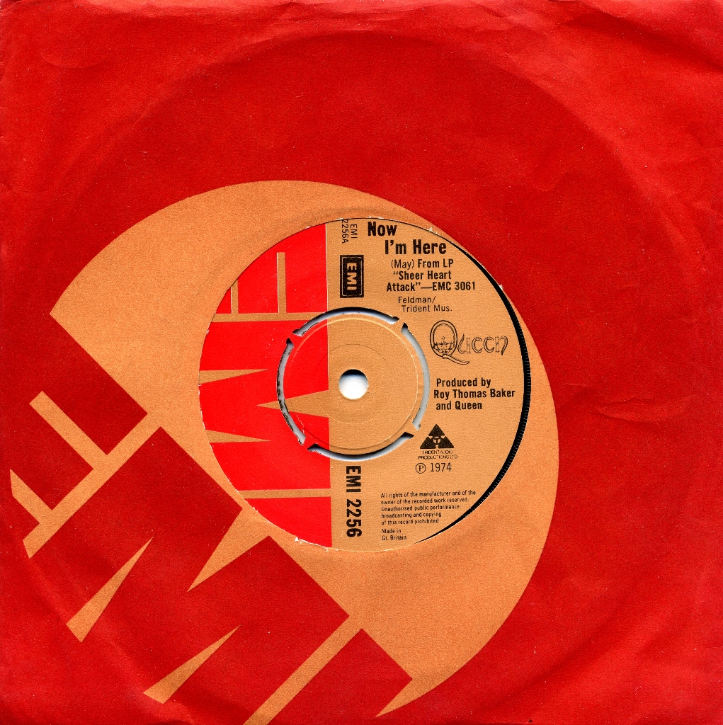
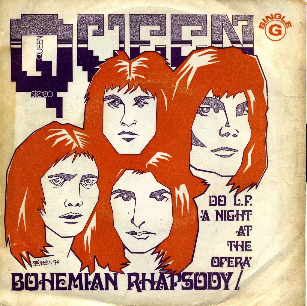
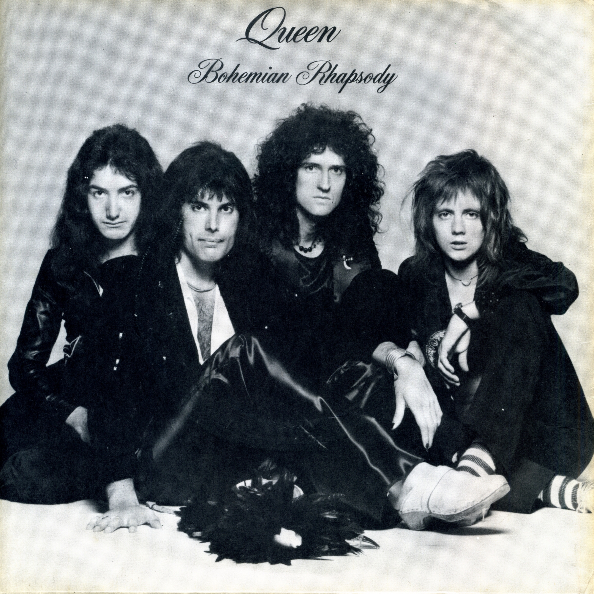
With Bohemian Rhapsody, the UK record company adopted a picture sleeve for a Queen single (Figure 10), using a studio photograph. The Portuguese design took a different approach: it promoted the song with a caricature (Figure 9).
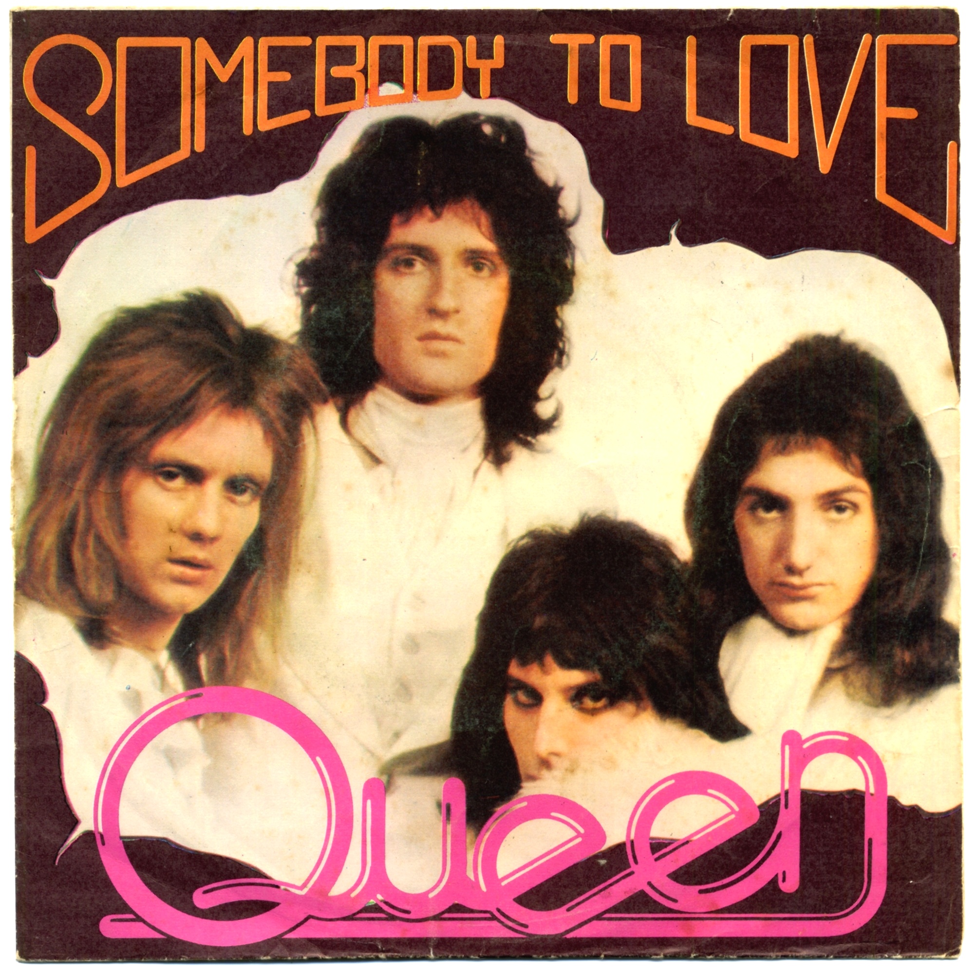
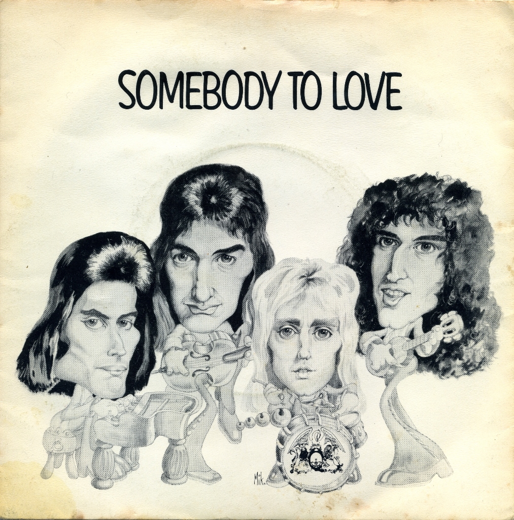
The Portuguese sleeve for 1976’s Somebody To Love (Figure 11) reused the photograph previously selected for Seven Seas Of Rhye, now in colour and with additional lettering for the title and band name, including a distinctive logo. The UK edition (Figure 12) instead used a caricature; on this particular version, the band’s name does not appear on the front, although it does on some international editions.
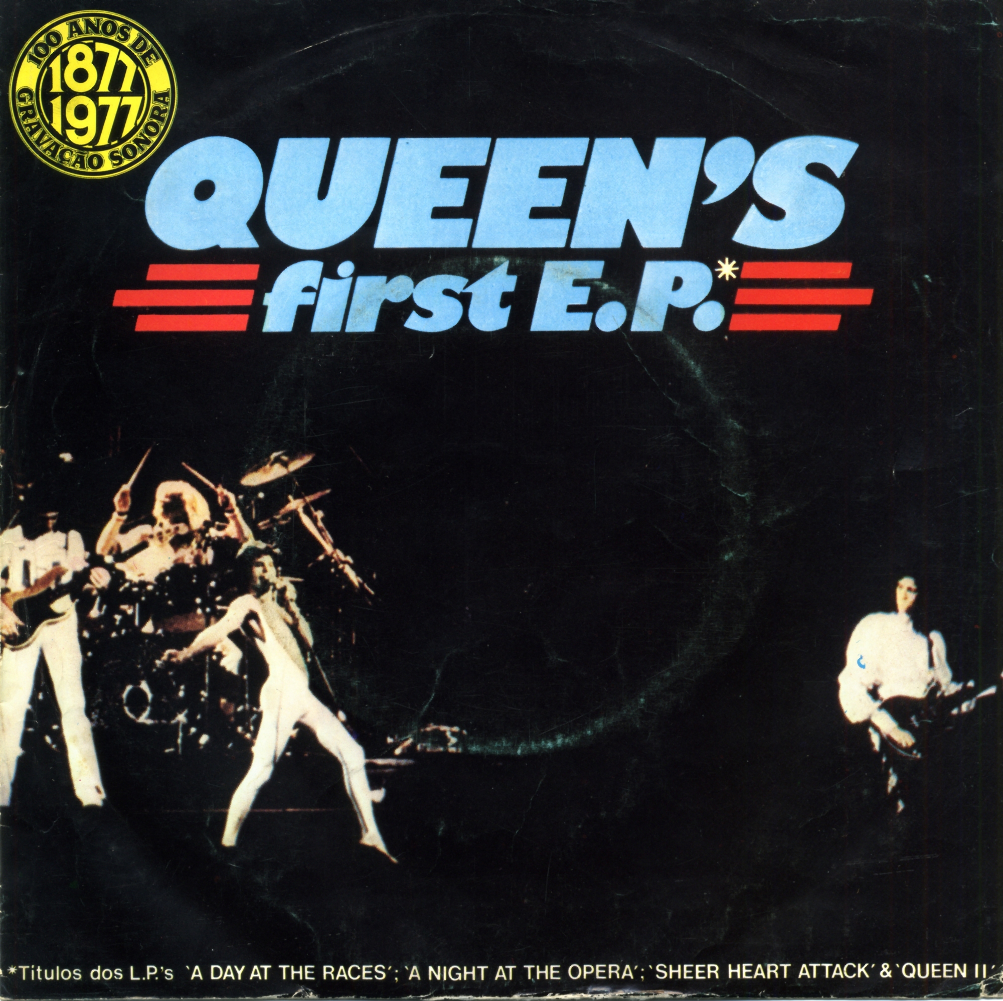
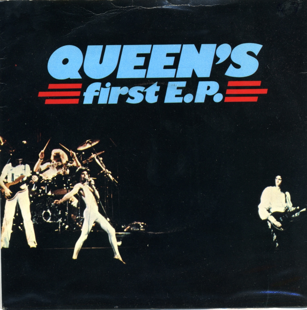
From Queen’s first E.P. in 1977, the UK and Portuguese sleeves became more closely aligned. This issue is an early example: the Portuguese edition (Figure 13) retained the UK concert photograph (Figure 14) while adding references to the albums containing the songs and a prominent mark commemorating the centenary of the phonograph.
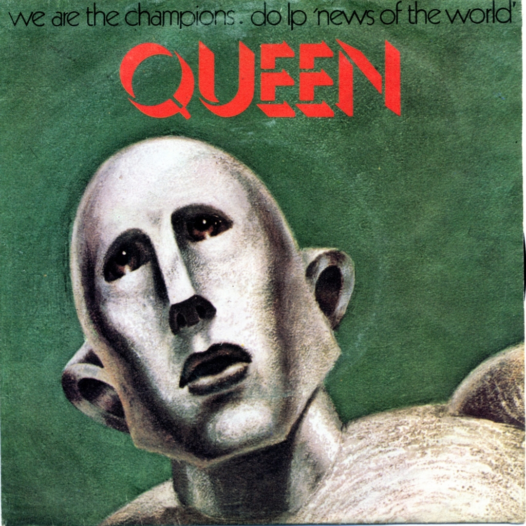
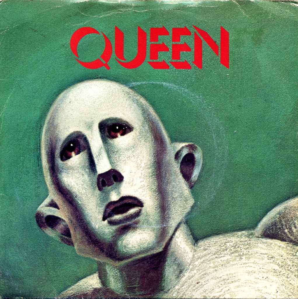
A similar approach informed We Are The Champions. The Portuguese sleeve (Figure 15) adapted the robot from “NEWS OF THE WORLD”, as seen on the UK edition (Figure 16), and added album information. American artist Frank Kelly Freas had originally drawn the robot for the 1953 magazine Astounding Science Fiction. Queen subsequently asked him to reinterpret the subject for their album.
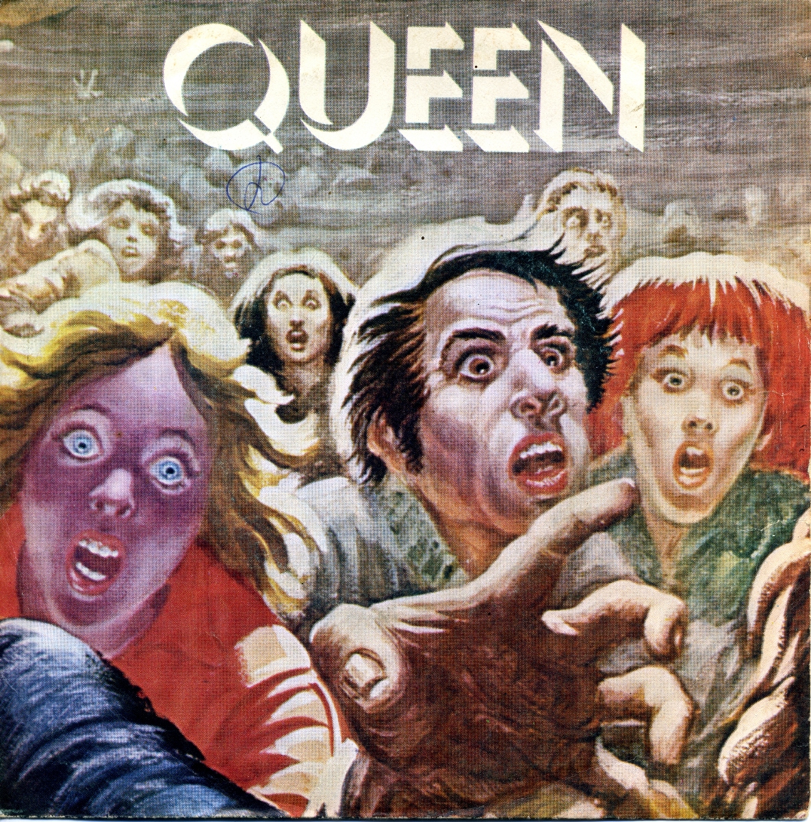
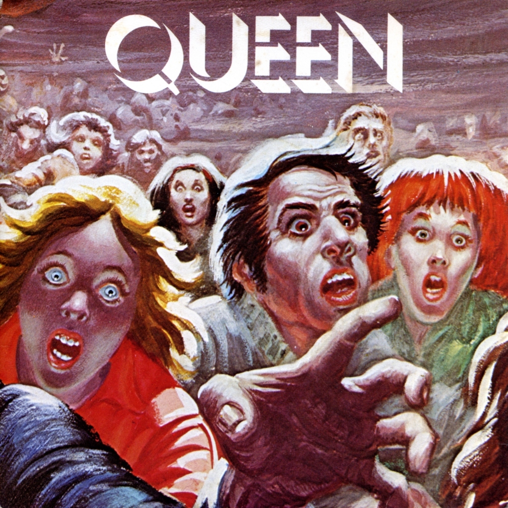
The crowd fleeing the robot, depicted inside the “NEWS OF THE WORLD” LP, became the sleeve image for 1977’s Spread Your Wings . Here the UK (Figure 18) and Portuguese (Figure 17) editions used the same design.
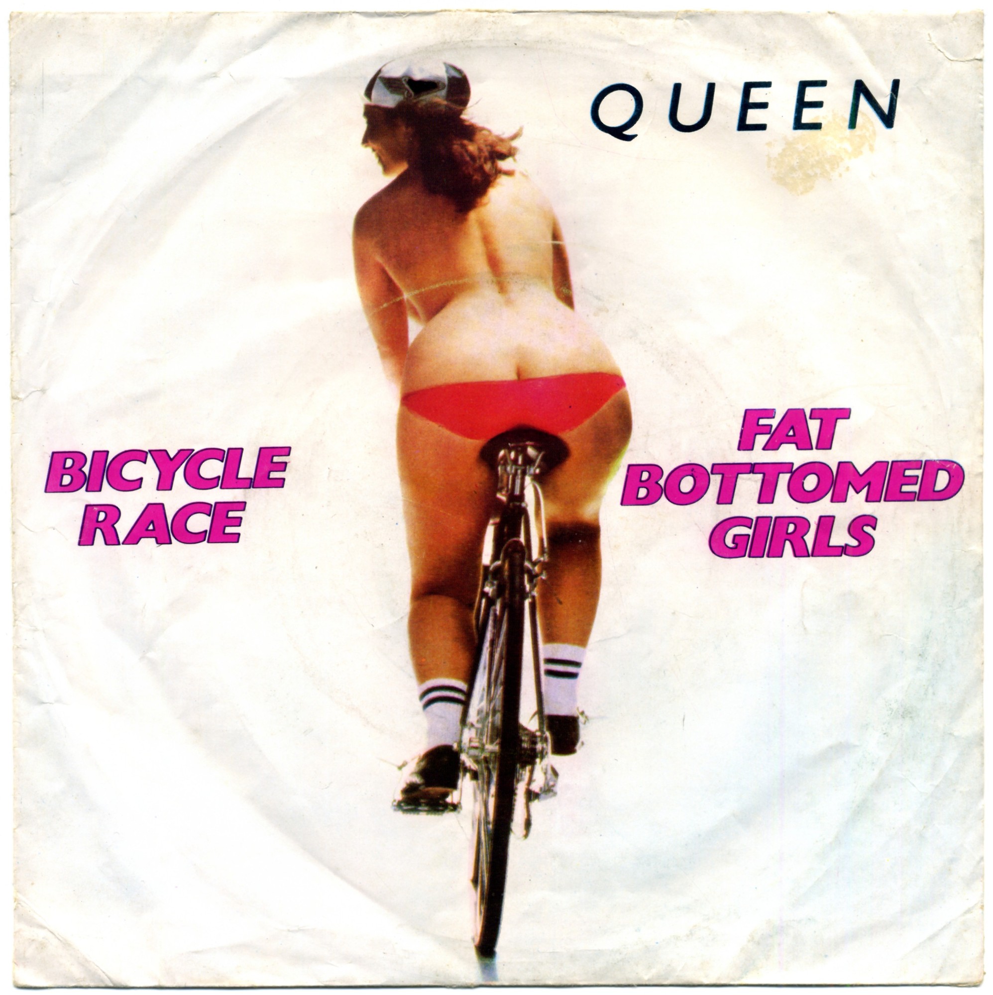
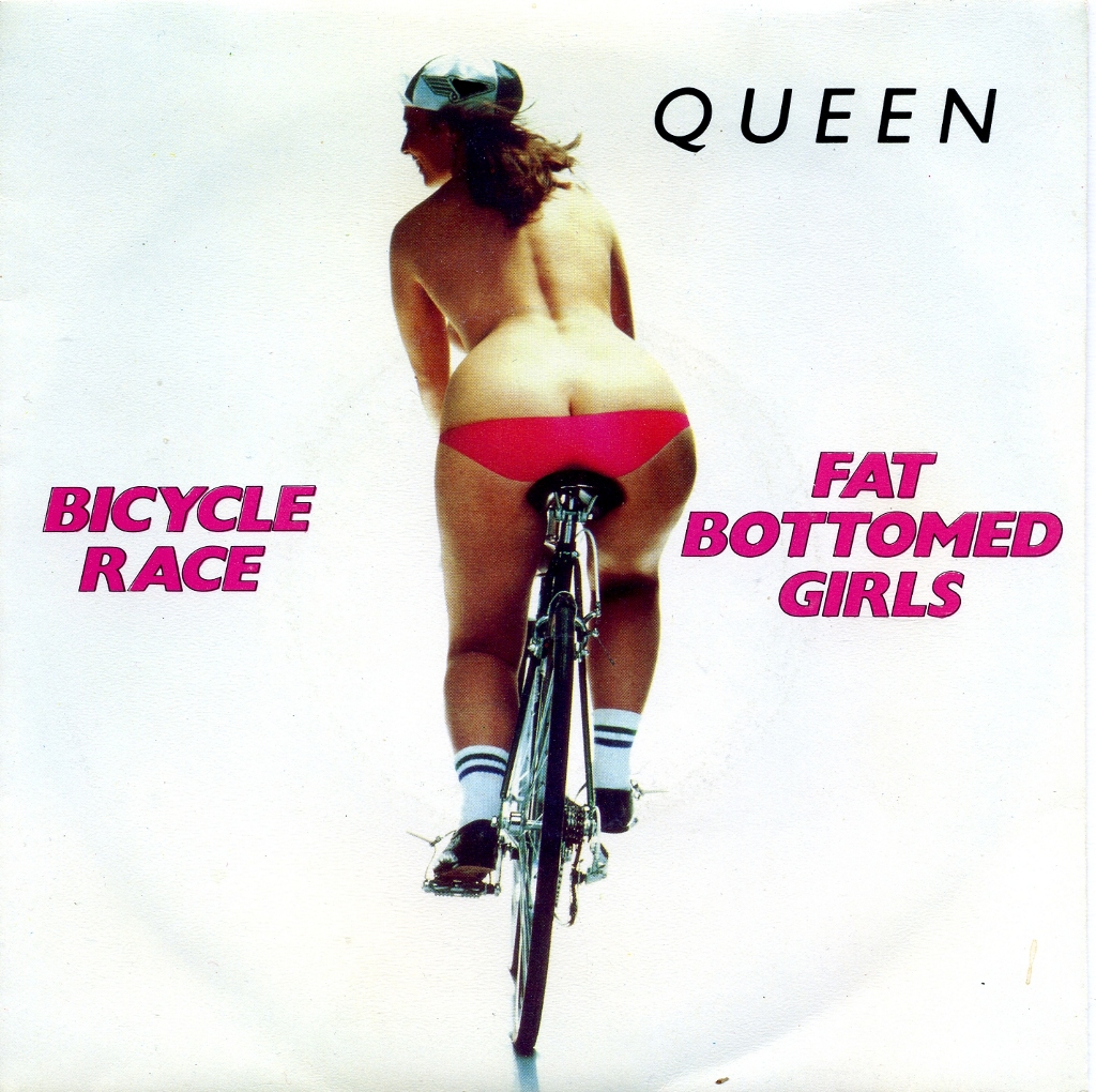
The 1978 single Bicycle Race shows a woman riding a bicycle, an image related to the songs on both sides of the record. The clothing added to the sleeve image covered the nudity of the original photograph, apparently to avoid censorship. The UK (Figure 20) and Portuguese (Figure 19) editions used the same design.
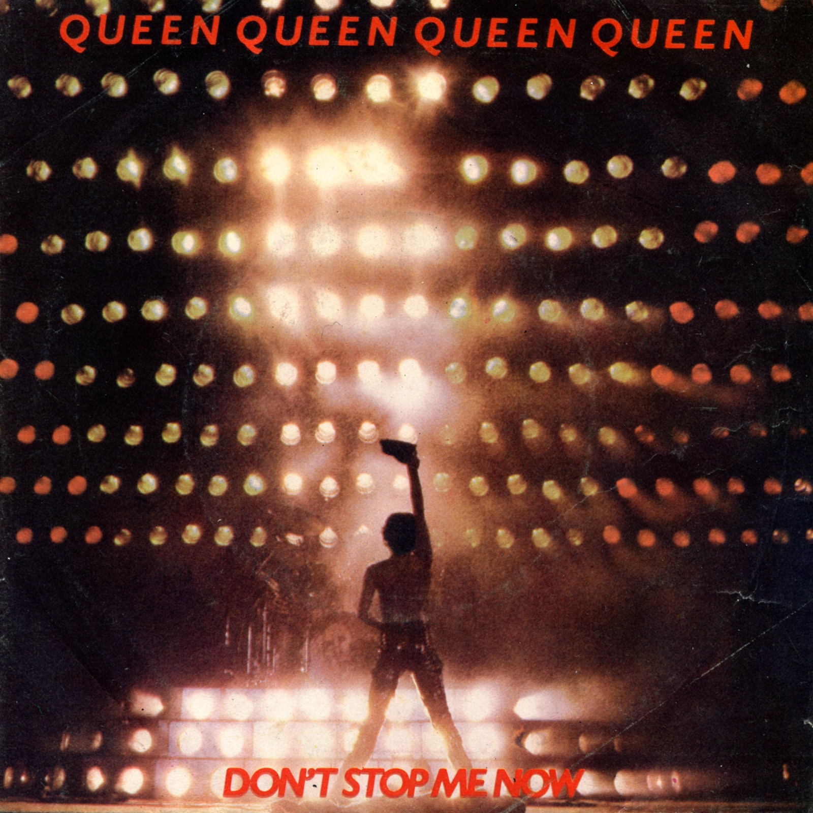
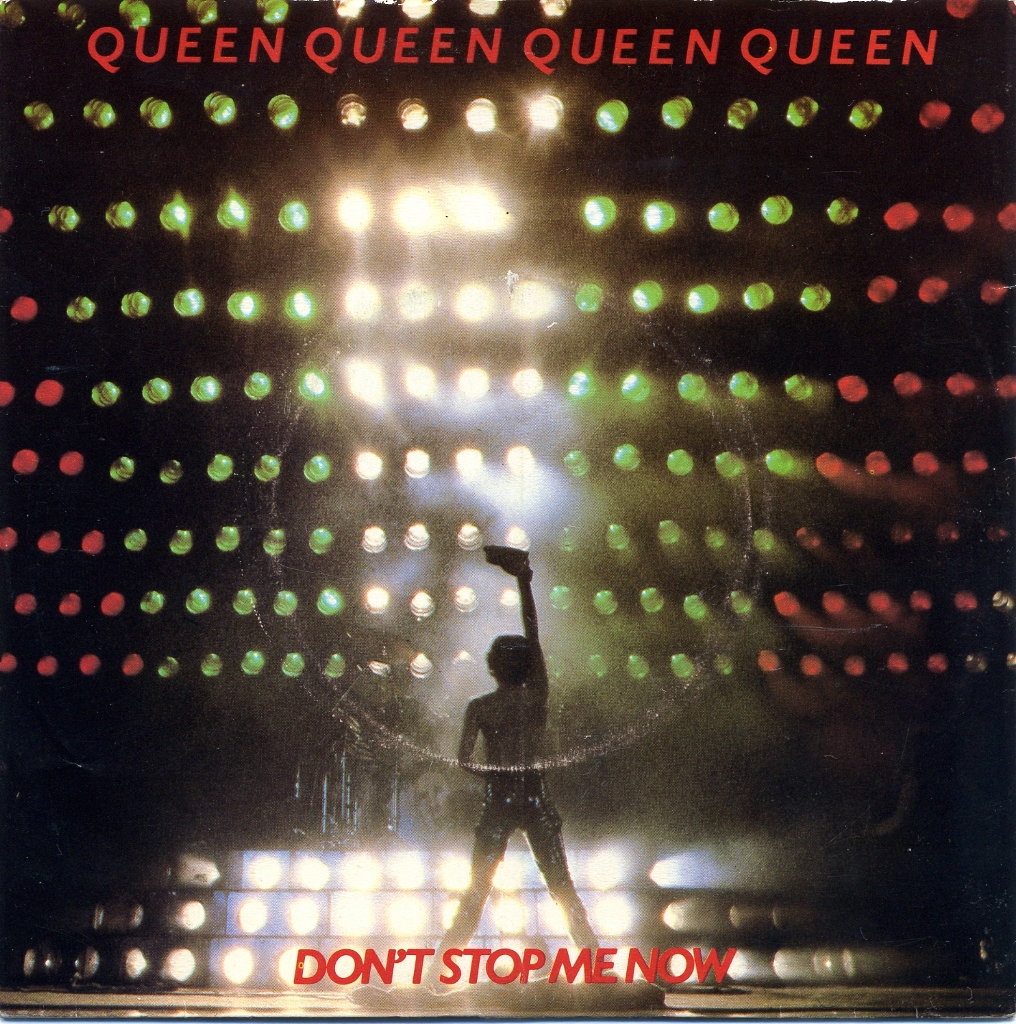
The sleeves for Don’t Stop Me Now likewise share a concert photograph (Figure 21 and Figure 22). Their principal material difference is the thinner paper used for the Portuguese edition.
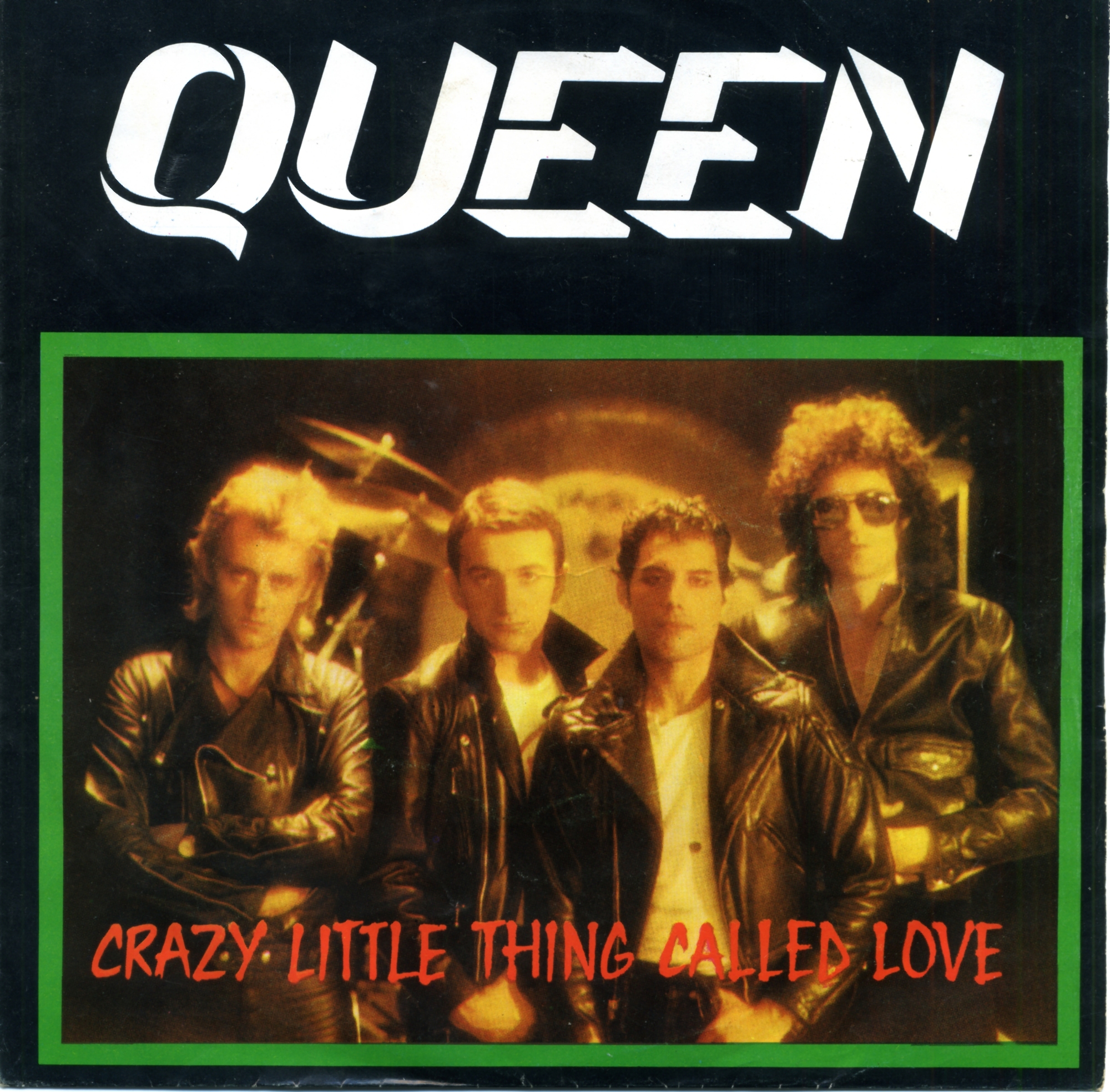
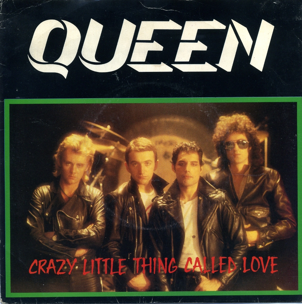
The Portuguese Crazy Little Thing Called Love sleeve follows the UK design (Figure 24), but exists in two versions (Figure 23). They differ in the colour of the word “Live” on the reverse, possibly reflecting separate print runs. The band’s changing hairstyles and clothes also register a shift away from its earlier glam aesthetic, alongside a less heavily overdubbed musical style.
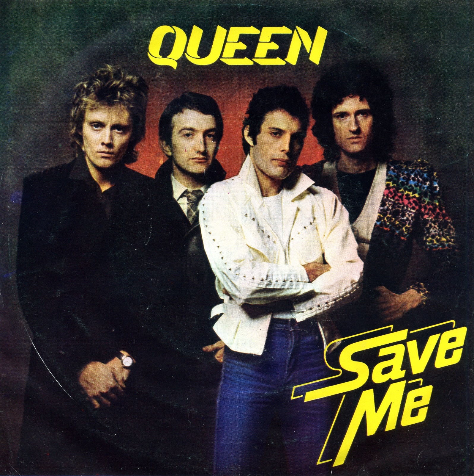
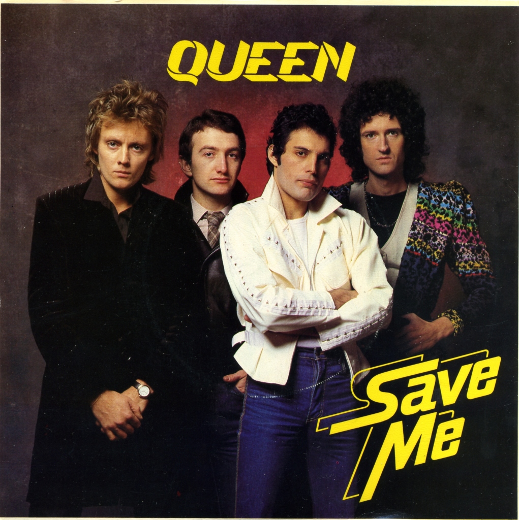
The 1980 single Save Me used a studio photograph in both markets. The Portuguese sleeve (Figure 25) differs from the UK edition (Figure 26) in its thinner, textured paper. A newer Queen logo appears in yellow at the top.
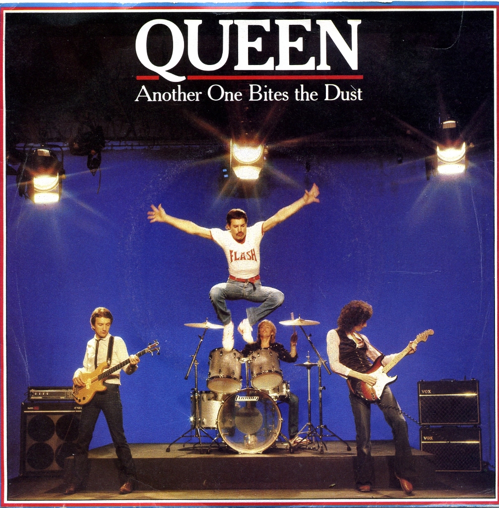
The Portuguese sleeve for Another One Bites The Dust (Figure 27) departs substantially from the UK design (Figure 28). The principal shared feature is the typeface used for the band’s name.
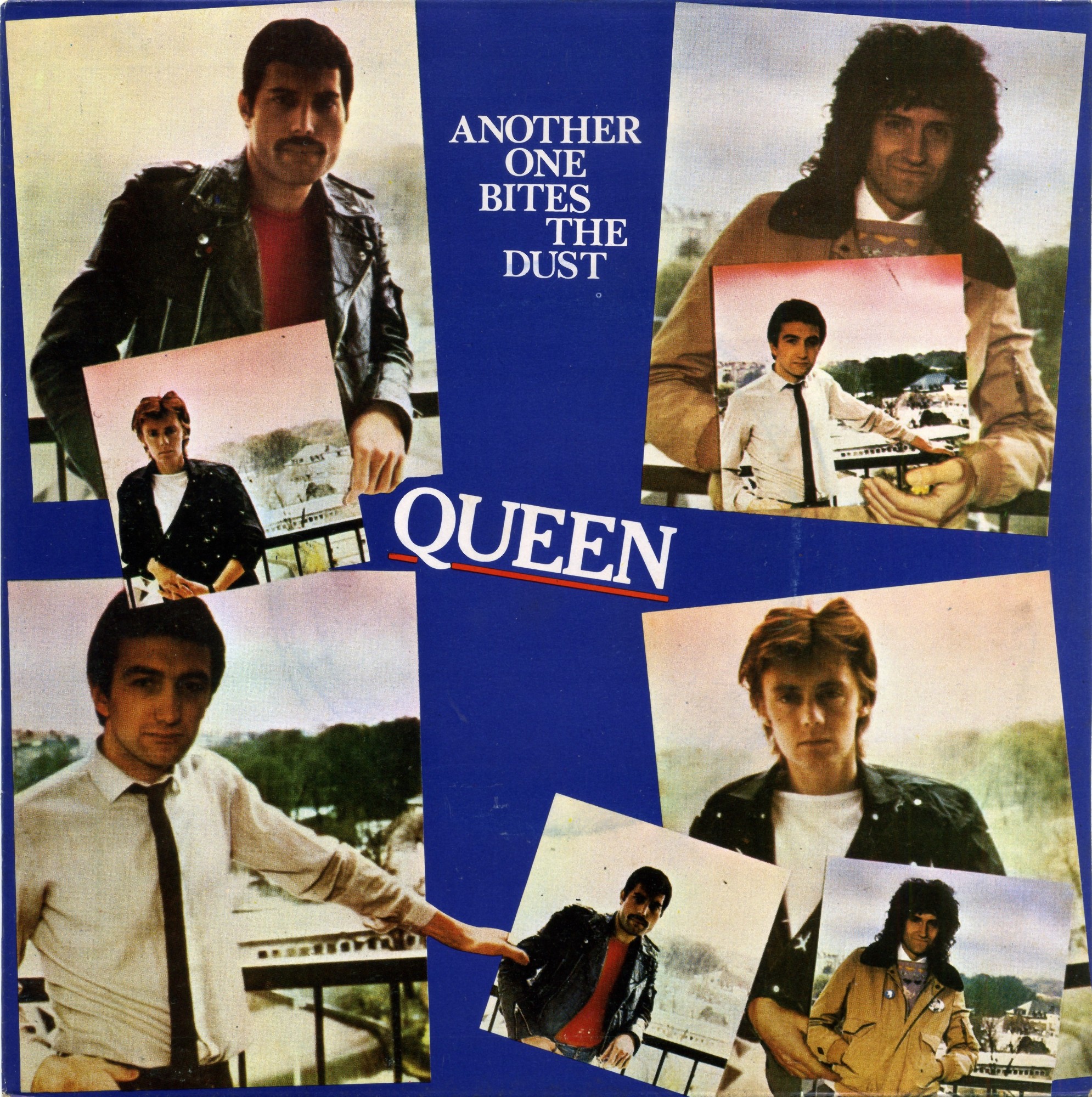
The positioning of the four musicians invites comparison with the Portuguese sleeve for ABBA’s The Winner Takes It All from the same year (Figure 29). Whereas the ABBA composition emphasises symmetry and order, Queen’s arrangement conveys a more informal and irreverent image.

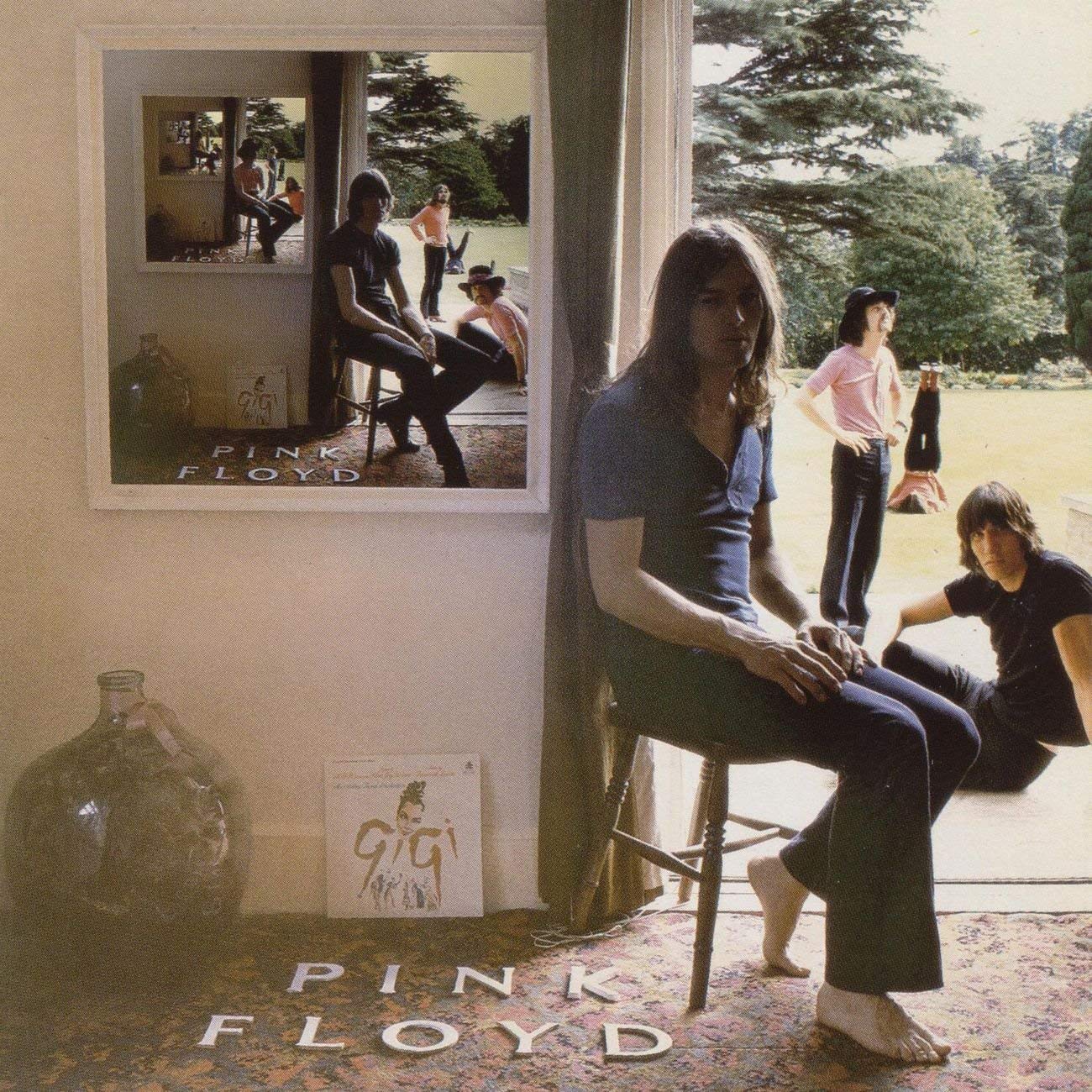
The design adds a further visual device: each member holds a sleeve bearing another member’s portrait. This repeated image recalls PINK FLOYD’s 1969 LP “UMMAGUMMA” (Figure 30). The underlying Queen photograph, without the repeated sleeves, also appears inside “THE GAME”.
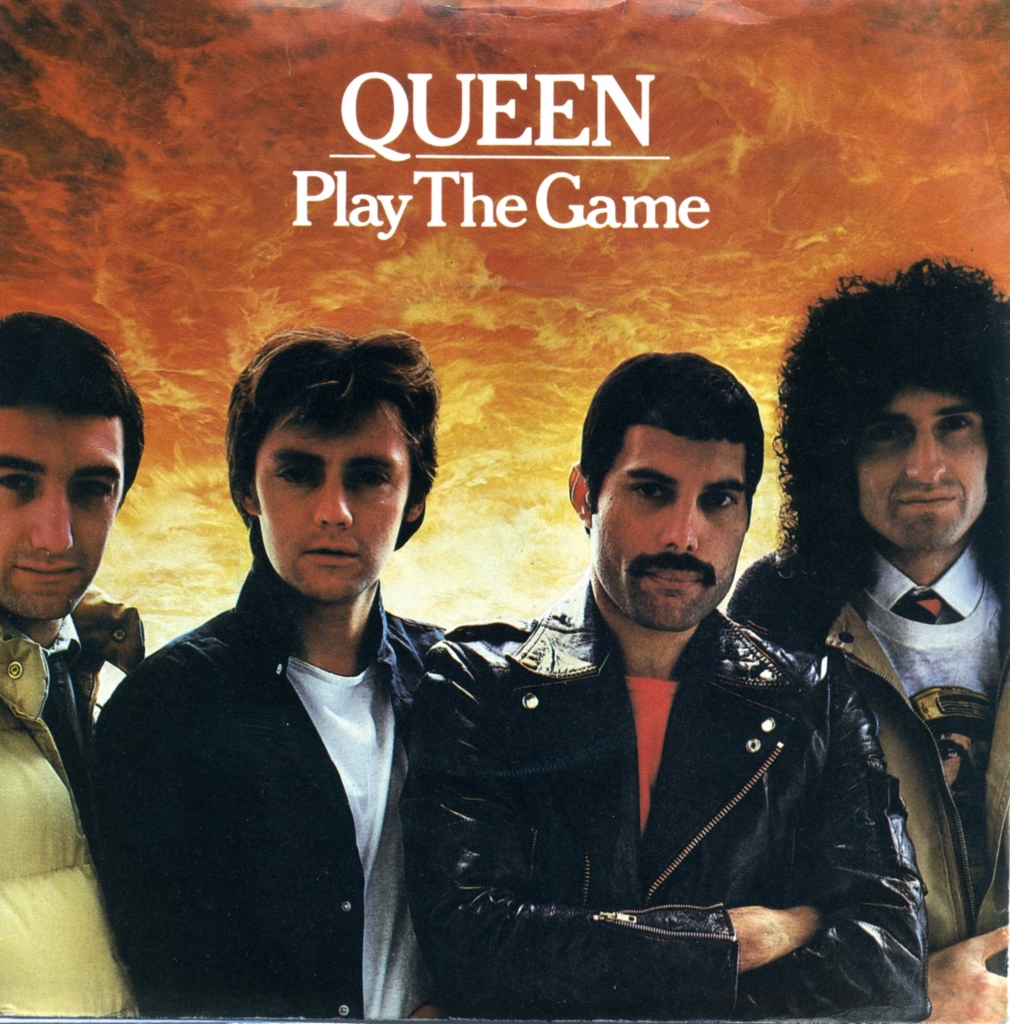
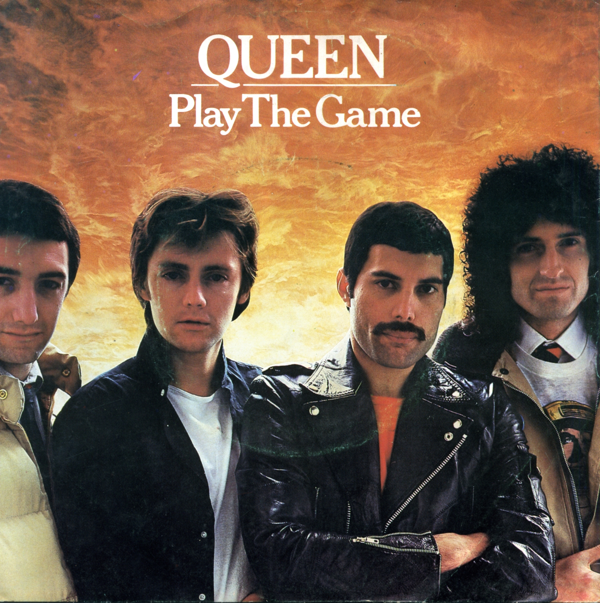
The Portuguese (Figure 31) and UK (Figure 32) sleeves for Play The Game use the same studio photograph. The musicians’ changed appearance parallels a shift in the band’s sound, including the use of synthesisers on the accompanying album.
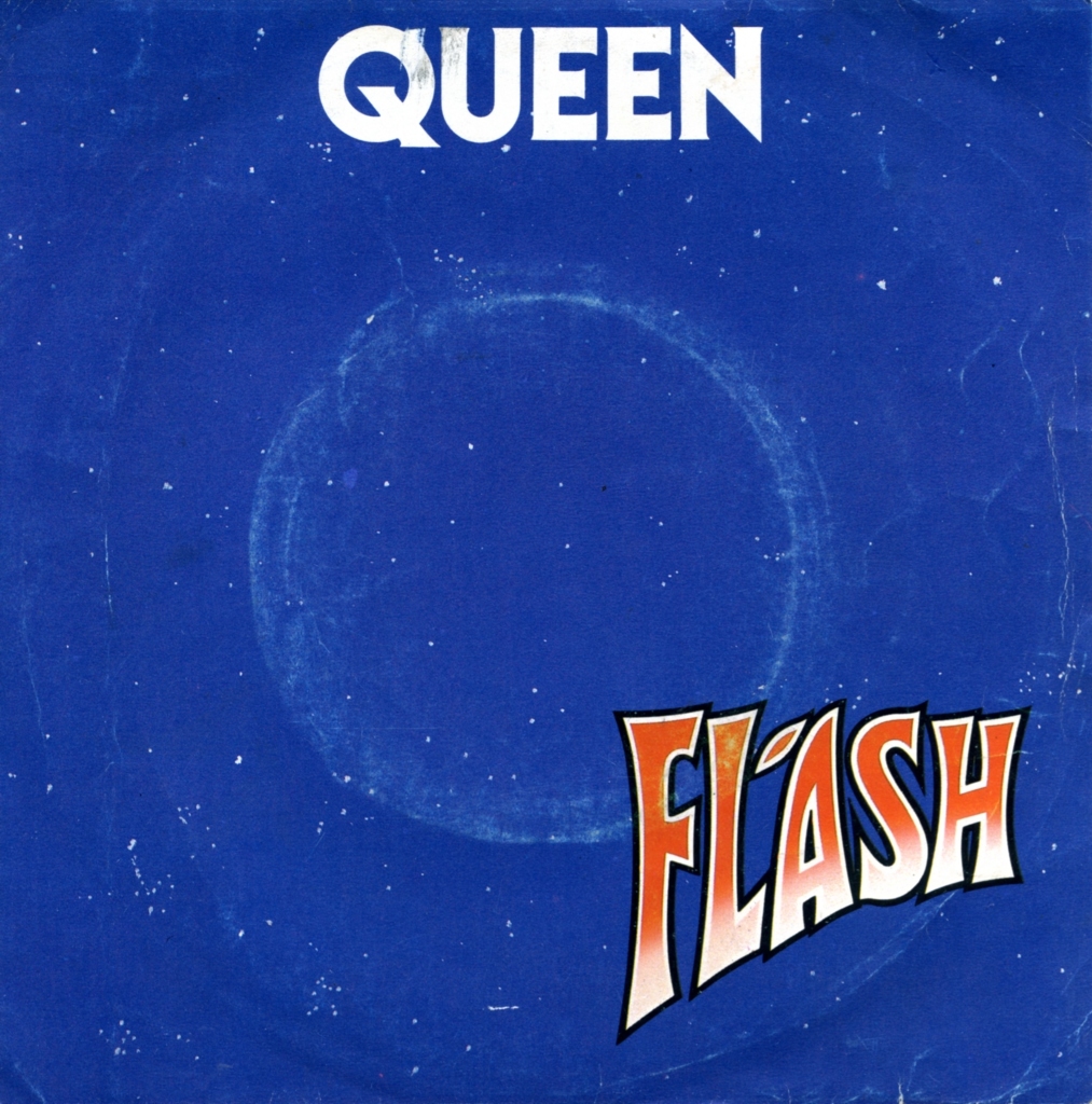
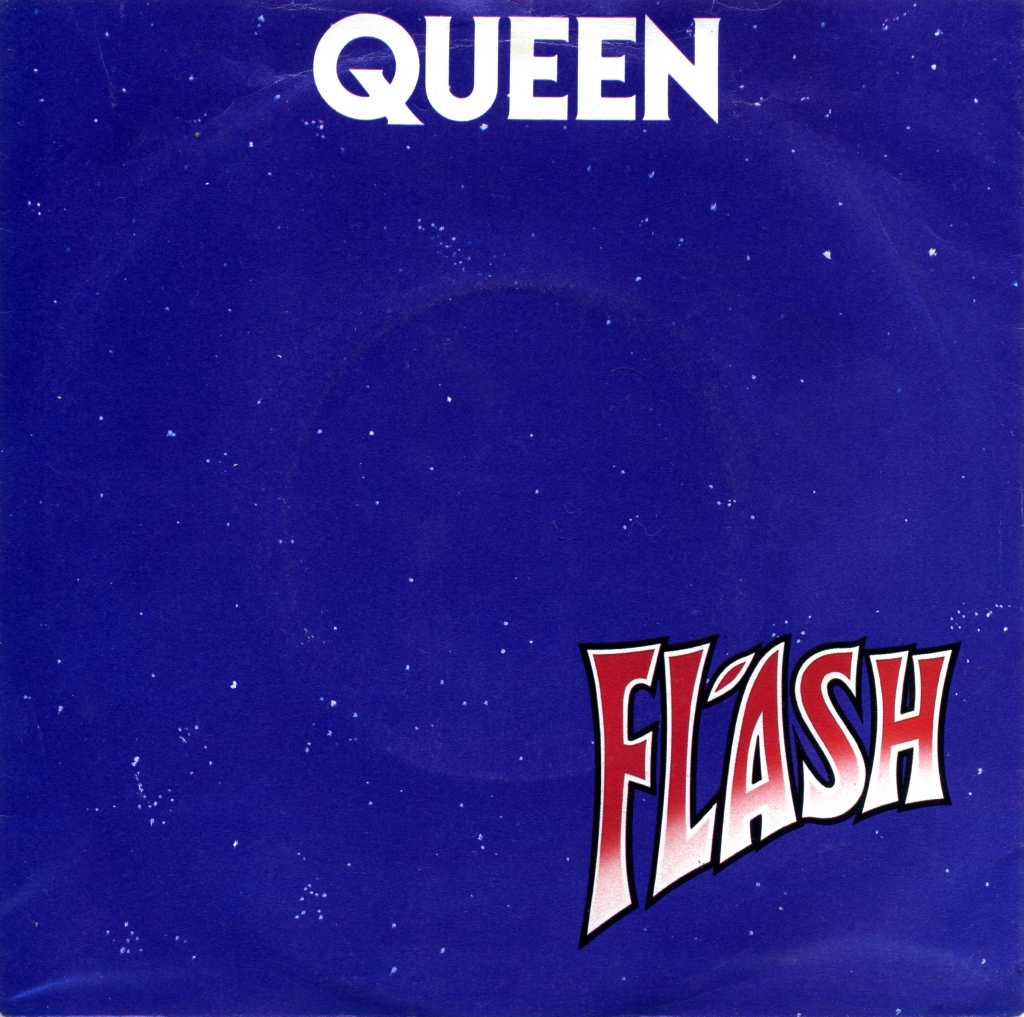
Queen released Flash in 1980 for the “Flash Gordon” soundtrack. Its predominantly lilac-blue sleeve was used in Portugal (Figure 33), the UK (Figure 34) and several other countries. Japanese and US designs instead emphasised the yellow associated with the soundtrack LP.
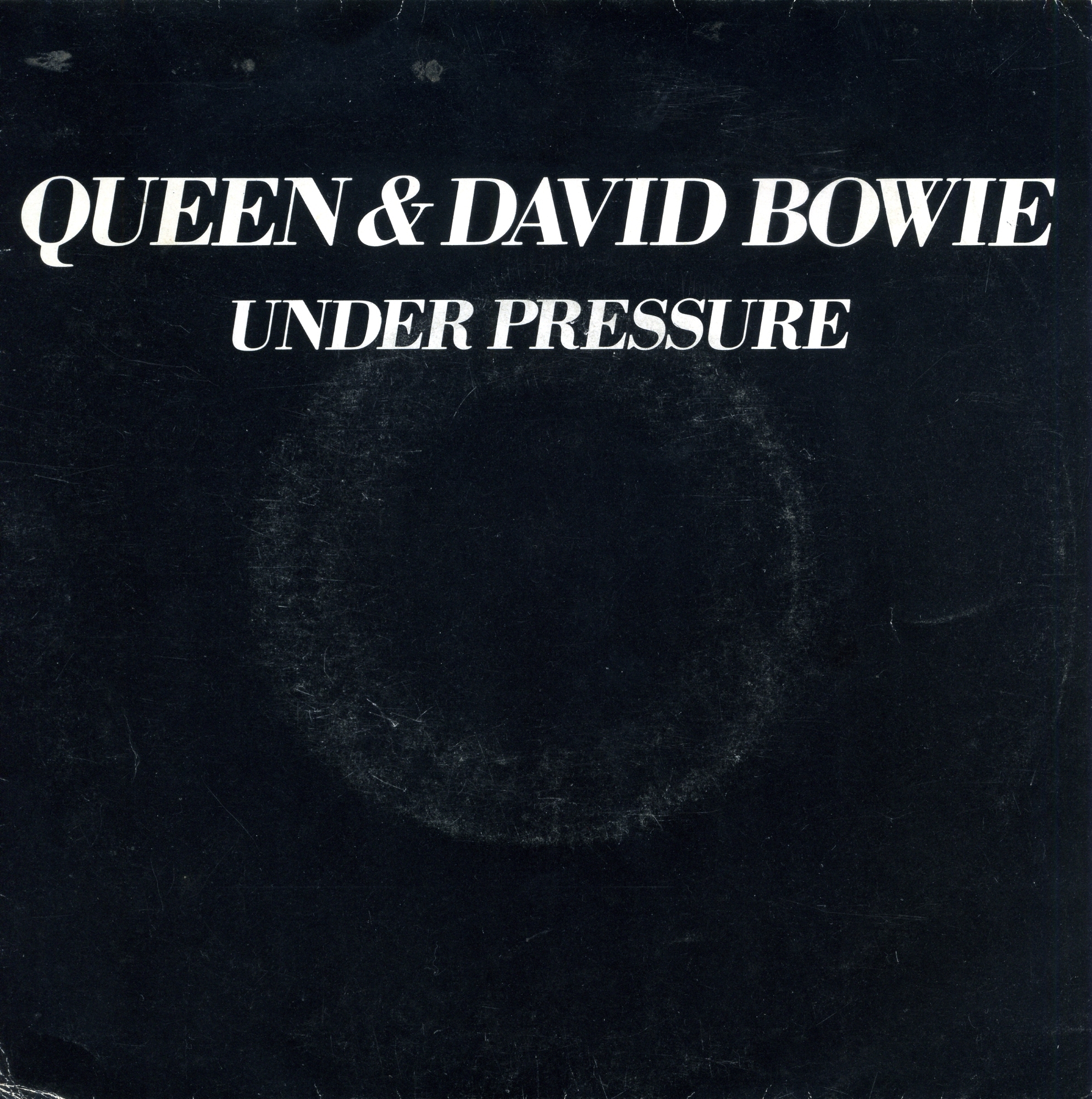
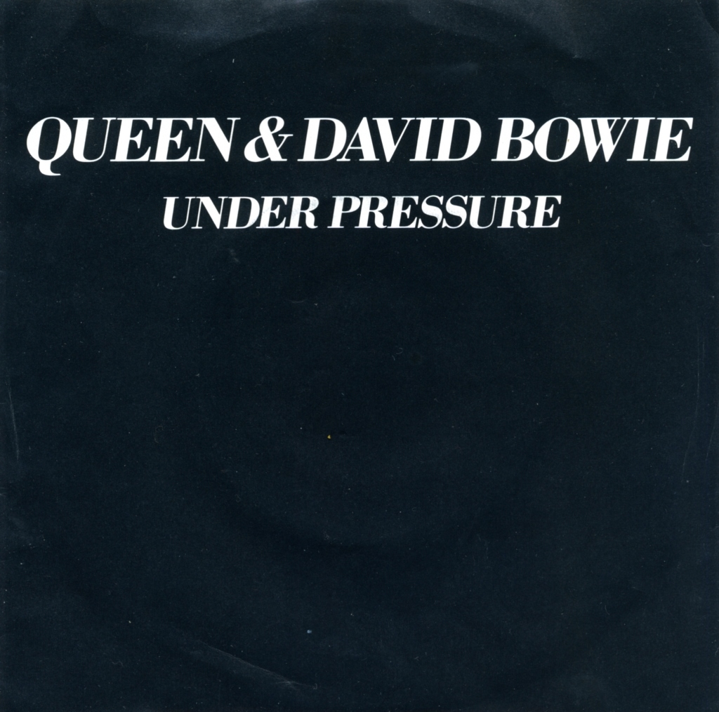
The 1981 collaboration with David Bowie, Under Pressure, appeared in a restrained black sleeve. The Portuguese (Figure 35) and UK (Figure 36) editions shared both design and track listing. The cover is among the most minimal in Queen’s singles discography.
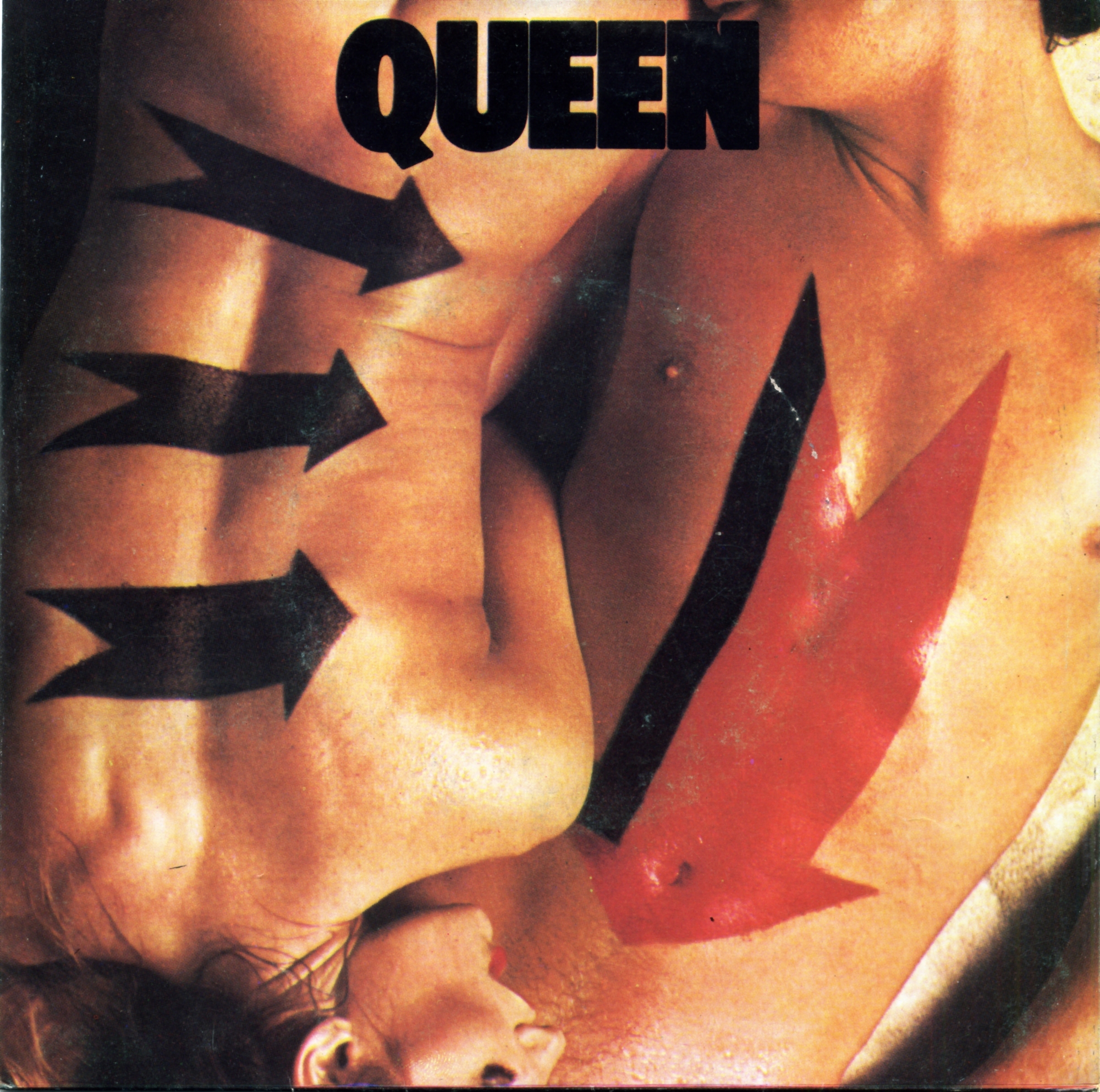
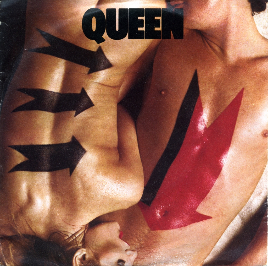
The sleeve for 1982’s Body Language depicts two nude figures. Although the image was censored in some countries, the Portuguese (Figure 37) and UK (Figure 38) editions retained the same concept. The song title is absent from the front: the photograph and its arrows carry the visual message. Mercury later incorporated similar arrows into his stage clothing.
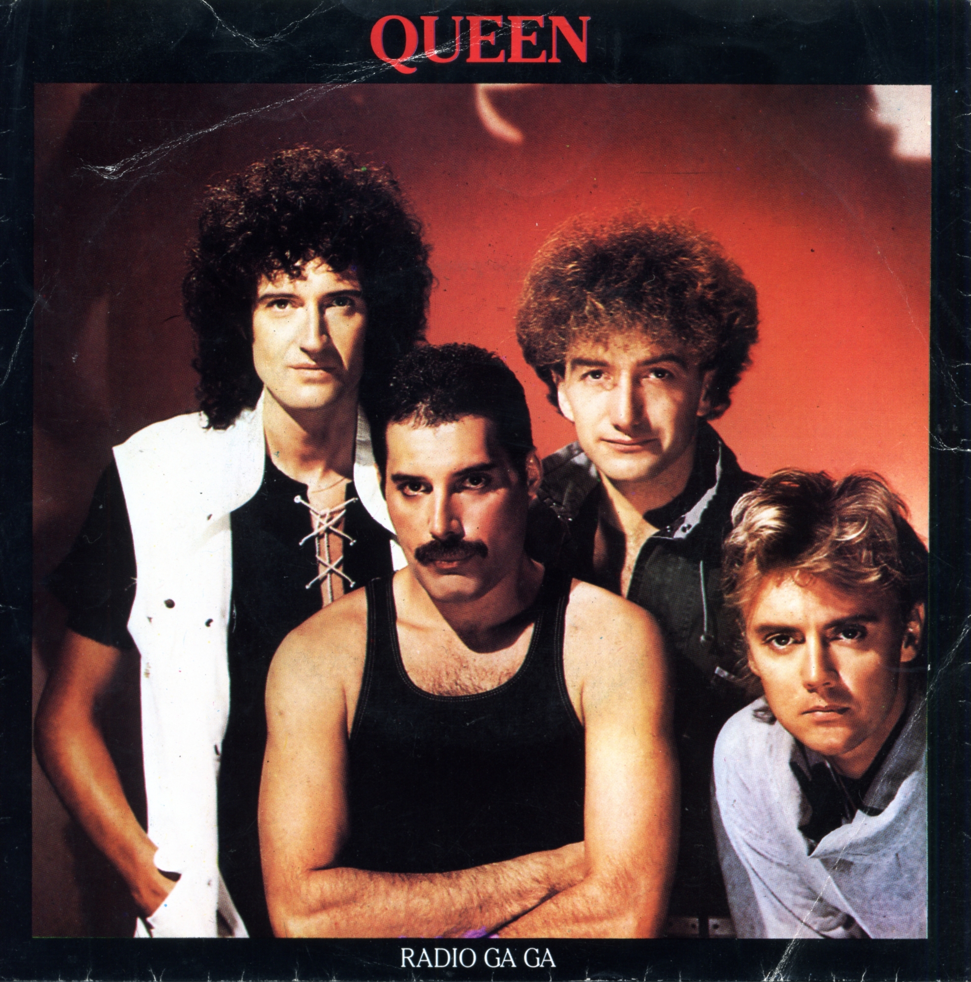
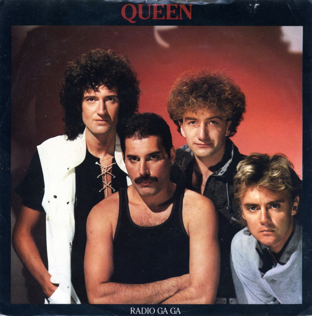
From the release of Radio Ga Ga in 1984, EMI increasingly standardised Queen’s international sleeve designs. The Portuguese (Figure 39) and UK (Figure 40) editions use the same studio photograph and a revised logo. Standardisation offered both production economies and a more consistent visual identity.
Several UK and US sleeves for I Want To Break Free featured individual band members, using photographs associated with “THE WORKS” (Figure 42). The Portuguese edition (Figure 41) used only the Roger Taylor version. The reason for this narrower selection is not documented here.


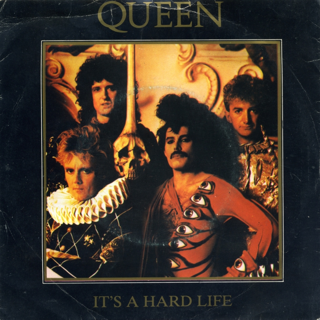
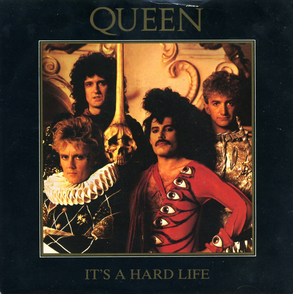
The elaborate costumes in the It’s A Hard Life video informed the single sleeve, whose photograph concentrates the production’s theatrical detail. It also shows an unusual guitar decorated with a skull-and-crossbones motif. The Portuguese (Figure 43) and UK (Figure 44) editions are visually identical.
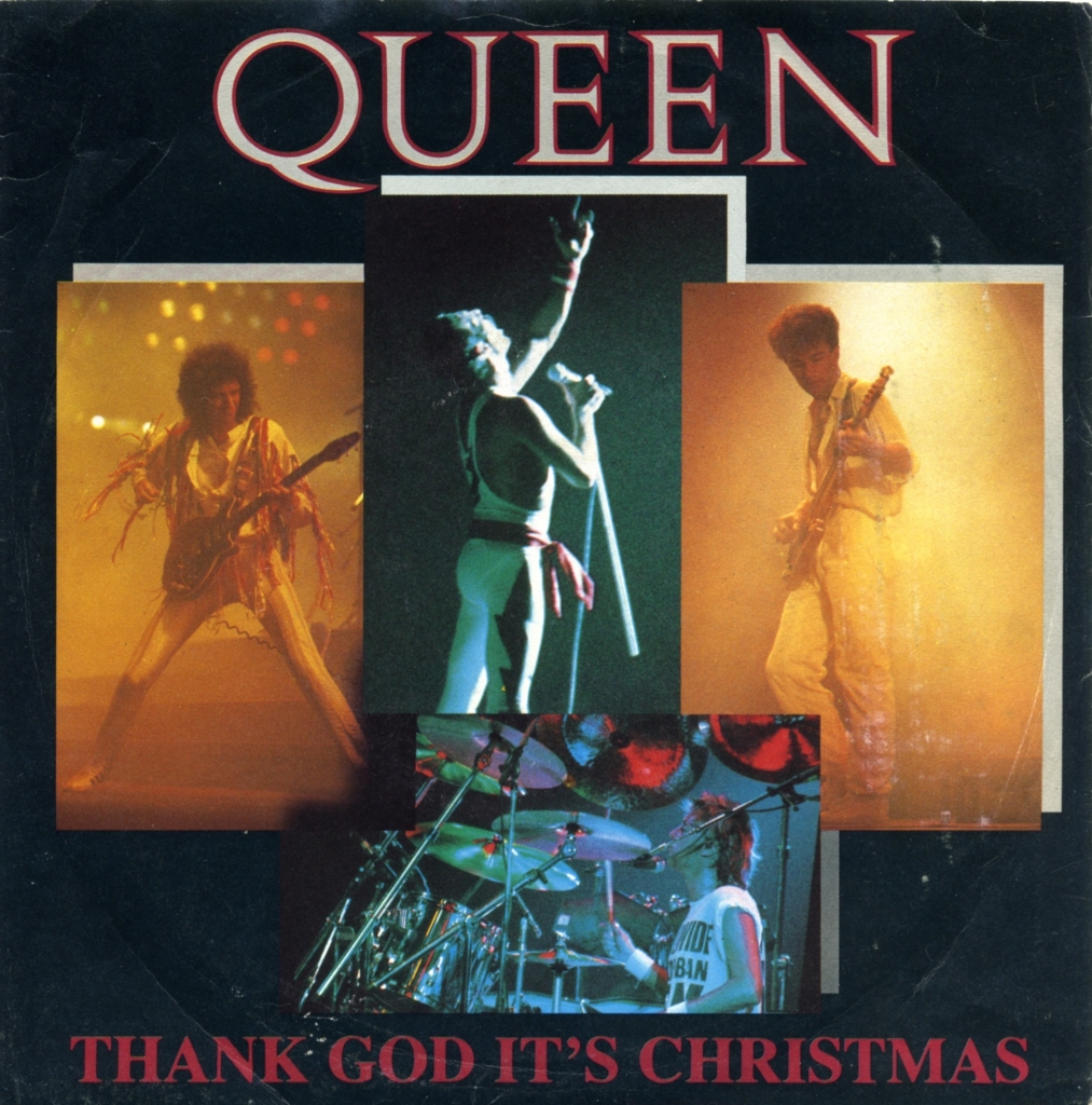
Written by Brian May and Roger Taylor, Thank God It’s Christmas was released on 26 November 1984. Its sleeve assembles photographs from that year’s tour. The UK design (Figure 46) supplied the model for the Portuguese issue (Figure 45) and other international releases.

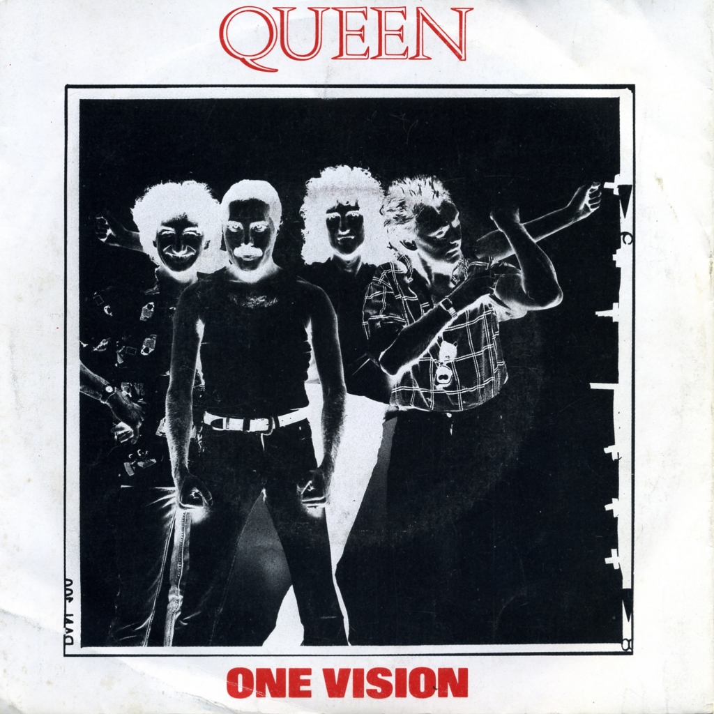
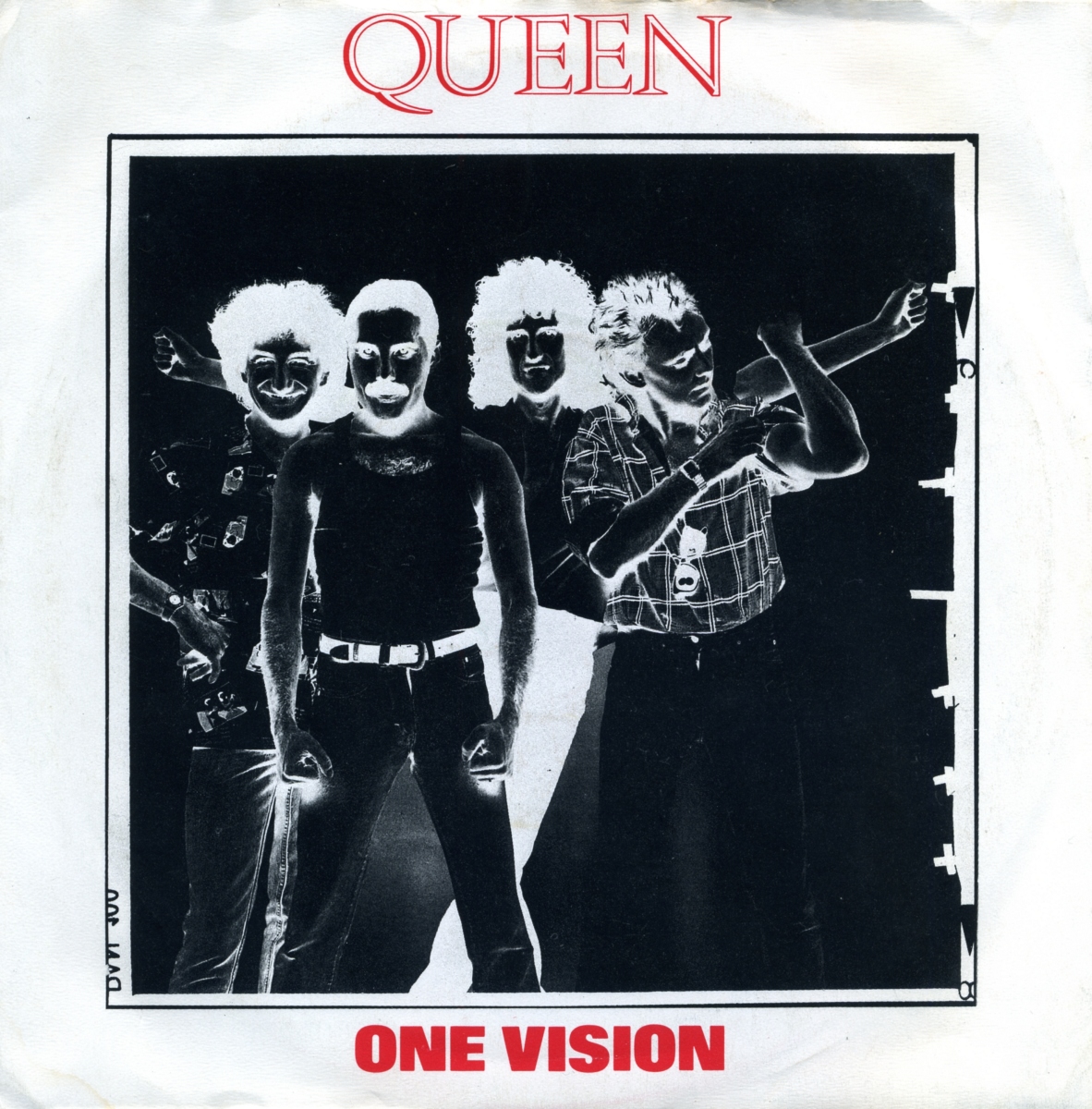
The sleeve for One Vision uses a band photograph from the 1985 Live Aid photo session. The Portuguese (Figure 47) and UK (Figure 48) editions share the same design, with the Queen logo printed in red above the image.
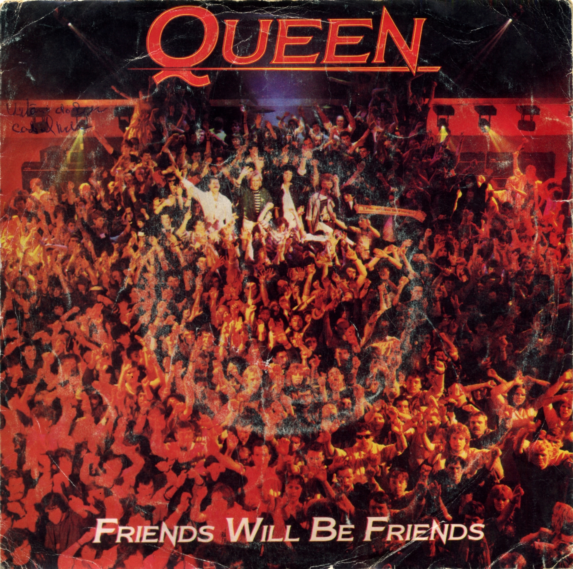
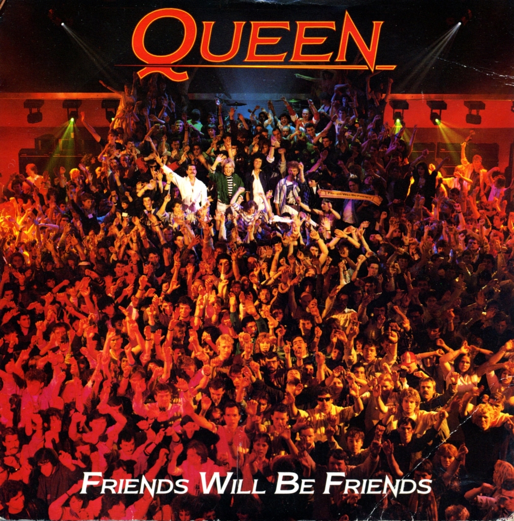
A photograph from the Friends Will Be Friends video shoot appears on the single sleeve. The UK version (Figure 50) served as the model for the Portuguese edition (Figure 49). The revised Queen logo remained in use until it was redesigned for “THE MIRACLE” in 1989.
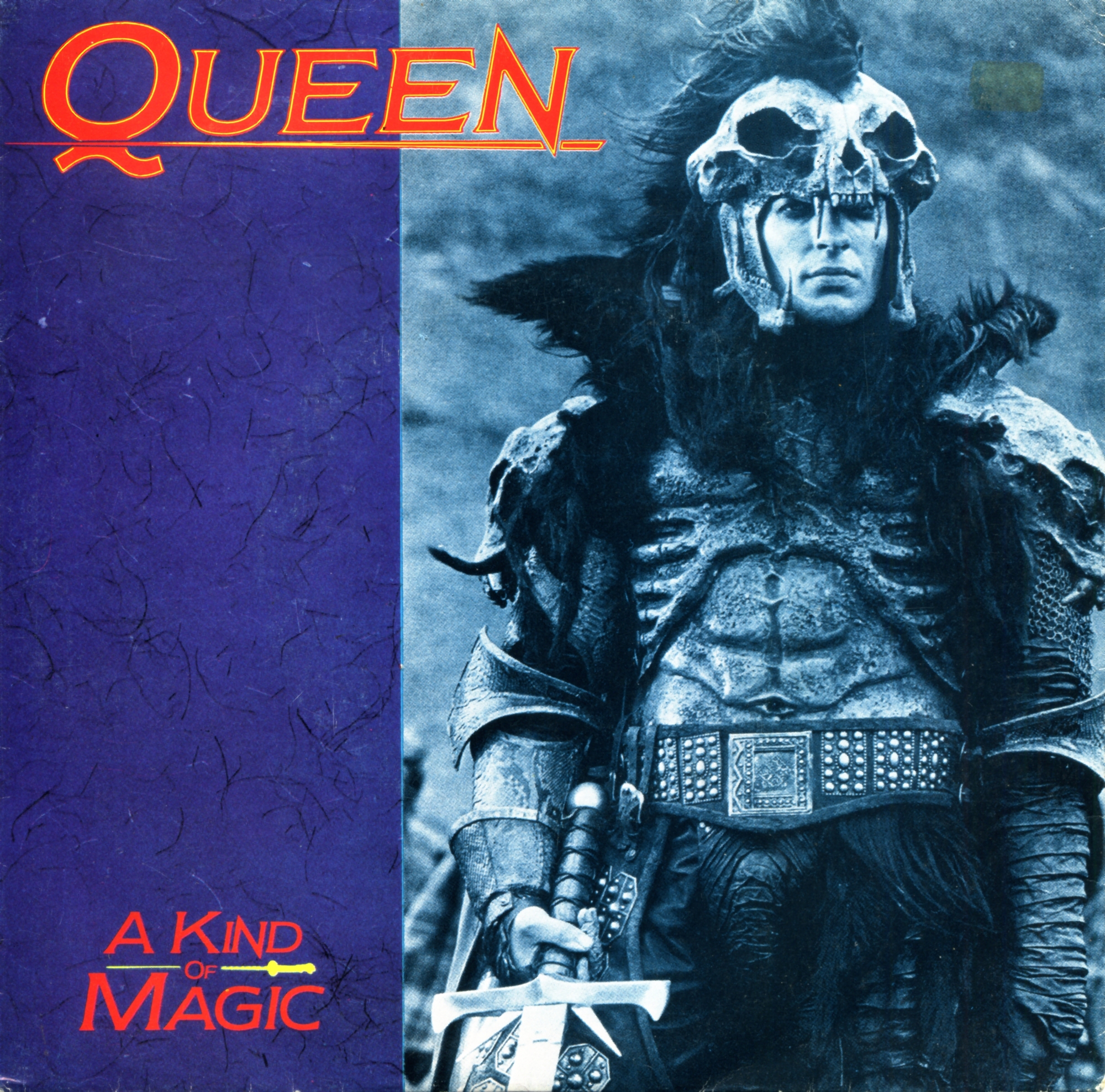
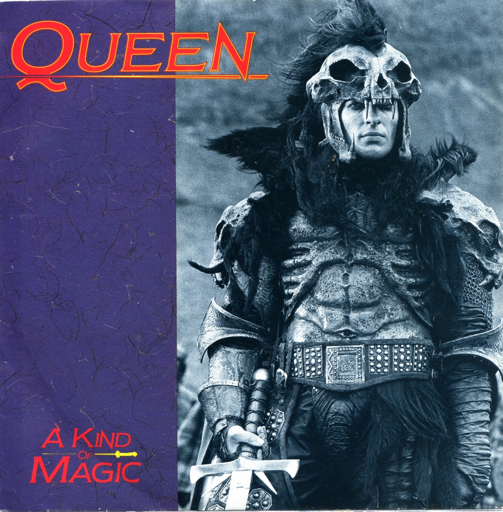
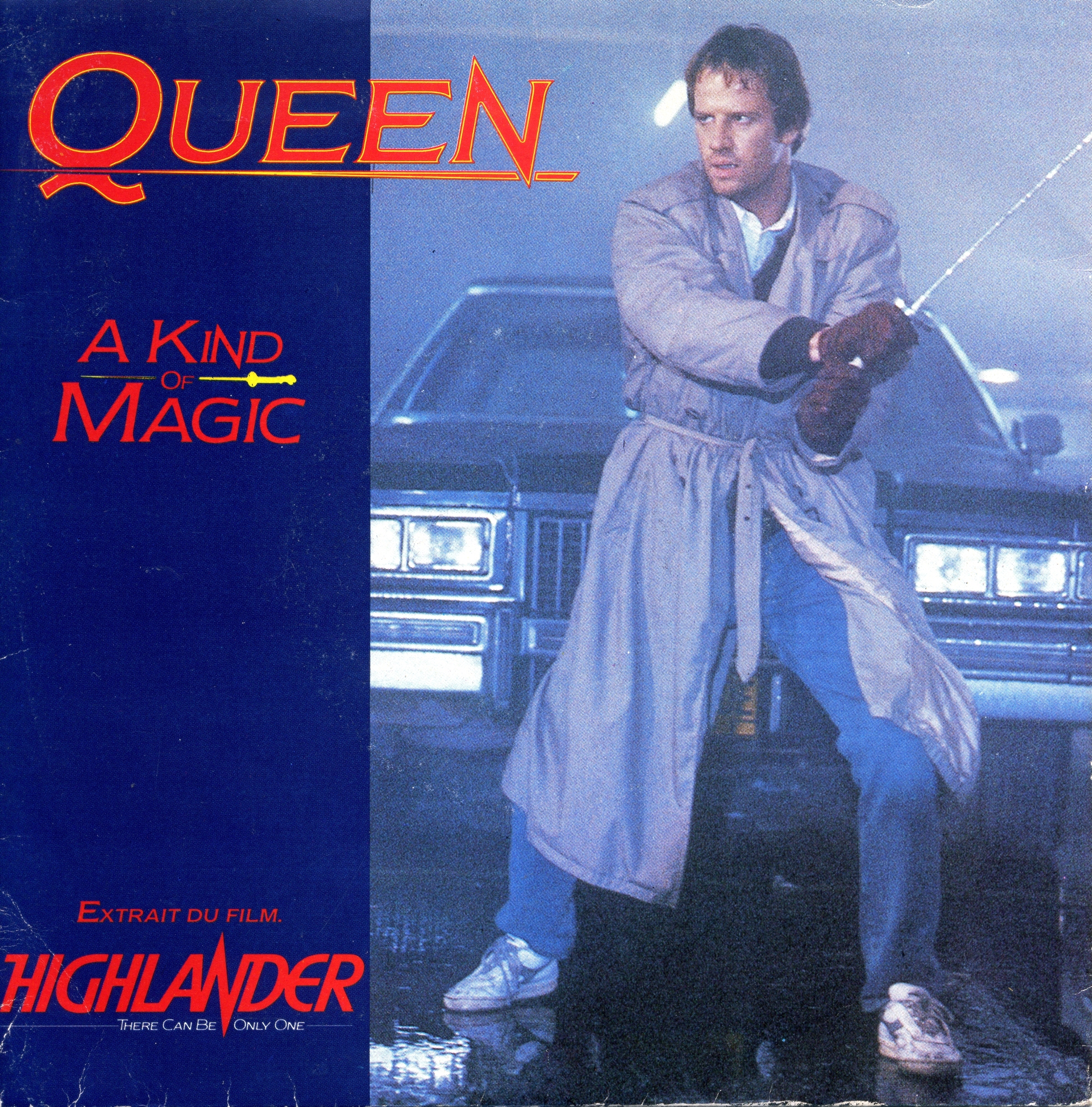
Queen’s second film soundtrack was written for “Highlander” (1986). The sleeve for A Kind Of Magic depicts the film’s antagonist, the Kurgan, played by Clancy Brown. The Portuguese (Figure 51) and UK (Figure 52) editions share this design; a French variation instead features Christopher Lambert.
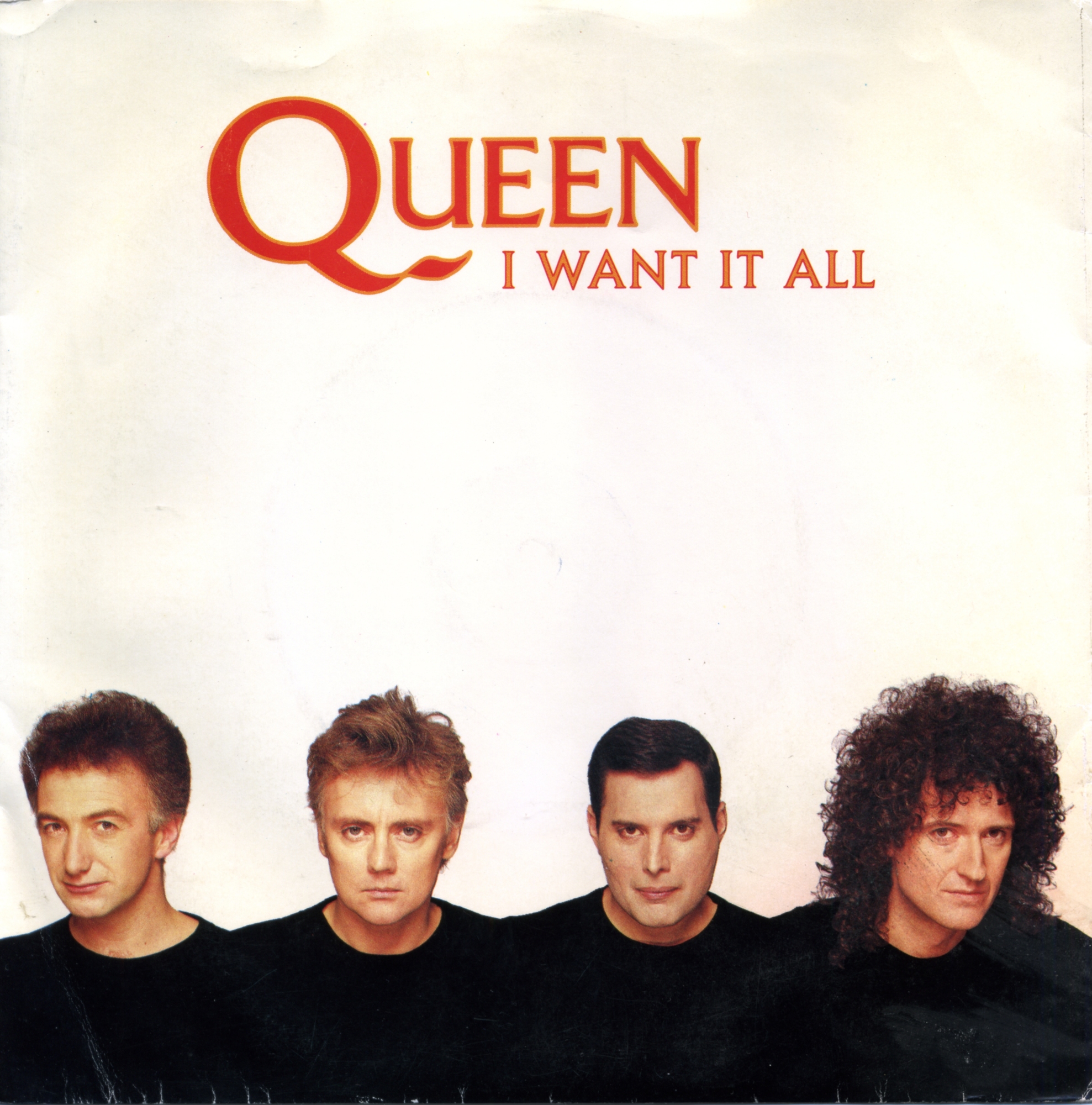
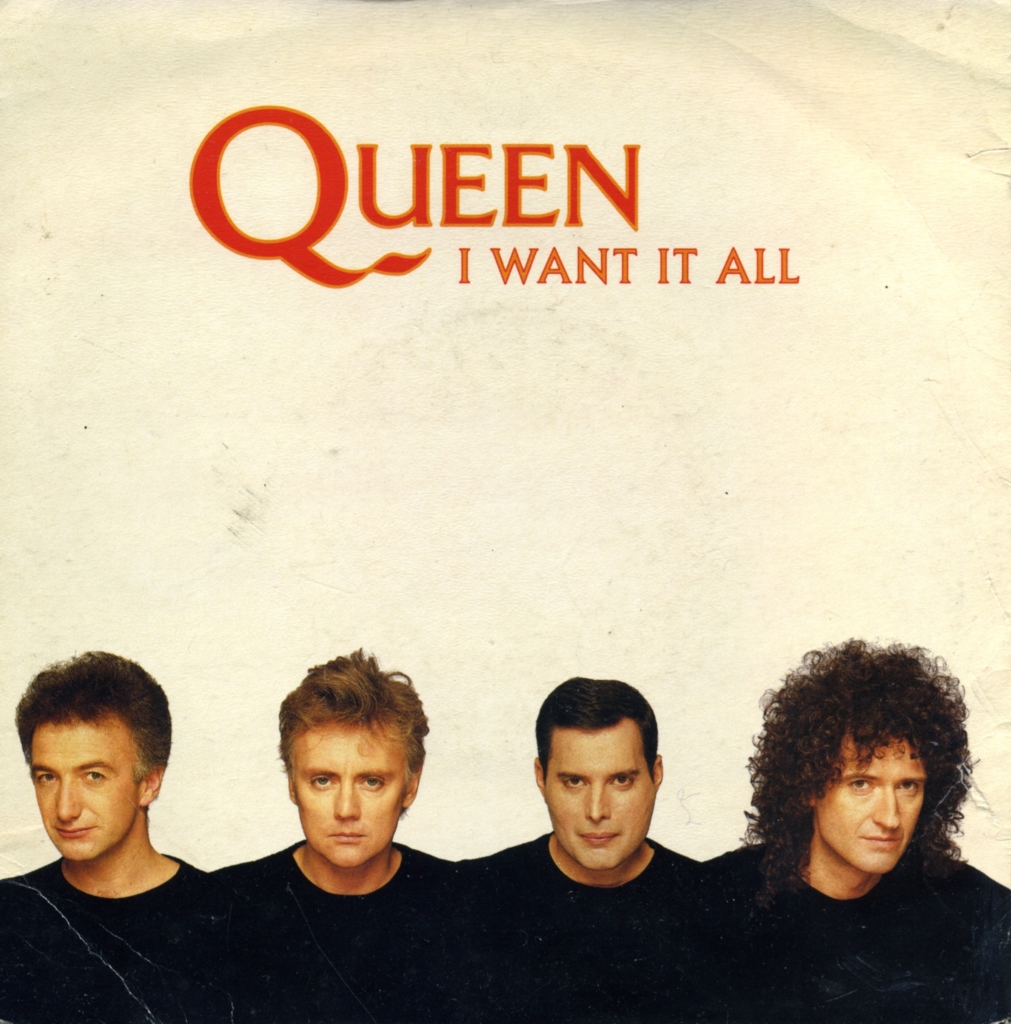
Released in 1989 and drawn from “THE MIRACLE”, I Want It All presents the four musicians dressed in black against a white background. The image suggests a renewed emphasis on the group as a collective, while the latest logo appears above it. The Portuguese (Figure 53) and UK (Figure 54) covers are identical.
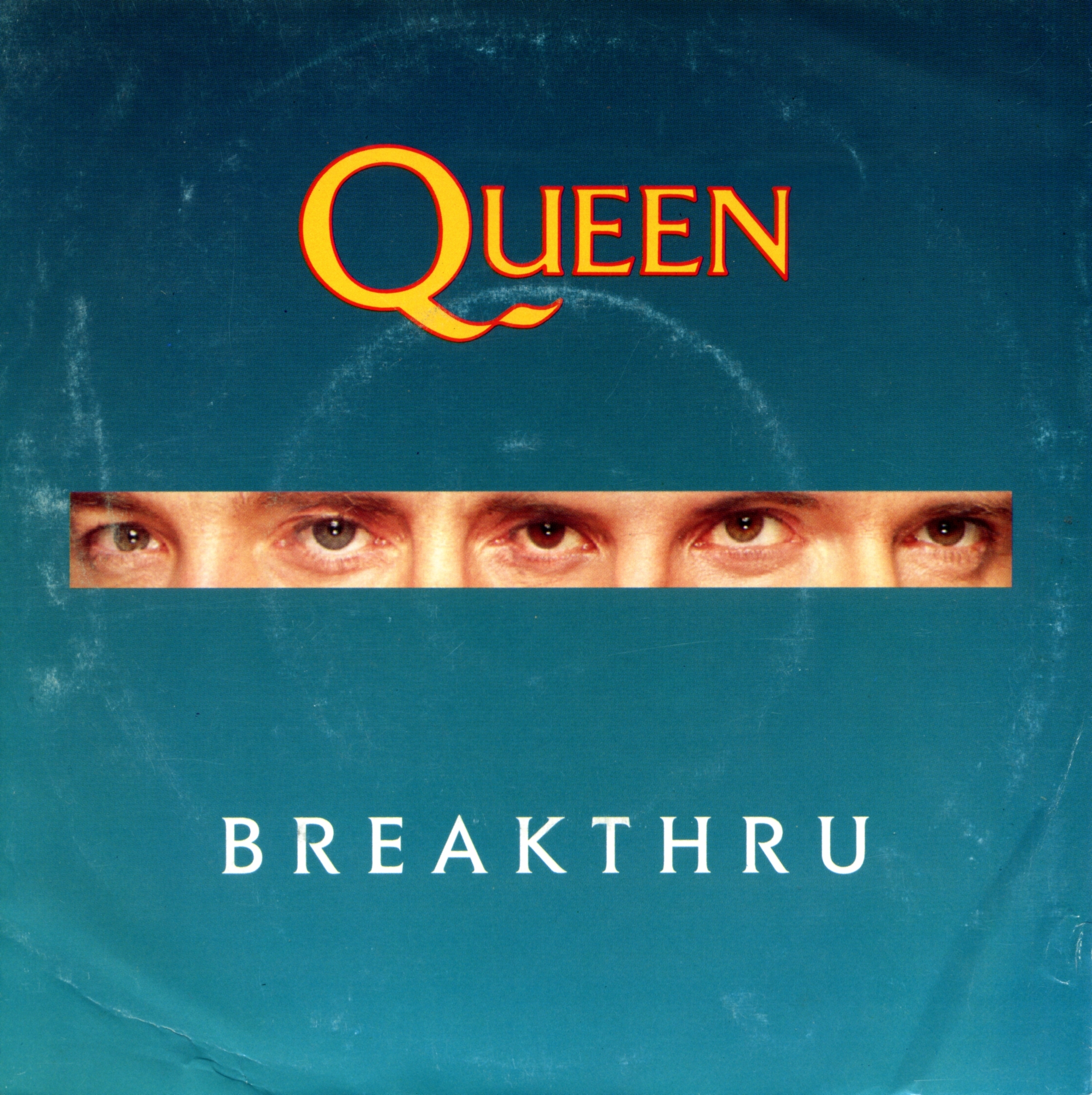
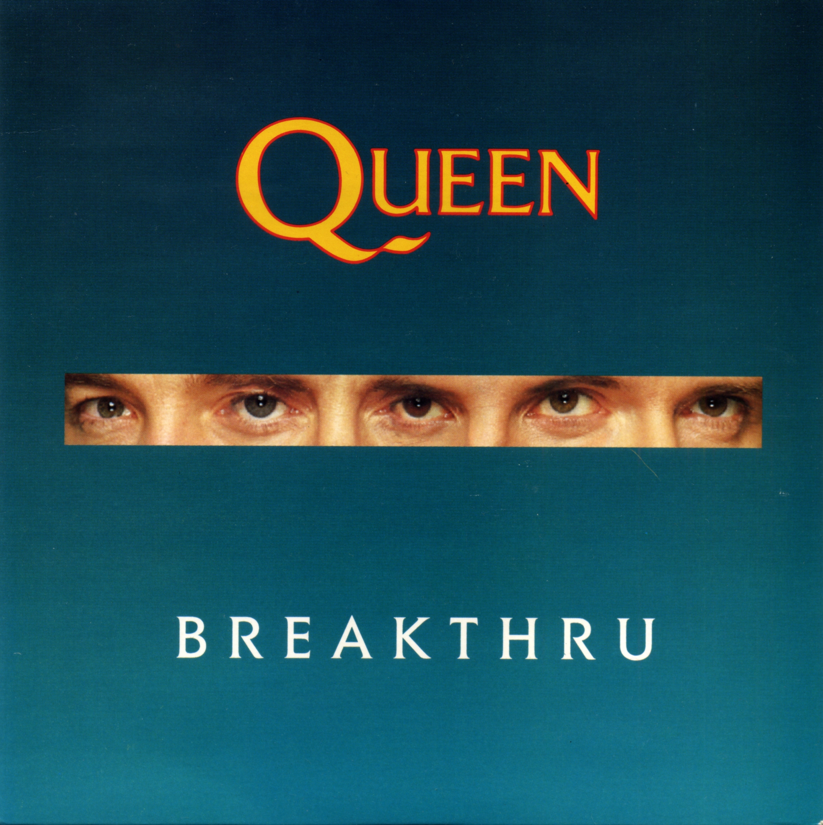
The cover for Breakthru isolates the eyes from the artwork of “THE MIRACLE”. The UK design (Figure 56) also served for the Portuguese edition (Figure 55). It was the last Queen seven-inch single issued in Portugal in this sequence; no comparable release followed from “INNUENDO” in 1991, as the CD increasingly displaced vinyl in distribution and promotion.
Portuguese and Angolan Queen singles thus offer an important record of the band’s changing iconography. Their sleeves served a commercial purpose, but they also combined locally distinctive artwork, adaptations of other media and, later, increasingly standardised international designs.
© Nicola Bizzo
Related collections: To compare these regional editions with the wider collection, browse Queen seven-inch singles by album and the single-record discography by country and year.
Related Articles



You must be logged in to post a comment.