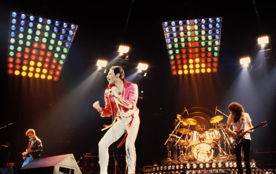
Queen’s decades-long career developed in dialogue with a wide range of artistic practices, particularly visual forms. Mercury and his bandmates repeatedly explored new means of communication, most notably the promotional video. The 1975 film for Bohemian Rhapsody became a prominent example of how popular music could circulate on television without the performers’ physical presence.
Promotional video gave the band a new mediated presence, much as sound recording had earlier extended performance beyond the concert. At the same time, it separated musicians from audiences by substituting an image for a live appearance. This dual function became significant in the mid-1970s. Programmes such as “Top of the Pops” had already normalised televised musical performance, often using recorded appearances and consistent studio settings. MTV would later make the continuous broadcast of promotional videos central to its format.
Dick Hebdige articulates the semantic implications of the music video particularly clearly (Note 1):
That which could be considered as the definitive characteristic of the video clip (is) the substitution of the coherent fiction with the referential density. Meanwhile the index-link signs – which carry on the story – succumb to the referential signs – those that evoke the atmosphere, define the mise en scène giving fundamental elements to “characters” and “style” (dressing up, pose, lights, special effects etc…) – the video clip becomes a way to “tell a story” rather than to “tell of an event”.
Queen’s career permits the reconstruction of several visual histories. Costumes, video sets and album covers reveal how ideas first encountered in other artistic contexts were adapted by the band. These connections also illuminate aspects of song construction. Tracing the recurring motifs makes it possible to identify sources that are not immediately apparent in the finished work.
A central question is how visual art and popular music came to interact so extensively in the twentieth century. One explanation lies in the reproducibility of art. Photographic technologies enabled works and images to circulate more widely than earlier forms of copying, giving them new contexts, audiences and possibilities for reinterpretation.
This broader circulation of images altered their relationship to music. A song might do more than refer to a painting: it could translate a visual object into a musical form. Such a translation is neither a simple copy nor wholly independent of its source. Its variations acquire aesthetic significance as works in their own right.
Visual and musical forms can thus generate further interpretations of one another. This article examines selected episodes in Queen’s career in which photography, film, design and dance intersect with music. Each example retains a recognisable relationship to an earlier work while establishing a new context for expression.
The first visual sequence is especially rich in later adaptations. It shows how a single pose could move between photography, album design and video while retaining its recognisability and acquiring new meanings.
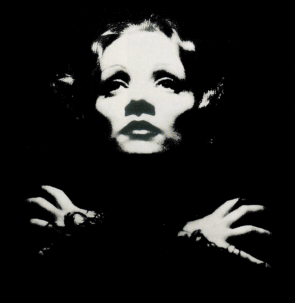
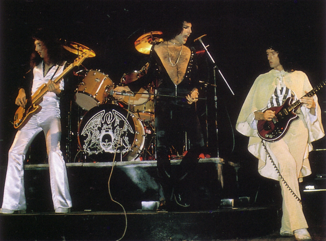
The cover of “QUEEN II” drew on an image from Josef von Sternberg’s 1932 film Shanghai Express. In the source image, Marlene Dietrich faces the camera with her arms crossed, her pose intensified by black-and-white photography. Queen adopted a comparable arrangement for the four musicians against a dark background. The pose thus moved from cinema into a new photographic and musical context.
The album’s other cover image uses a comparable contrast, but gives prominence to white. The two designs anticipate the opposition between the record’s two sides, extending a visual principle into the album’s structure.
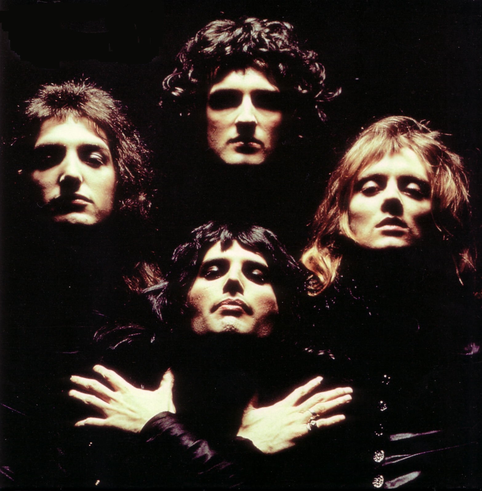
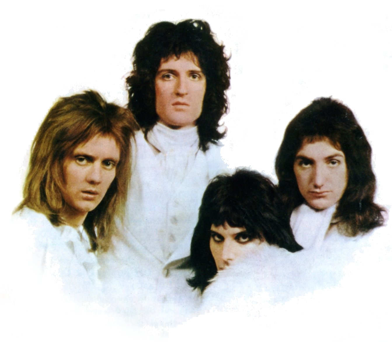
Photographer Mick Rock later explained his choice of source in an interview with Rolling Stone:
It should have been a photo of the whole band, and have as a theme white and black (like the whole album project). A friend […] showed me a photo of Marlene Dietrich from the set of the film Shanghai Express. It was an immediate intuition, strong. It was the perfect image for Queen; fascinating, mysterious, classic. […] I believe to have been the only one that understood the dualism that was in their music: the light and the shadow, white and black. There was always tension between these two poles. The result was strong and involving, like in dramatic opera.
The image continued to circulate after the album’s release. Queen returned to the pose in the opening frames of the promotional film for Bohemian Rhapsody, even though that song appeared on “A NIGHT AT THE OPERA” rather than “QUEEN II”.
A decade later, the band revisited its own visual history in the video for One Vision. The four musicians resumed the familiar arrangement, but their clothes and appearances registered the intervening years.
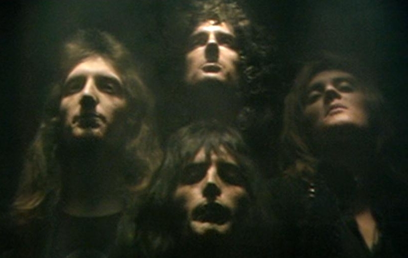
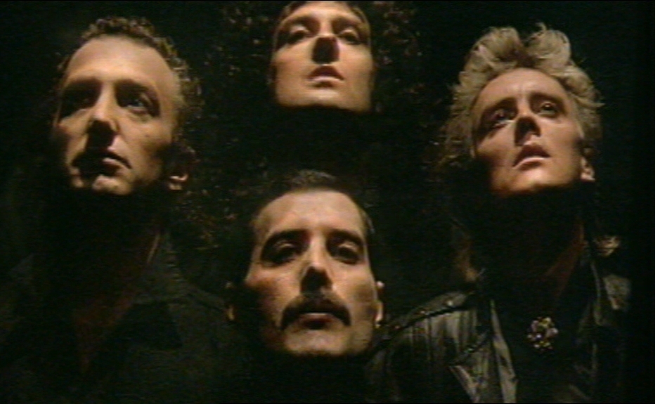
Each repetition generated another version of the motif. A cinematic image became an album photograph and then appeared in two promotional videos. Photographs taken from those videos subsequently returned the motif to the still image. The following illustration makes this sequence visible:
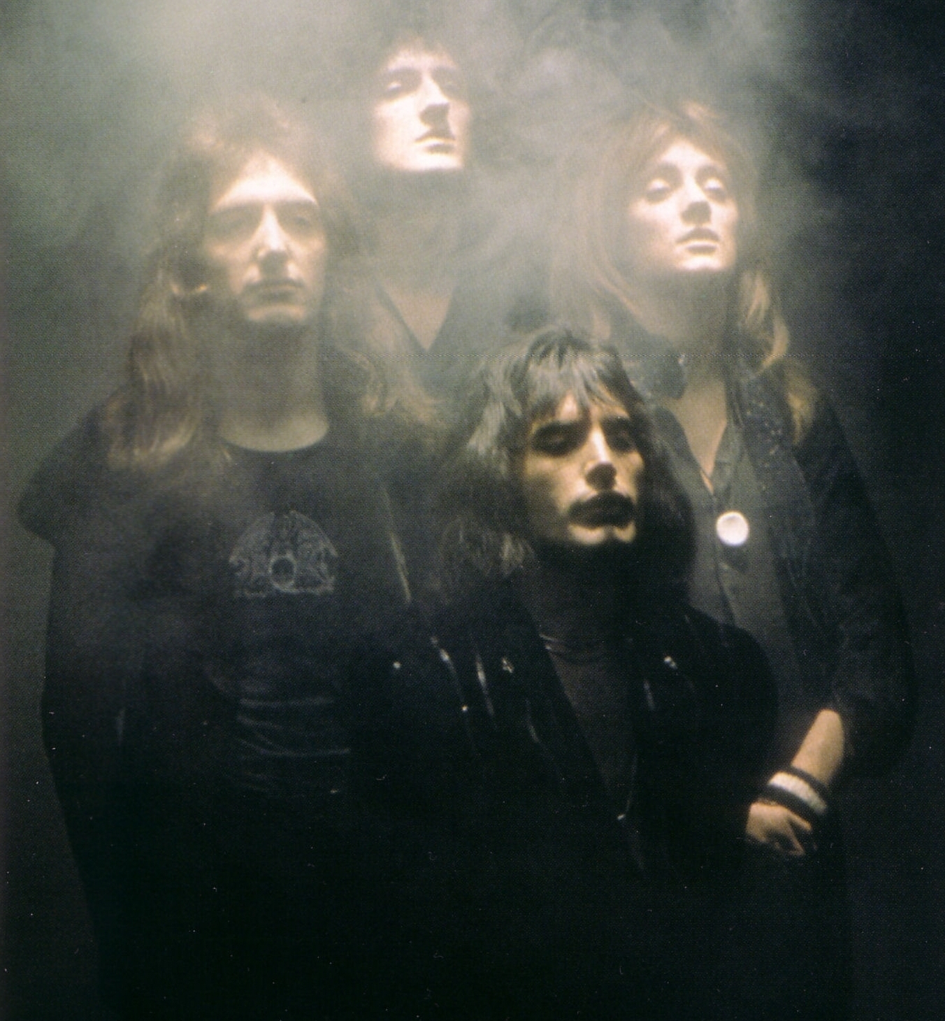
The same illustration also helps trace changes to Queen’s graphic emblem. A simplified form appears on John Deacon’s T-shirt; an early version had already appeared on the reverse of “QUEEN”.
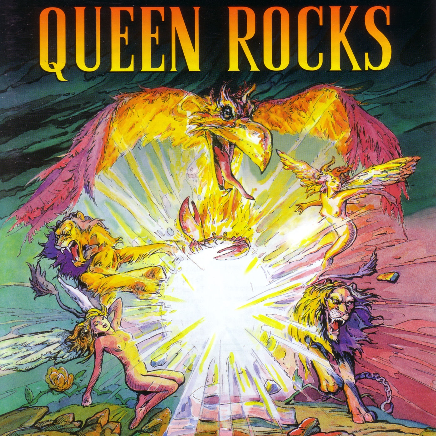
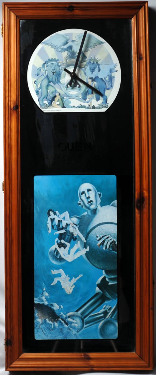
The emblem came to the fore on “A NIGHT AT THE OPERA” and “A DAY AT THE RACES”. Mercury arranged the four members’ zodiac symbols around the initial “Q”: two lions for Roger Taylor and John Deacon, a crab for Brian May’s Cancer sign, and two fairies for his own Virgo sign. A phoenix crowns the composition. The emblem subsequently appeared, in varied forms, on albums including “GREATEST HITS II”, “CLASSIC QUEEN” and “QUEEN ROCKS”, as well as on singles. Its recurring structure remained recognisable even as individual releases reinterpreted it.
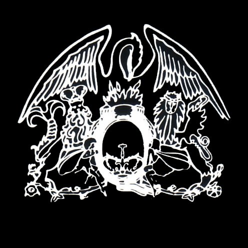
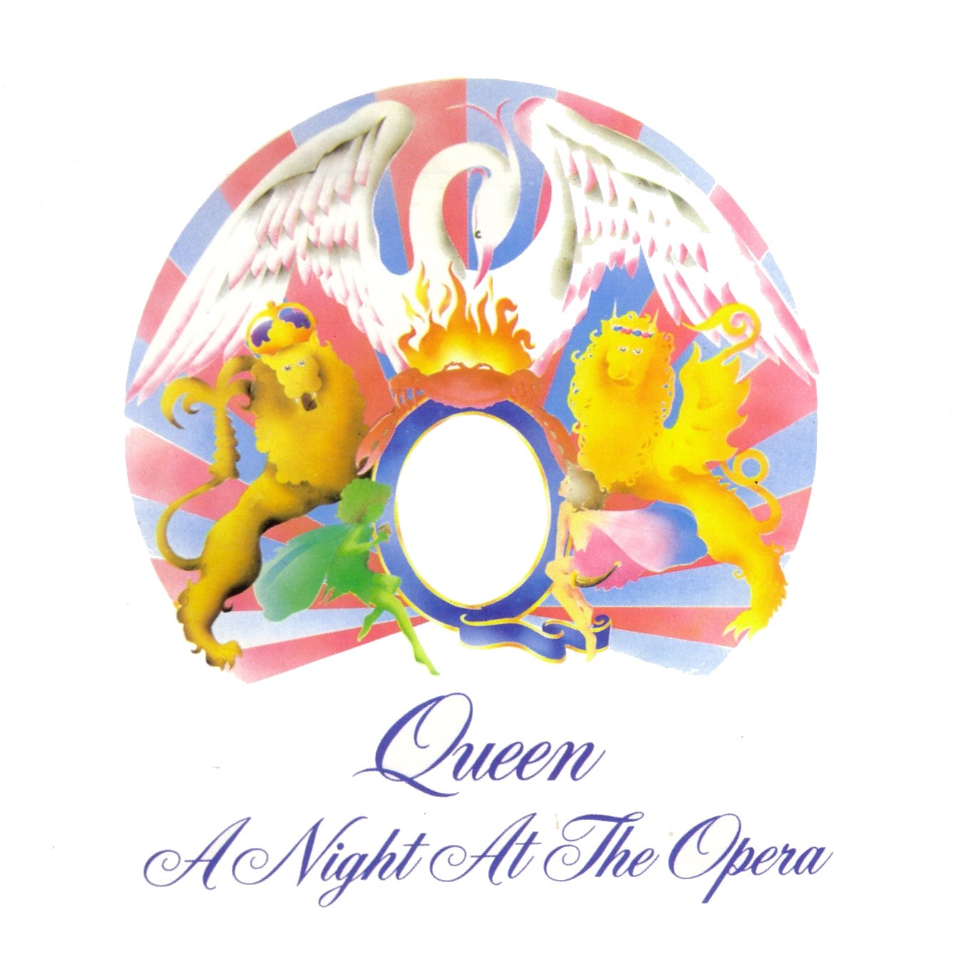
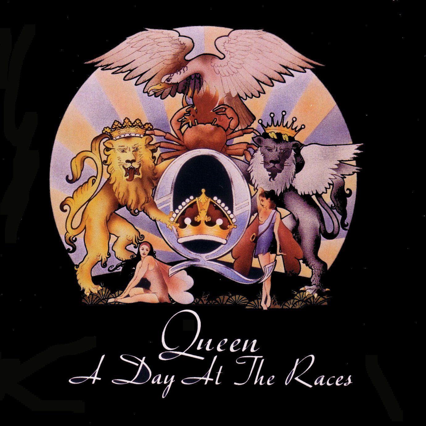
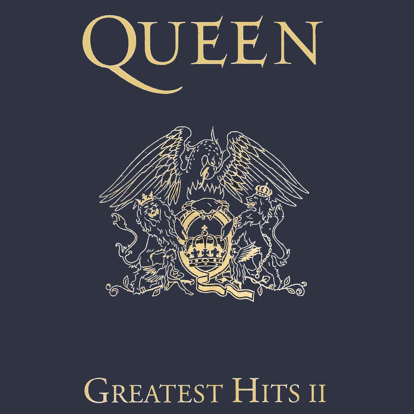

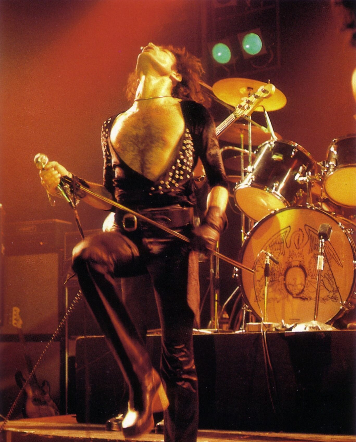
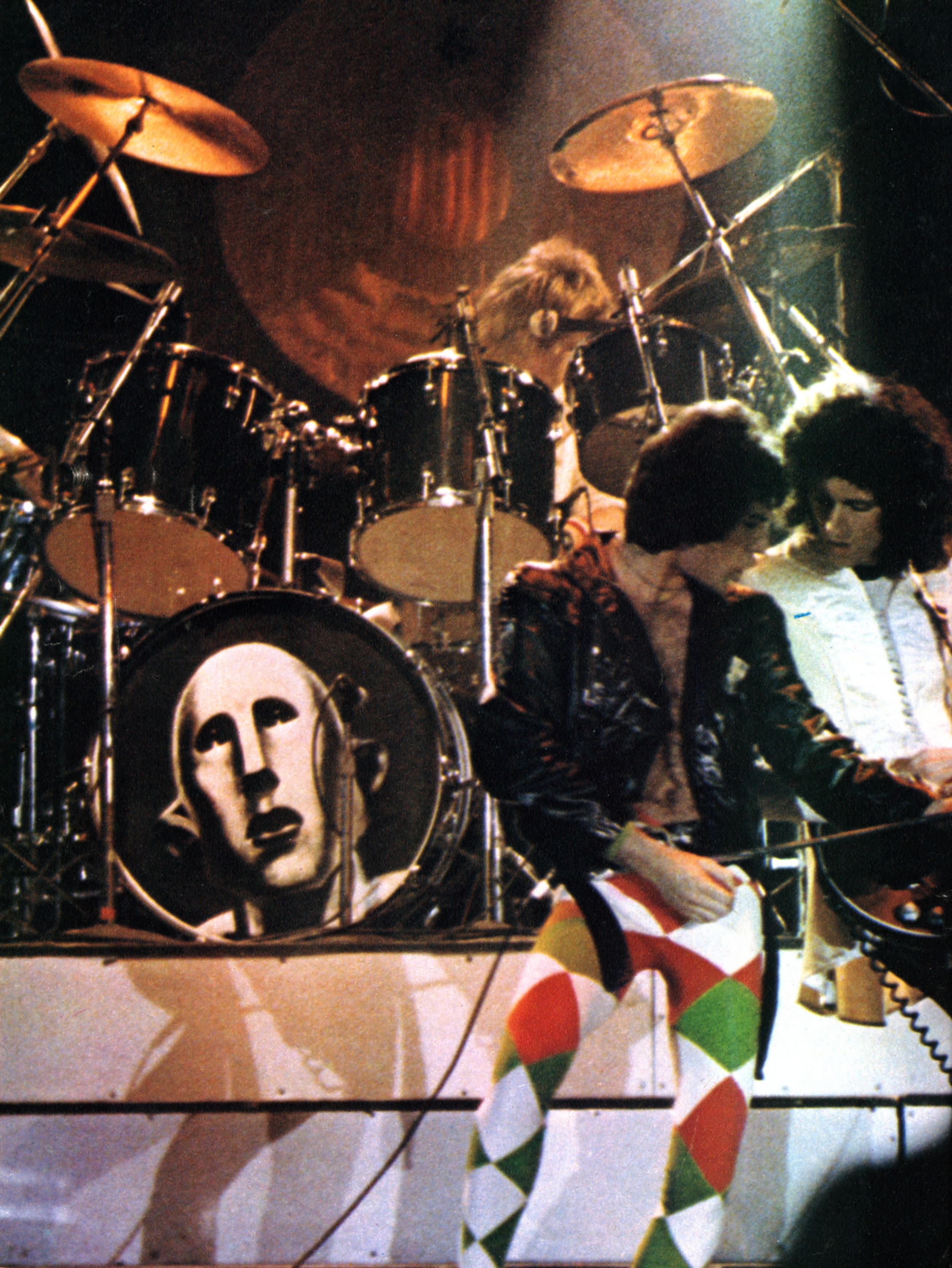
Queen’s emblem appeared not only on record sleeves but also on Roger Taylor’s drum kit during 1970s concerts. Its variations contributed to a stage language that included costume, lighting and effects. The positive and negative versions illustrated here need not be read as a strict chronology; Mercury’s clothing provides an additional visual point of reference. The lettering used for “Queen” likewise changed between releases, adapting the band’s identity to different colours, images and formats.
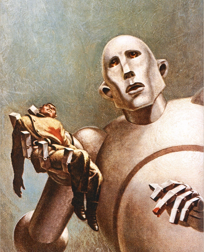
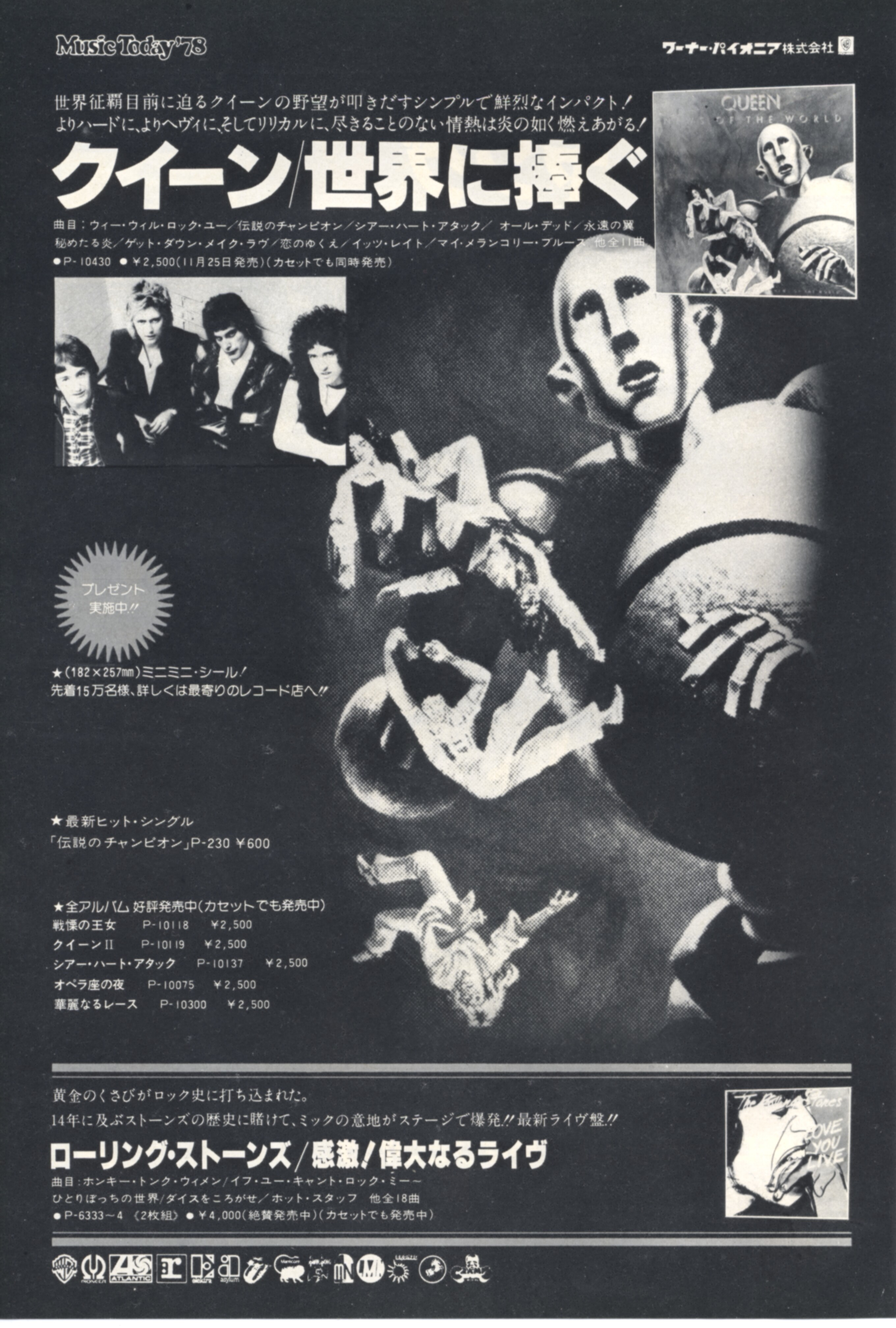
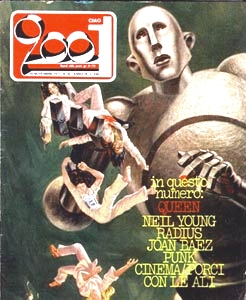
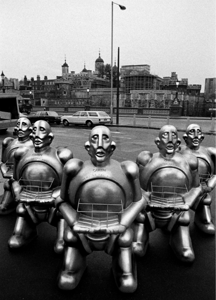
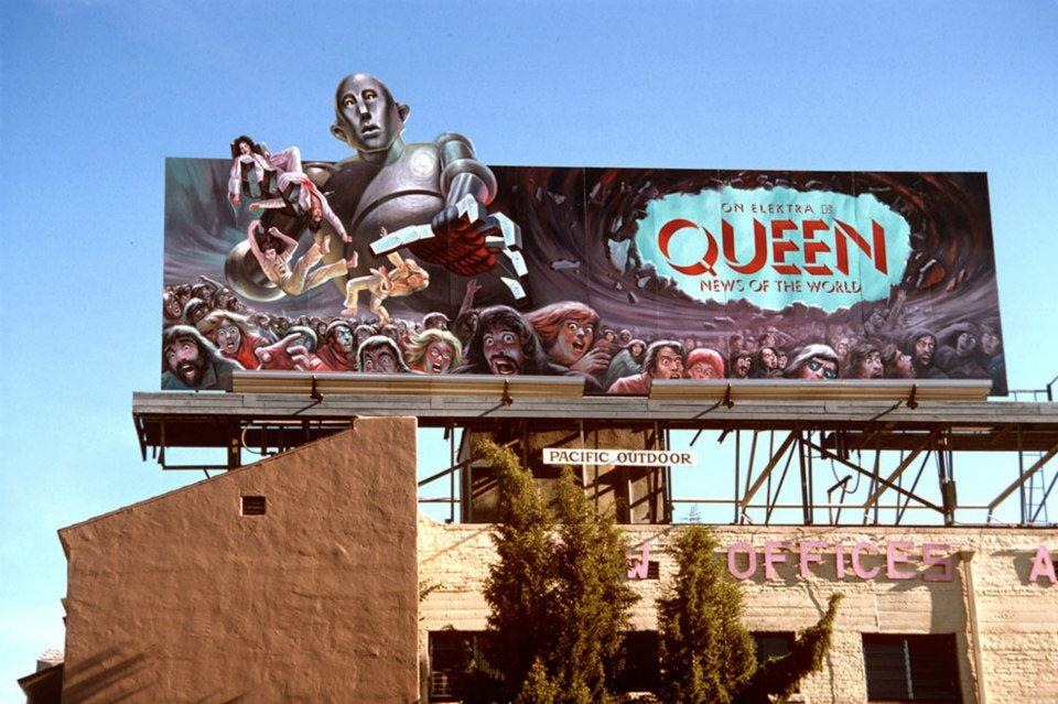
Several Queen albums use a single image to convey the character of the record as a whole. Beyond the examples centred on the band’s emblem, “NEWS OF THE WORLD” (1977) is especially notable for its science-fiction imagery and its debt to mid-century illustration. The official biography describes the origins of its cover as follows:
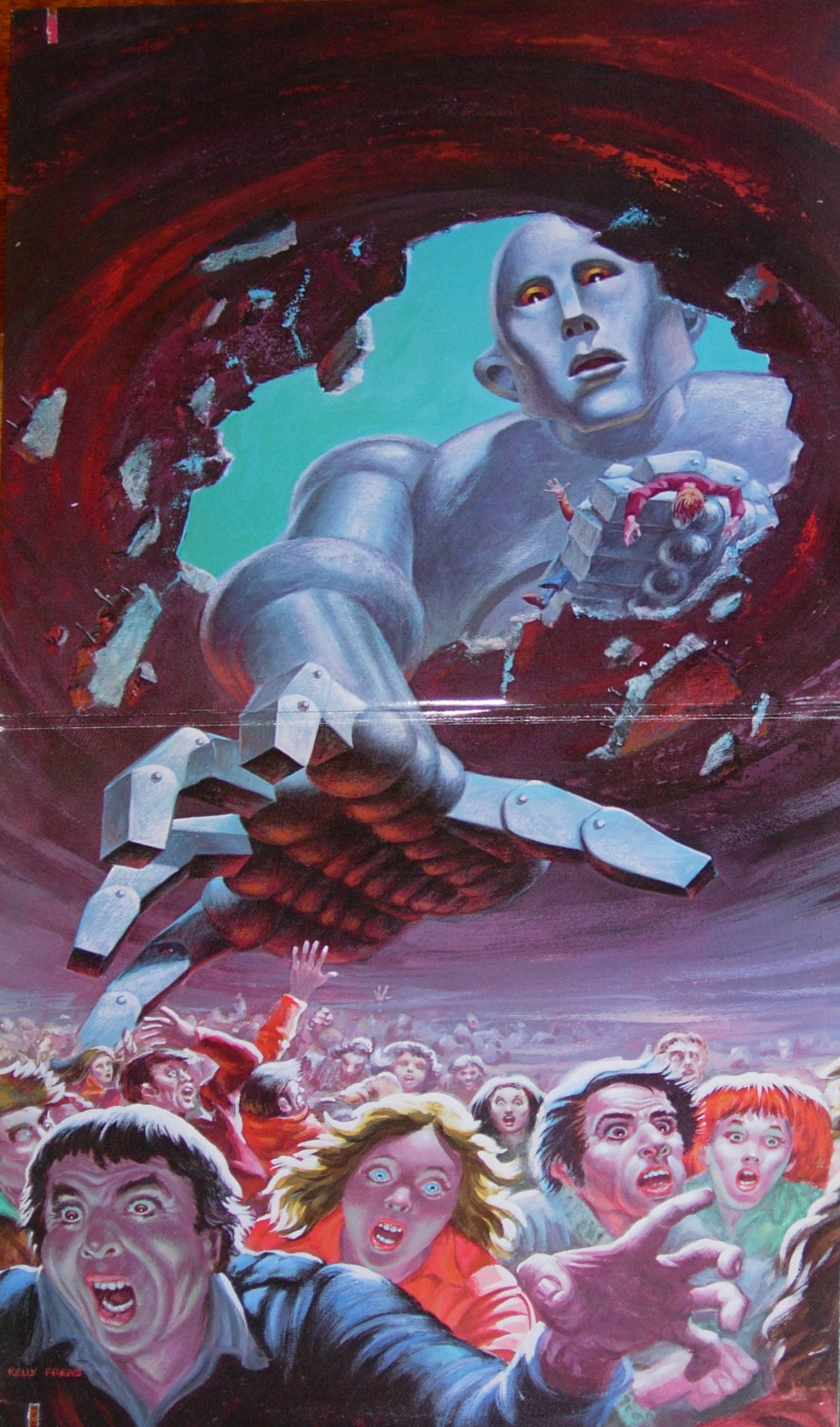
During the recent trip to the United States, Brian [May], keen on science fiction, had browsed though an American magazine Astounding Science [in particular the number of October of 1953]. On the cover there was an image of a robot that scattered panic and destruction among the human population, a work of the artist Frank Kelly Freas. Roger [Taylor] thought that the robot with some variations, would have been perfect for the cover of an album. It took a while but at last the elusive mister Freas was found. The artist appreciated the idea and well accepted the variations proposed to him: the persons that the robot was to hold in his huge hand were to look like Freddie [Mercury], Brian [May], Roger [Taylor] and John [Deacon]. Freas created also the inside cover of the album (Note 2).


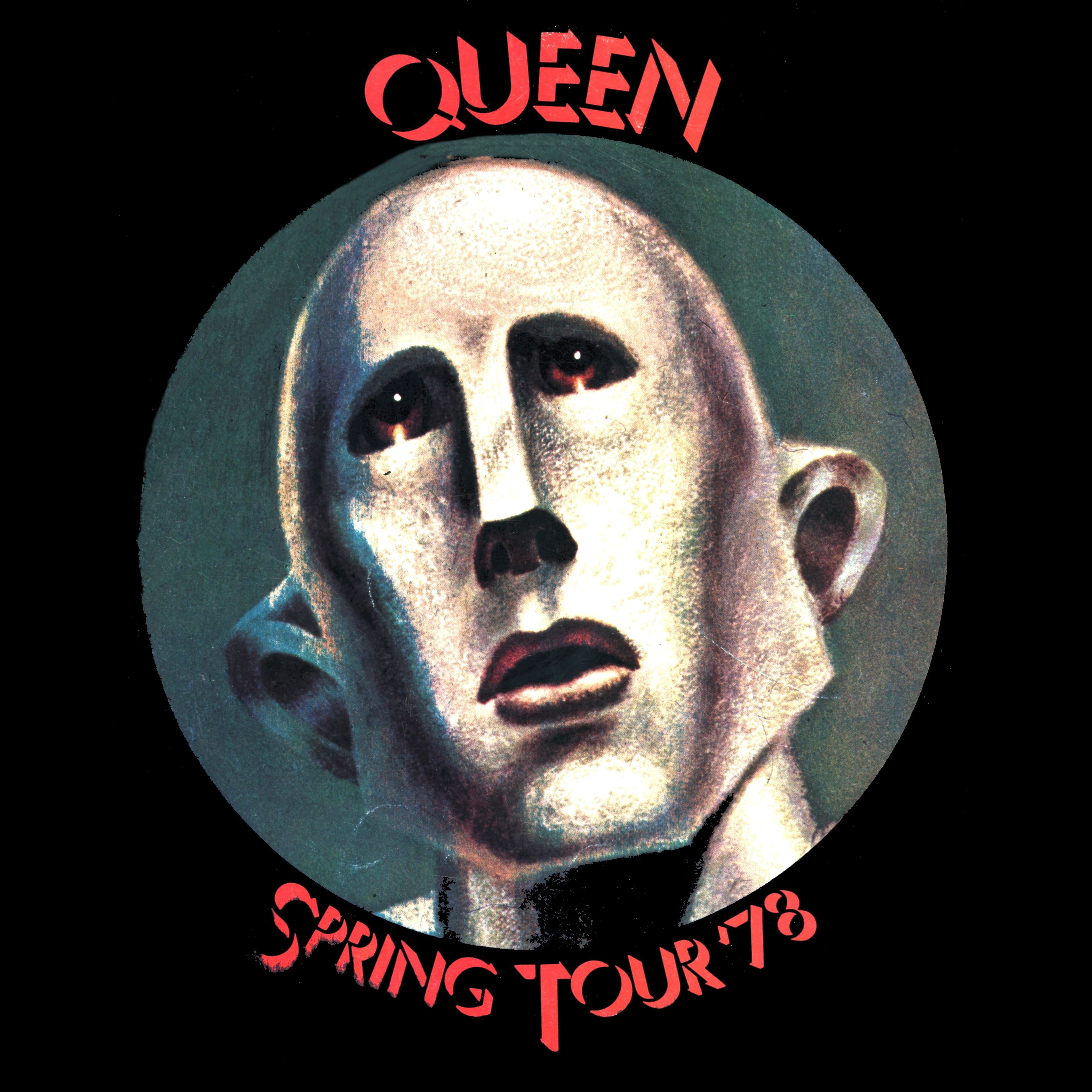
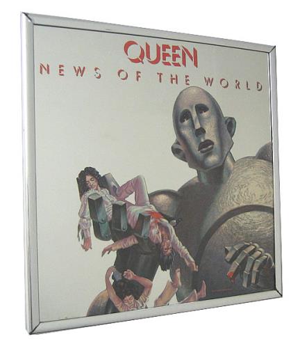
The album image retains much of its source composition, although the figures beneath the robot have changed. A vivid green background remains a shared feature; the French vinyl edition used green in place of the more familiar black.
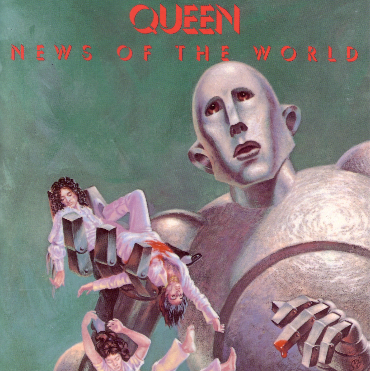
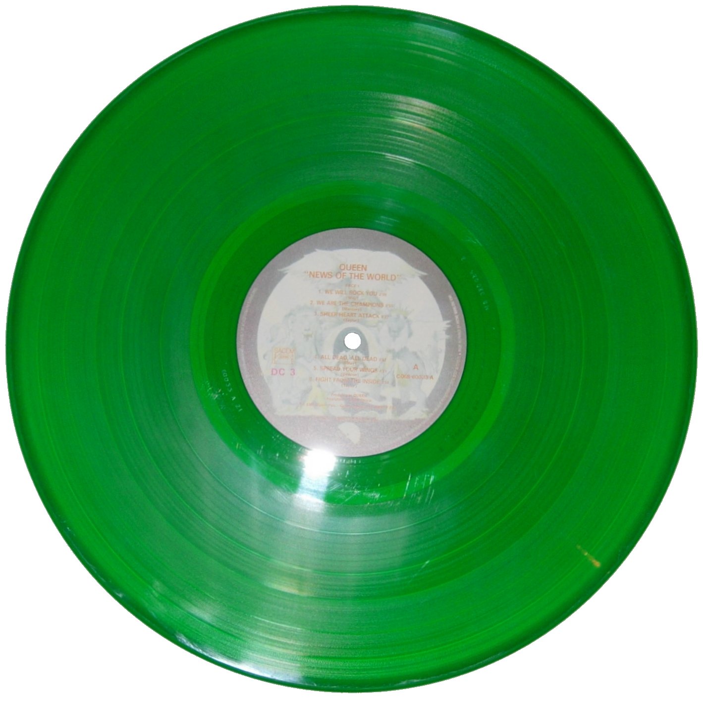
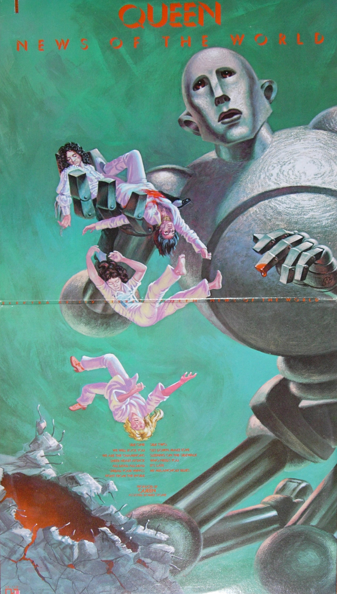
The front and inner images can also be read in sequence. When the sleeve is opened, the unfolding action resembles a comic-strip narrative. Album packaging here invites the viewer to interpret images over time, rather than as an isolated cover.
The front presents the robot with the four band members near a chasm. Inside, the scene develops: the opening widens and a crowd flees the destructive figure. The two panels thus establish a visual progression.
The robot’s role extended beyond the LP. Sleeves for singles from “NEWS OF THE WORLD” drew on the same figure and fleeing crowd, giving the associated releases a recognisable graphic identity.
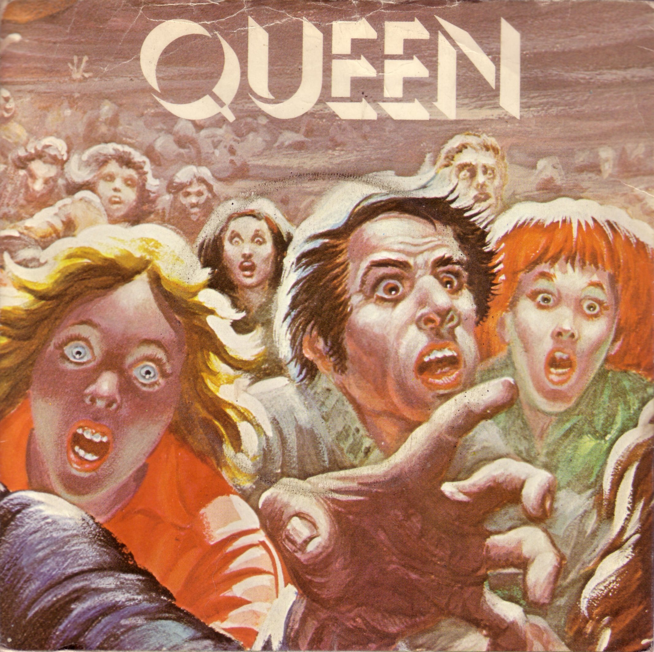
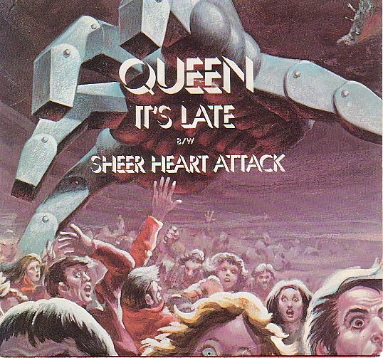
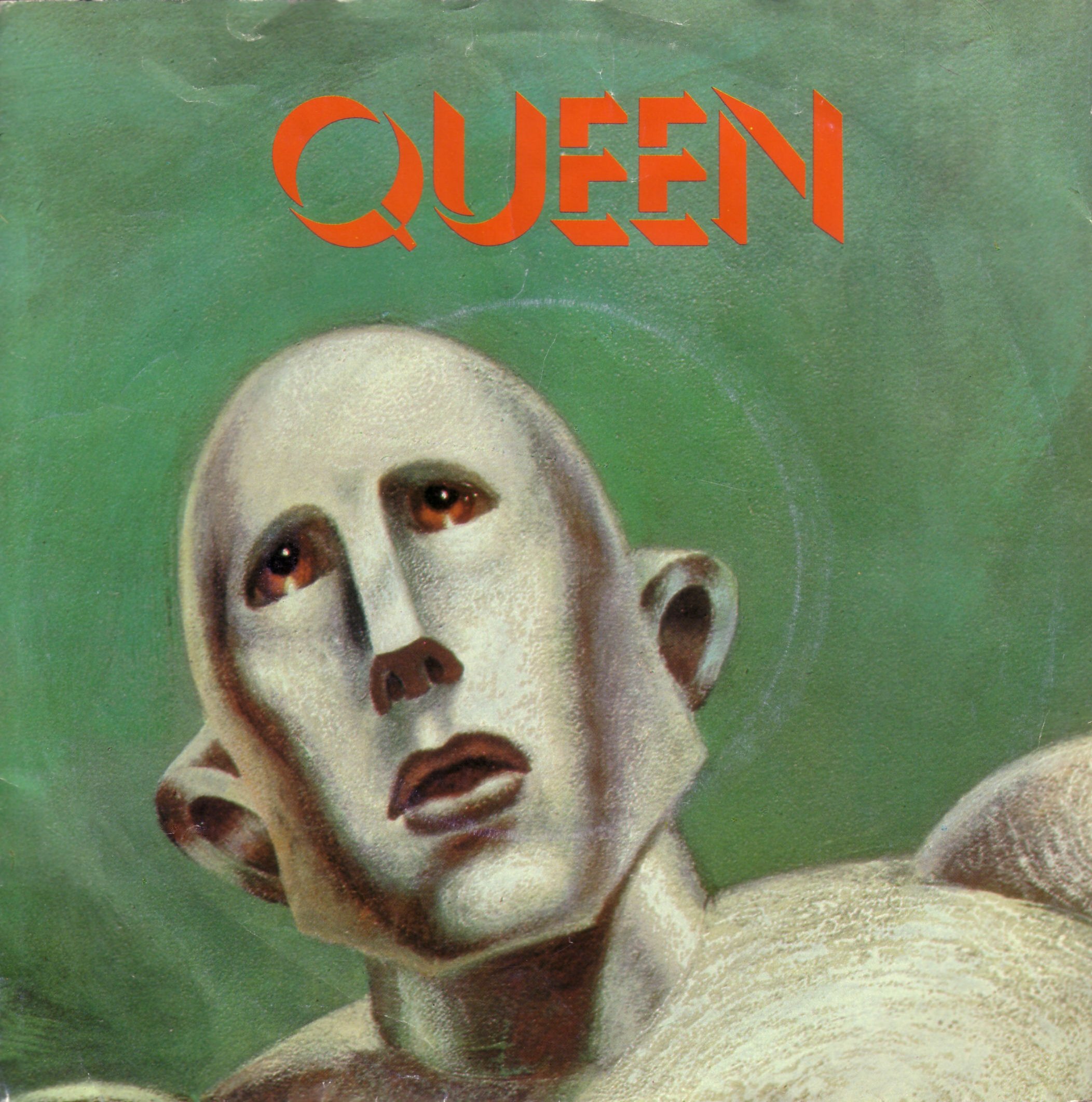
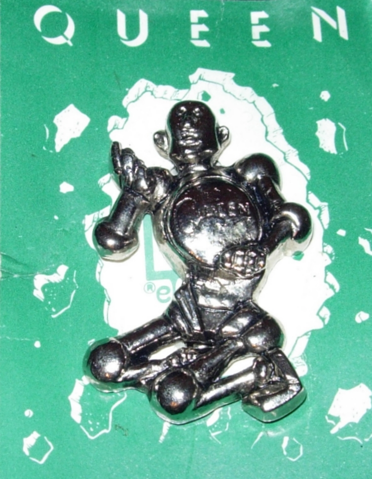
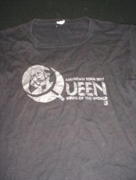
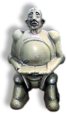
The motif appeared across advertisements in European, American and Japanese magazines, concert posters, merchandise, promotional objects and the tour programme. It also informed the decoration of Taylor’s drum kit and later appeared as a three-dimensional display or collectors’ model.
These uses show how an album image could organise an entire promotional campaign. Although the objects differed in scale and purpose, the recurring robot connected them to “NEWS OF THE WORLD”. Together they form a visual sequence extending outward from the original sleeve.
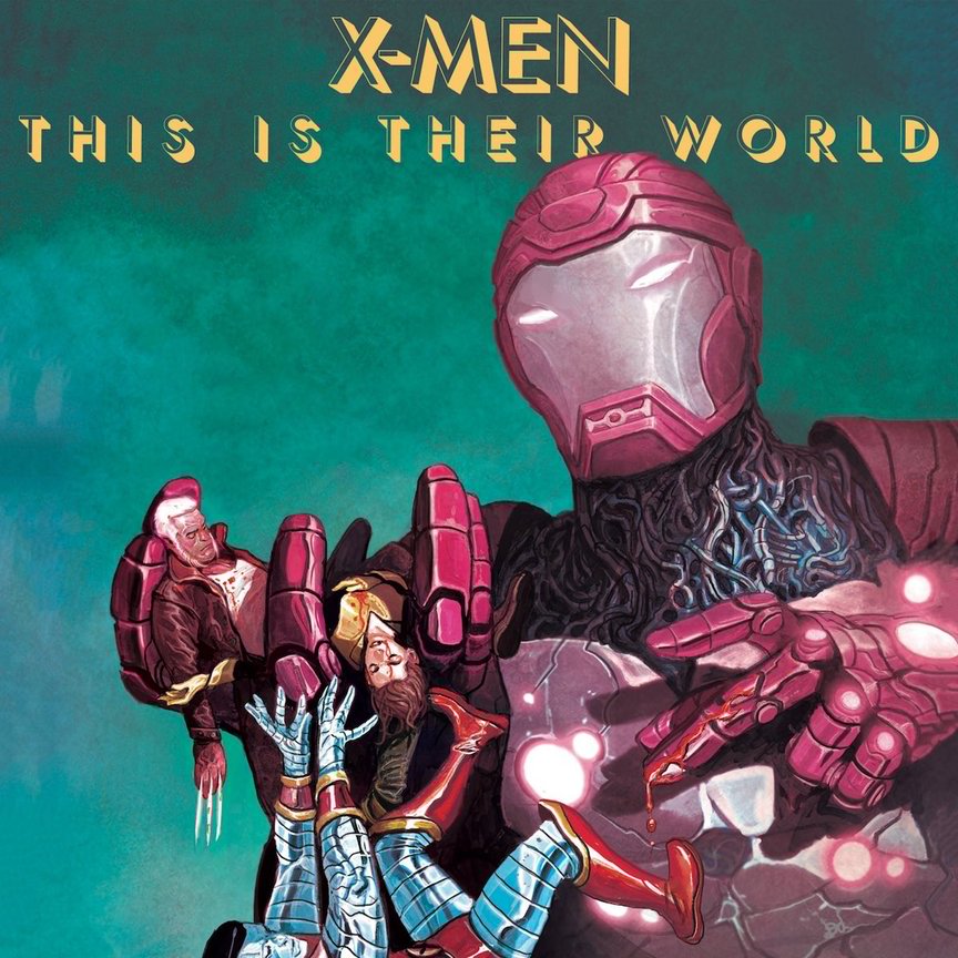
A 2017 vinyl edition marking the fortieth anniversary of “NEWS OF THE WORLD”, produced in a limited run of 200 with Marvel, reworked the original composition with X-Men characters. A related comic book used the new image as well.
An album sleeve inspired by a comic-book illustration thus became a source for another comic and a later record. The sequence makes the movement of an image between popular media unusually clear.
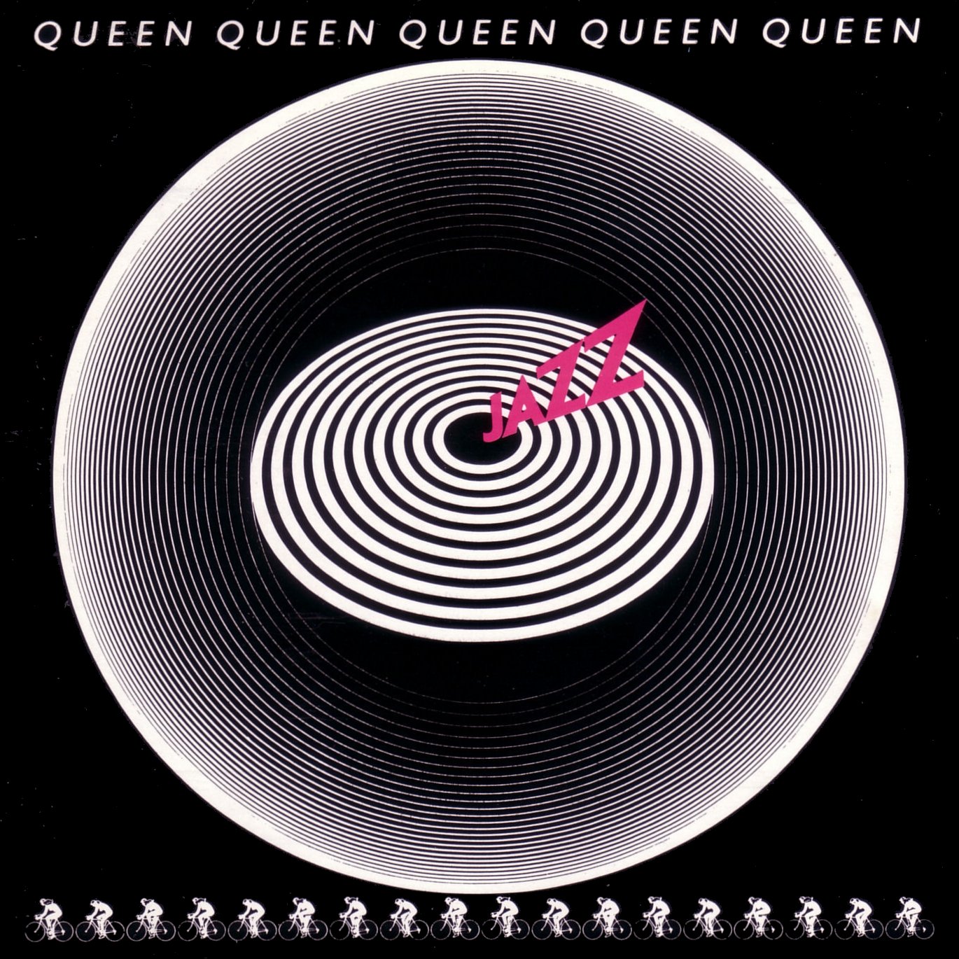
The cover of “JAZZ” uses concentric circles based on graffiti Mercury saw on a Berlin wall. Its circular movement can also suggest a bicycle wheel, connecting the design to Bicycle Race. Images of women riding bicycles reinforced that association and linked the song to Fat Bottomed Girls, which was paired with it on a double A-side single. Subsequent covers, including “HOT SPACE”, “A KIND OF MAGIC” and “THE MIRACLE”, likewise use immediate visual motifs to establish a relationship with their musical contents.
The album’s promotion also included the widely discussed proposal involving 65 nude women cycling at Wimbledon Stadium, with a resulting image intended for the release.
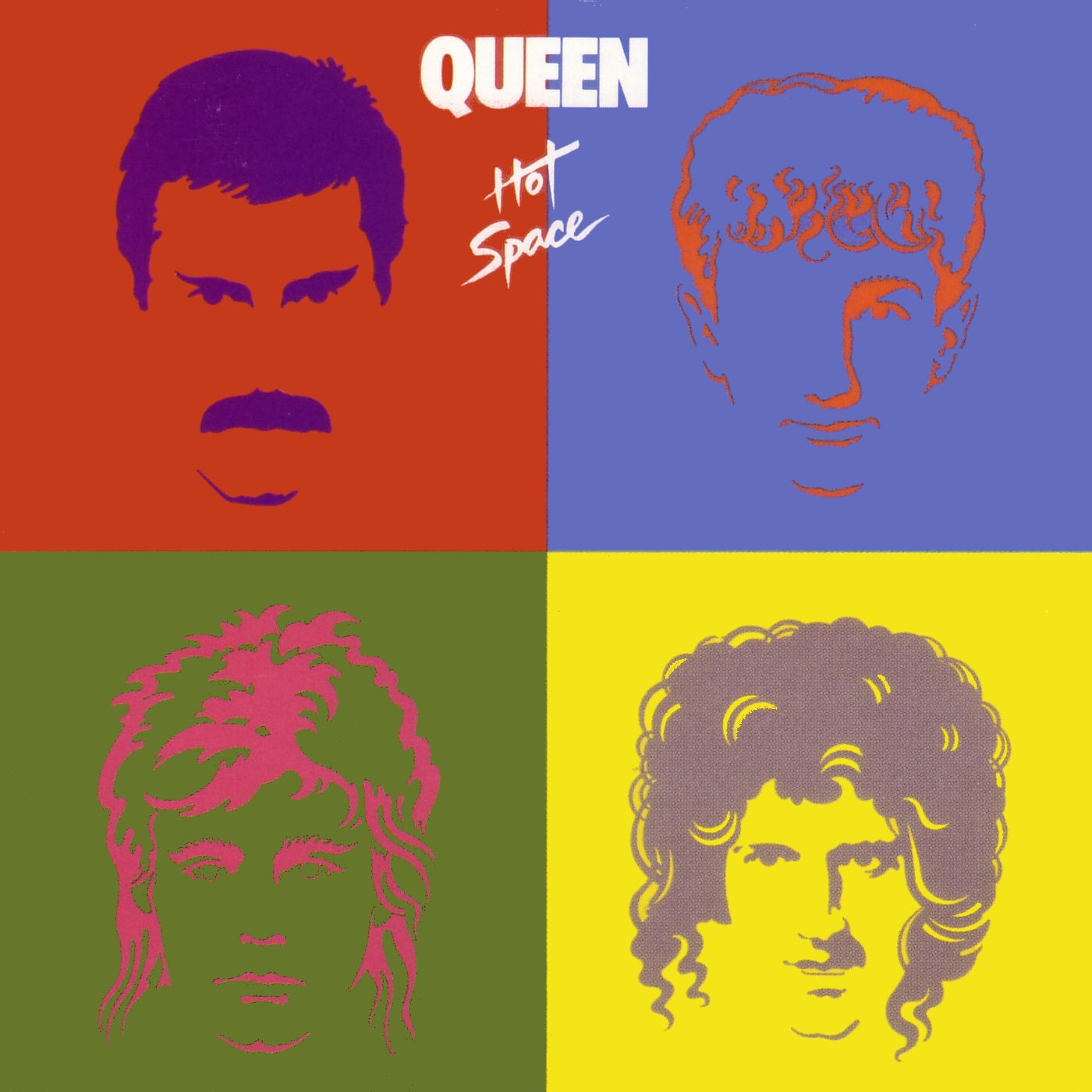
The four portraits against vivid colour fields on “HOT SPACE” invite comparison with Andy Warhol’s pop-art imagery. The design also signals a change in Queen’s sound towards rhythmically driven music associated with dance and disco. Its bright colours evoke the visual environment of the dance floor.
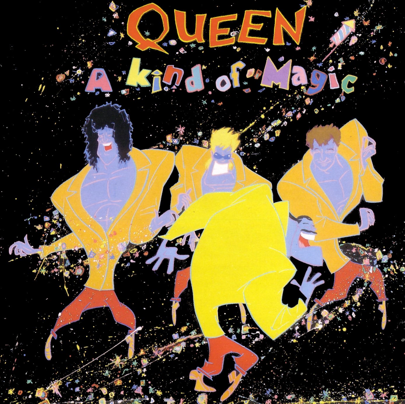
“A KIND OF MAGIC” depicts the musicians as animated figures, using an approach also seen in the promotional video for the title song. The playful design reflects both the record’s title and its close association with the film Highlander.
The pale blue background and the fusion of the four faces define the visual identity of “THE MIRACLE”. The motif recurs on related singles, including Breakthru and The Invisible man.
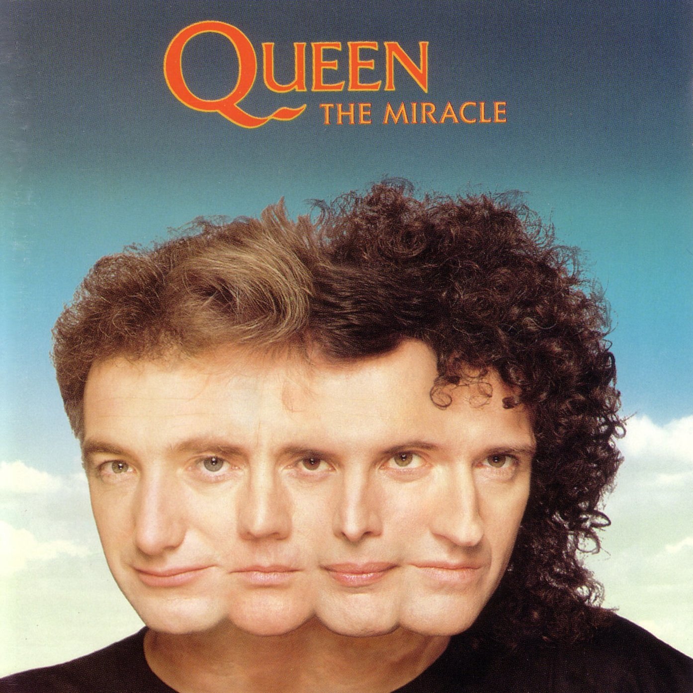
The composite portrait on “THE MIRACLE” also recalls, in some respects, the poster for David Cronenberg’s Dead Ringers, released the preceding year. Within Queen’s own campaign, the image became a repeated pattern on the album’s reverse and appeared on singles. Its emphasis on unity corresponded to the decision to credit all four members on each song after the band’s three-year absence from the recording market.
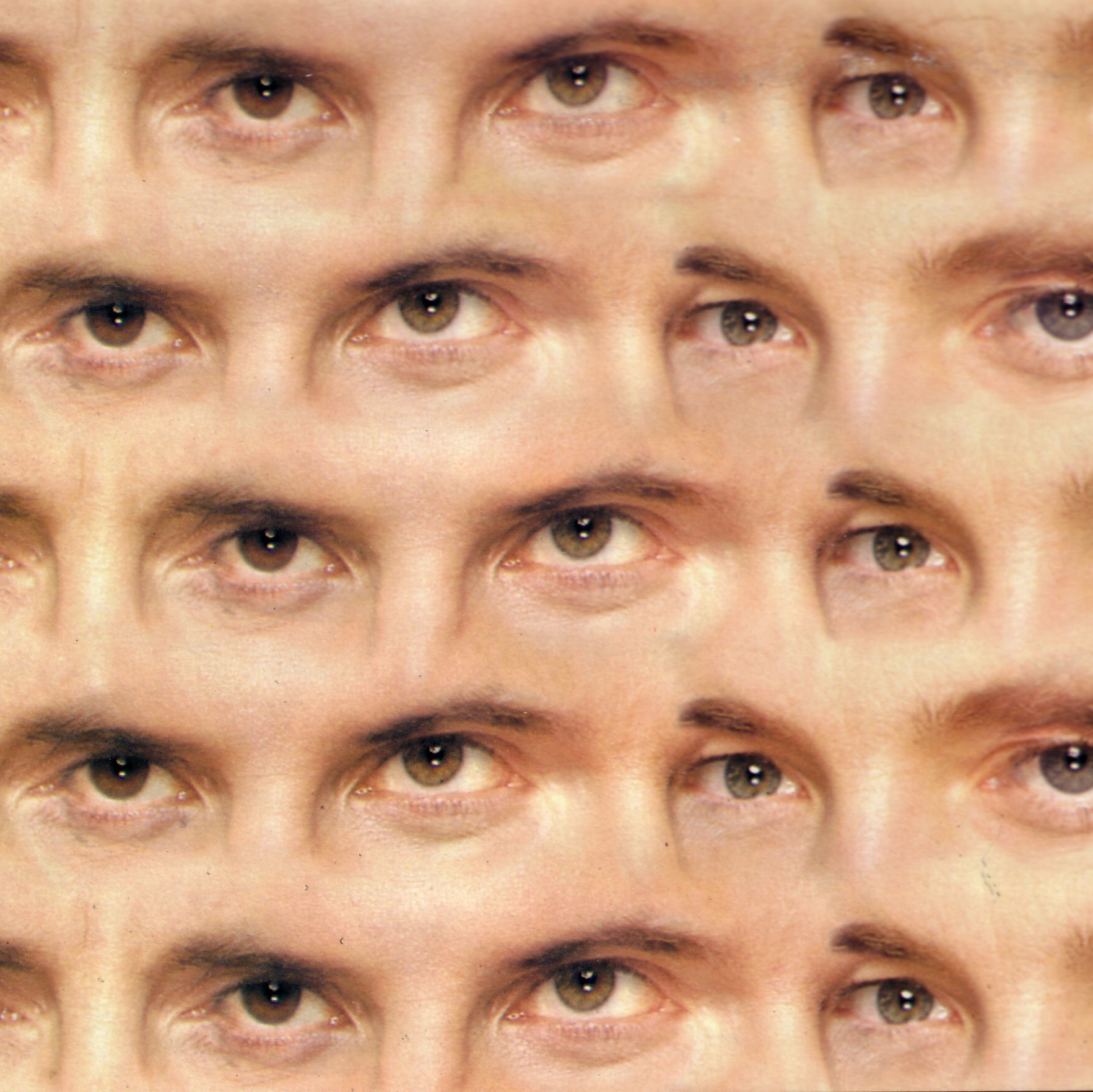
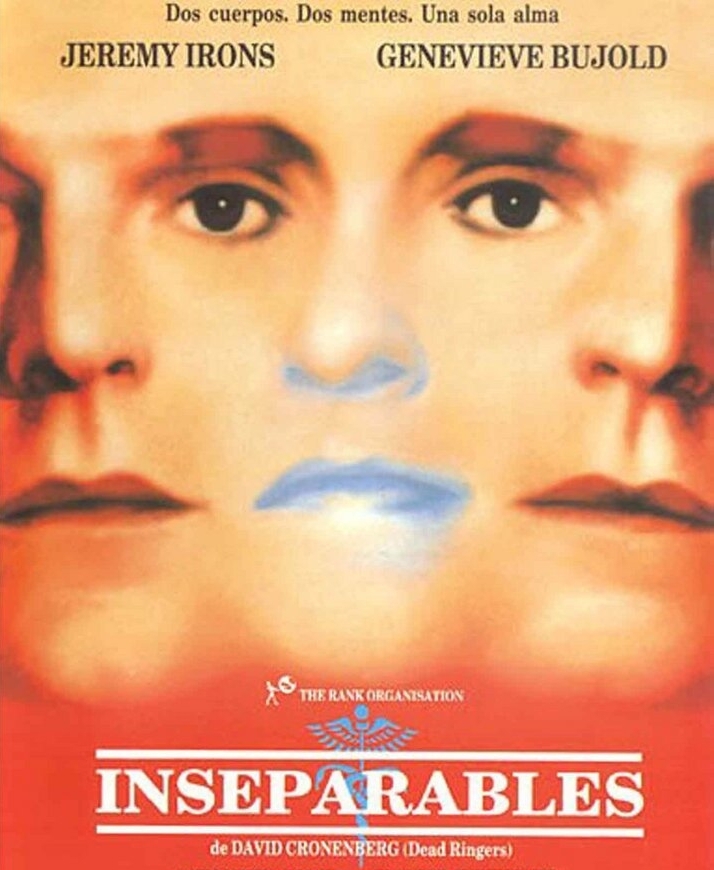
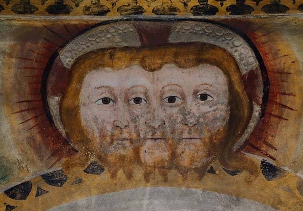
The joined-face motif has an older iconographic history. Comparable multi-faced figures appeared in ninth-century representations of the Holy Trinity, although such images later became contentious because they could also evoke demonic imagery.
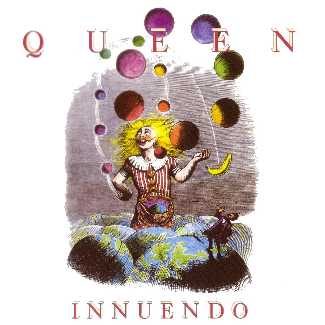
“INNUENDO” (1991) offers a more elaborate case of visual adaptation. Its illustrations draw on Grandville, the pseudonym of French caricaturist Jean Ignace Isidore Gérard (1803–1847). His fantastic combinations of human, animal and object give apparently irrational scenes their own internal logic.
Grandville’s illustrations were reproduced with little intervention, preserving their distinctive character. His work also appears throughout the inner artwork of “INNUENDO”, giving the album a consistent visual programme comparable in scope to that of “NEWS OF THE WORLD”.
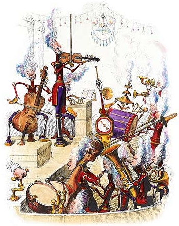
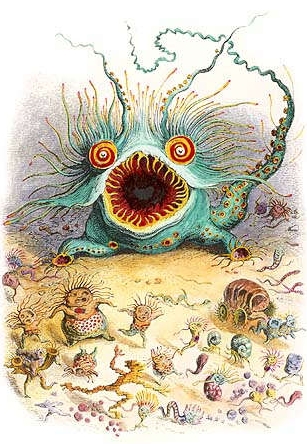
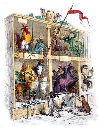
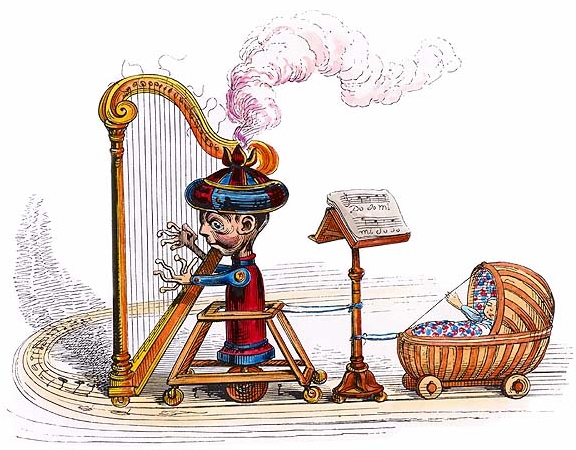
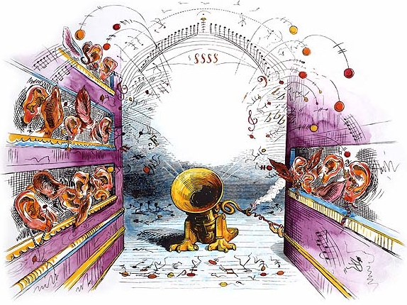
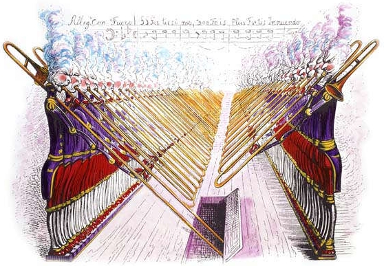
The band members themselves are absent from most of Grandville’s images on “INNUENDO”, a significant choice for the last Queen album released during Mercury’s lifetime. Against predominantly white backgrounds, the drawings give their fantastical figures room to stand apart from the musicians’ usual portraits.
The cover’s juggling figure suggests both levity and fragility. A small world hangs among the objects in motion, while another figure recoils from a falling banana. Details of this kind give Grandville’s imagery its ironic and unsettling character.
The inner artwork contains the principal images of the band: a vertically elongated, blue-toned photograph and a caricature in which their faces and costumes echo Grandville’s style.
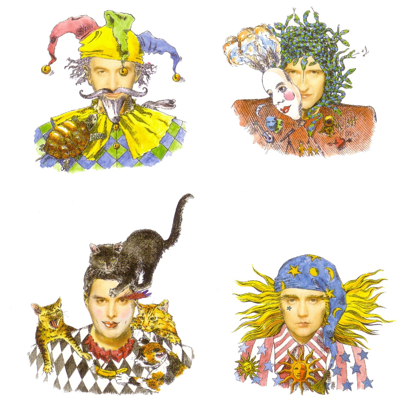
The caricature also associates each musician with objects or animals. May’s clothing includes a guitar and a telescope, referring to music and astronomy; Mercury, a lover of cats, is surrounded by felines. Deacon appears as a clown accompanied by a tortoise and a hare, while Taylor wears a bandana and resembles a fortune-teller.
Beginning with Bohemian Rhapsody, Queen’s promotional films helped establish conventions that endured in later music videos. Directors and technical specialists increasingly treated the short film as a distinct form. Its images could intensify a song’s effect, but the balance between music and image remained a central creative question.
Keith McMillan’s 1979 video for Save Me, developed from a concept by Brian May, combines staged band footage with animation. A girl’s story unfolds alongside the musicians’ simulated performance. Dissolves allow her to move between the two visual worlds, while a luminous white dove repeatedly links the animated and filmed elements, including through transitions into Mercury’s figure.
David Mallet’s video for Radio Ga Ga incorporates imagery from Fritz Lang’s Metropolis, a film also associated with Mercury’s later solo work. Queen appear in a flying vehicle alongside footage from the film. Changes between colour and monochrome, and shifts in framing, create a dialogue between historical cinema and contemporary performance. The synchronised handclaps became a memorable concert gesture. The video also includes brief references to the band’s earlier films and live appearances.
Tim Pope’s 1984 video for It’s A Hard Life uses an exuberantly theatrical setting. Costumes, wigs, table arrangements and saturated colour fill the frame in a manner reminiscent of baroque horror vacui. Each detail contributes to the production’s deliberate excess (Note 3).
Lighting places Mercury at the centre of the scene, while the other members take less prominent roles. May’s brief guitar solo highlights the instrument’s unusual skull-shaped design. The imagery also reinforces the song’s theatrical introduction and its musical allusion to “Vesti la giubba” from Ruggero Leoncavallo’s opera.
Russell Mulcahy, the director of Highlander, also directed the 1986 video for A Kind Of Magic. Mercury plays a magical figure who enters an abandoned theatre and transforms its inhabitants, played by May, Taylor and Deacon, into musicians. When he departs, the setting returns to its original state.
Animated figures modelled in plasticine provide transitions between musical and narrative sequences. Grandville-inspired drawings associated with the album also appear alongside caricatures of the musicians. Each band member is rendered in a different visual idiom: Mercury recalls Leonardo da Vinci, May a Victorian engraving, Deacon a Picasso-like style and Taylor a painting associated with Jackson Pollock.
The video for “INNUENDO” (1991), directed by Jerry Hibbert and Rudi Dolezal, is among Queen’s most visually elaborate. Set in a cinema populated by marionettes, it projects images of the band together with archival footage of armies, dictatorships and nuclear destruction. Its length of more than six minutes allows these disparate sources to develop into an unsettling visual sequence.
The film also alludes to earlier cinema. A cut-tie sequence recalls the Marx Brothers, whose films had supplied the titles “A NIGHT AT THE OPERA” and “A DAY AT THE RACES”. Brief passages of vivid colour associated with Mercury stand out against the surrounding imagery before disappearing.
One of the final videos featuring Mercury, I’m Going slightly Mad, was directed by Rudi Dolezal and Hannes Rossacher in February 1991. Filmed in black and white, it presents the musicians in deliberately eccentric costumes and make-up. Its dreamlike images translate elements of the lyrics into visual form, including Mercury among daffodils, penguins and a headless gorilla.
David Mallet’s 1995 video for Heaven For Everyone draws on Georges Méliès’s early cinema, notably Le voyage dans la Lune (1902) and Le Voyage à travers l’impossible (1904; Note 4). Its use of historical footage can also be read as a tribute to Queen: dissolves incorporate the musicians without placing them directly within the original scenes. The opening shows messages left by fans at Mercury’s London home. This colour sequence contrasts with the largely archival imagery that follows, producing an elegiac sense of distance and remembrance.
As the preceding examples demonstrate, a film image could generate the concept for an album cover and subsequently inform a promotional video, while a comic-book cover could be reinterpreted for an album and its related singles. These successive adaptations offered musicians new visual means of expression.
These visual relationships also extend across artistic media. At least two Queen songs can be understood as musical interpretations of a painting or lithograph. Their shared subjects do not make them identical works: harmony, melody and form give the images a distinct musical interpretation. Twentieth-century reproduction broadened access to art and enabled such reinterpretations to circulate as new works in other media.
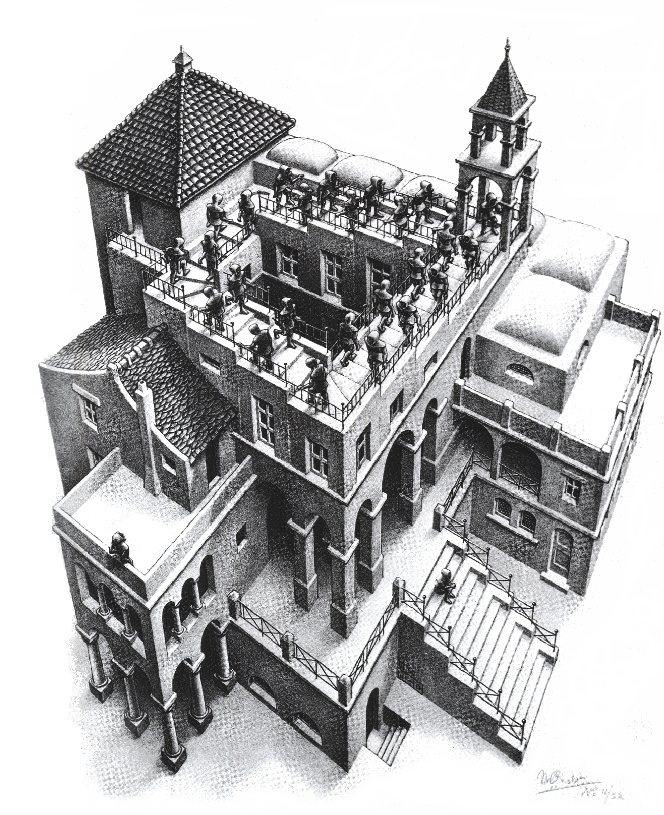
M. C. Escher’s visual paradoxes inform two related songs, Tie Your Mother Down and Teo Torriatte, and invite a further reading of their placement on the album. Just as Escher’s figures seem to move without ascending or descending, the music suggests a continuing movement; the fragments that frame the album evoke the immovable stairs.
The sources of The Fairy Feller’s Master-Stroke form a more complex sequence. Traditions of an enchanted woodland informed Shakespeare’s A Midsummer Night’s Dream ; Richard Dadd’s painting of the same title gave visual form to this imaginative world. Queen, and Mercury in particular, offered a detailed musical interpretation of Dadd’s work, displayed at the Tate Gallery in London.
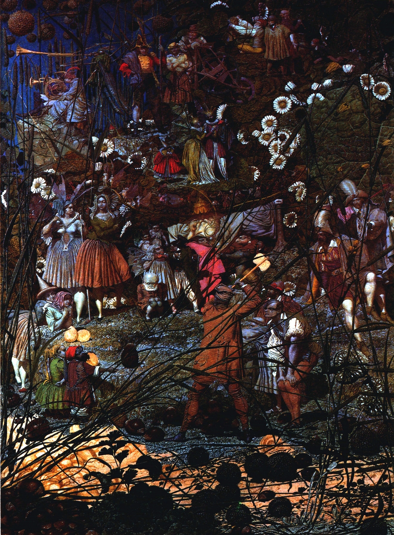
The sequence thus moves from oral tradition to Shakespeare’s written drama, then to Dadd’s painting and Queen’s song. Each change of medium produces a distinct work and creates possibilities for further interpretation. Queen’s videos for Save Me and Innuendo likewise combine film with animation and modelling in plasticine. The Marx Brothers’ A Night At The Opera, which inspired Queen’s fourth album title, also draws on Leoncavallo’s I Pagliacci; an operatic reference recurs, musically and visually, in Queen’s It’s A Hard Life.
Earlier traditions often took a literary text as the starting point for a musical work, in the form of a libretto, or for a painting. Ovid’s Metamorphosis , for example, furnished subjects for many later paintings. In the twentieth century, by contrast, a pre-existing image could shape both the words and the musical form of a song. Don McLean’s Vincent draws on Vincent van Gogh’s Starry Night, while Nick Didkovsky’s The Twittering Machine takes its point of departure from Paul Klee’s work of the same name. The reference to the visual source can be audible in the lyrics from the outset, and the song can engage with features of the original image.
Mechanical reproduction helped make such exchanges possible. Photography and cinema altered the relationships between audiences, artists and artworks: an image could circulate independently of its original medium and become the source of another interpretation. A painting, for example, might be reproduced photographically or reimagined musically.
A musical interpretation of a painting is one possible form of this wider process. Such reinterpretations allow an artwork to exert influence across different media and aesthetic contexts long after its initial creation.
A photograph of Marlene Dietrich, mediated through cinema, could likewise inspire an album cover and then a video. Queen’s references to the Marx Brothers, Fritz Lang’s Metropolis and Georges Méliès operate similarly across album titles and video imagery. These are reinterpretations of earlier works rather than literal reproductions.
© Nicola Bizzo
Article published in Music in Art (International Journal for Music Iconography). Vol. XXXII, no 1-2 – Spring-Fall 2007, New York City
(1) Cited in ALBERTO CAMPO, Get Back! I giorni del rock, Bari, Gius. Laterza & Figli, Spa, 2004, pag 53.
(2) JACKY GUNN & JIM JENKINS, Queen – La biografia ufficiale, Milano, Arcana Editrice, 1993, pag, 119.
(3) Compare the scenery of the video clip with the prints of Charles Nicholas Cochin, French illustrator of the first eight hundred.
(4) Curiously the following year (1996) another video clip similar and once again inspired by a film of Méliès is created: the video mentioned is Tonight, Tonight by the Smashing Pumpkins.
Related collections: Related material includes the original 35 mm slides from Queen’s Innuendo video and the study of Queen’s music in film and videogames.
Related Articles


You must be logged in to post a comment.